I was commissioned to design the visual identity and interface for an app that has been developed as part of
Guia de Campo (Field Guide), an environmental education research project. Although interactive digital design is not my area of expertise, the leader of the project, Sónia Matos invited me to collaborate because she believed my skills and knowledge in graphic design for print could be utilised for the project, offering a different approach than might be taken by someone from a purely tech background.
Guia de Campo takes as a departing point the questions posed by children and teenagers regarding their surrounding environment. Through a commitment to place-based learning, it emphasises the importance of connecting younger generations to local environments. The project designs, develops and tests interactive technologies for place-based learning in conversation with local communities as a means to explore pedagogical strategies in the context of environmental education.
The development of the app was a close collaboration between myself and Daniel Sousa, a programmer working from Lisbon, alongside Sónia Matos, who is based in Madeira, with input from the rest of the Guia de Campo team. Throughout our discussions about the design and functionality of the app, our main focus was the end user – how they would understand the app, and how they would interact with it. My approach to the design of the interface was informed by the results of the research that the team had already undertaken that looked at how young people engage with technology and with the natural environment.
As well as designing the interface for the app I was commissioned to develop a visual identity for the project: the central feature of the identity is the
Guia de Campo logo (above), a circle split in to two equal parts along the horizon, and coloured blue and green – a simplified echo of the landscape of the Azores. The logo appears on a grey background on the app’s loading page (above) along with the name ‘Guia de Campo’, set in the typeface Roboto regular. This typeface is used throughout the app; it was selected because, as a Google typeface, it is widely available on all platforms; Roboto also fitted the brief, which specified a clean, contemporary typeface.
The home page (below) consists of the navigation bar and a map with a marker which shows the user’s location alongside content (photographs, videos, sound files and questions to scientists) that has been uploaded by other users. The content is represented by a set of icons that I designed: a camera for images; a microphone for sound files; a video camera for videos; and a question icon which refers to questions asked in the Comunica section. The lozenge at top left allows the user to zoom in on the map.
One of the key aims of my design for the interface was that it should be completely intuitive and easy to navigate without a manual: the app is used in the ‘field’, with the initial test location an area of outstanding natural beauty in the heart of Terceira Island in the Azores archipelago called
Mistérios Negros (in English: Black Mysteries), where the young people would be using the app with minimal intervention from adults. The navigation bar at the bottom of the screen is present on almost every ‘page’ of the app allowing the user to understand their position in the app and to quickly return to the home page by pressing the centrally-placed
Guia de Campo logo; the icons in the navigation bar increase or decrease in size to indicate the user’s position in the app. The icons allow the user to access other pages on the app, from left to right:
Adicionar Conteúdo (Upload Content);
Ver Arquivo (Search Archive);
Comunica (Contact); and
Informações Adicionais (Additional Information).
Clicking on the icons on the map brings up the content uploaded by other users at that location; in this instance, the camera icon brings up a photograph taken at that location (above). Icons below the photograph allow the user to share the photo to social media and to expand the image to full screen (below). If the photograph is part of an album, icons below the image allow the user to scroll through the album. I designed the interface without words or instructions, refining the design over several iterations, and in collaboration with the programmer and the
Guia de Campo team so that it is simple and intuitive to use.

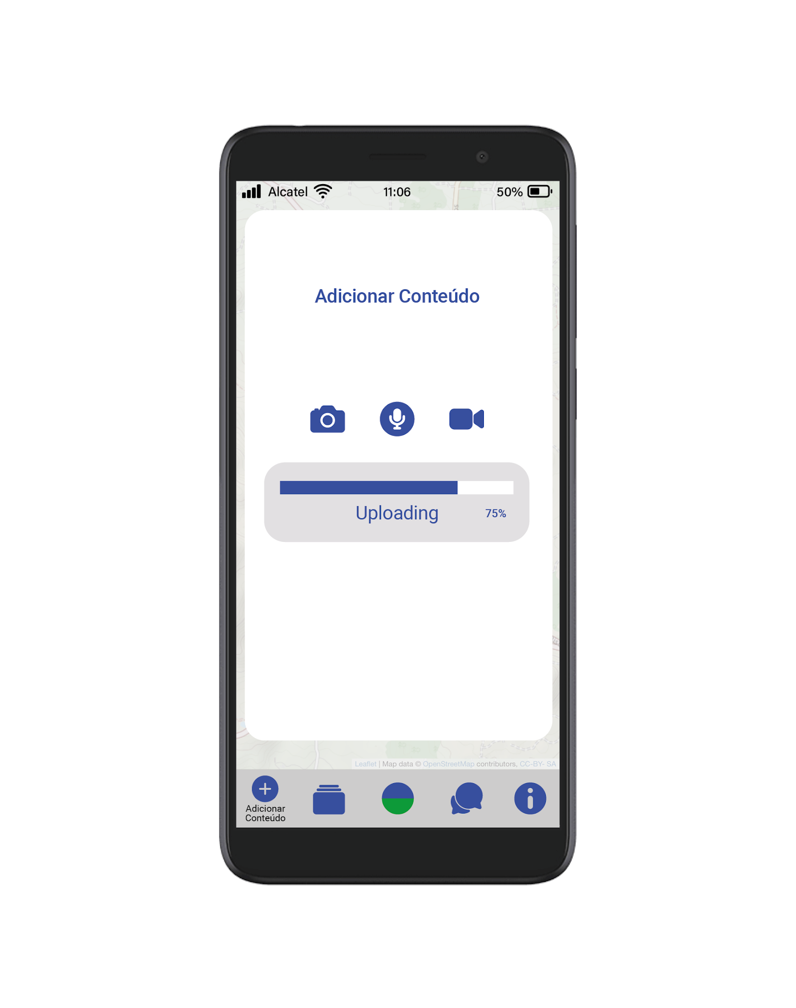
On the
Adicionar Conteúdo page (first image below) the user can add content by clicking on the map – the add content icon appears in the user’s location. When the user clicks on the add content icon a pop-up window opens (second image below). When the user clicks on one of the upload icons the app will locate the relevant file (image, sound or video) on the user’s phone and will upload it to the location of the user. The functionality of the app was built by the programmer following my specifications and designs – as part of the brief for the project I had to submit fully annotated working drawings of the app with specific instructions, measurements, proportions, and colours for the programmer to work from.
The
Ver Arquivo page (beow) allows the user to search the archive by entering keywords in the search box which brings up a drop-down list of items from the archive. The list can be further refined by type (sound, image, video or question) by clicking on the icons, versions of the icons that I designed for the home page, below the search box. The scroll bar allows the user to scroll down a long list of content.
The
Comunica page (below) allows the user of the app to communicate or ask a question to a scientist. This page appears as a pop-up window over the greyed-out map to make a connection between the location of the user and the question (and subsequent answer). The answered question, as with all user-uploaded content, appears on the map on the home page, and is indicated by a location marker. Finally, the
Adicionar Conteúdo page (not shown here) contains information about the project, links to the websites of the organisations taking part in it, as well as funding credits for the project.
It has been really interesting to collaborate on this project, one that is outside the familiar world of design for print that I usually inhabit. It has been fascinating to see my working drawings and specifications translated in to the code that makes the app function and to test various iterations of the app on a phone. I have had to think very carefully, through the designs that I have generated, about how they will be translated, by the programmer, into a functioning app, and also how they will be used and understood by the end user. My default design position is generally to take a minimal stripped back approach with few unnecessary elements and this approach has worked very well with this project, creating an uncluttered design that prioritises the user experience.
Guia de Campo is an environmental education research project funded by the FCT – Foundation for Science and Technology, Portugal, Project Number 31182. The project was developed by a team of researchers working at Madeira Interactive Technologies Institute and the Azorean Biodiversity Group at the University of the Azores.
Code developed by Daniel Sousa.