

End of the Glacier by Alyson Hallett

End of the Glacier
Alyson Hallett
Published by the Wilhelmina Barns-Graham Trust, 2023
Designed by James Brook
ISBN 978 1 7384 111 0 8
Soft cover | 210 x 148mm | 32 pages | Printed by Gomer Print, Wales, on 140gsm Edixion Offset with a cover printed on 250gsm Edixion Offset
End of the Glacier is a collection of 27 poems by Alyson Hallett written in conversation with the work of Wilhelmina Barns-Graham.


My Faraway Country: Myanmar by Linda Lewin

Written and illustrated by Linda Lewin
Published by Golden Hare, Edinburgh, 2023
Designed by James Brook
ISBN 978 1 8384 0655 4
Soft cover with wraparound jacket | 254 x 203 mm | 256 pages | Printed and bound by Gomer Press, Wales, on 140gsm Edixion Offset with a cover printed on 300gsm Edixion Offset and a wraparound jacket printed on 140gsm Edixion Offset
A series of stories, told by a range of real and fictive narrators which lyrically evoke the childhoods and the adult adventures and struggles of a Karen family in Myanmar, through the twentieth and into the twenty first century.
With vivid and beautiful illustrations, drawn from historic photographs and the work of the artist/author, this book is as illuminating about Myanmar as it is a moving account of an admirably adventurous, enterprising and eccentric family.
A poetic and beautifully illustrated account of a family, its adventures and experience, and their country Myanmar.


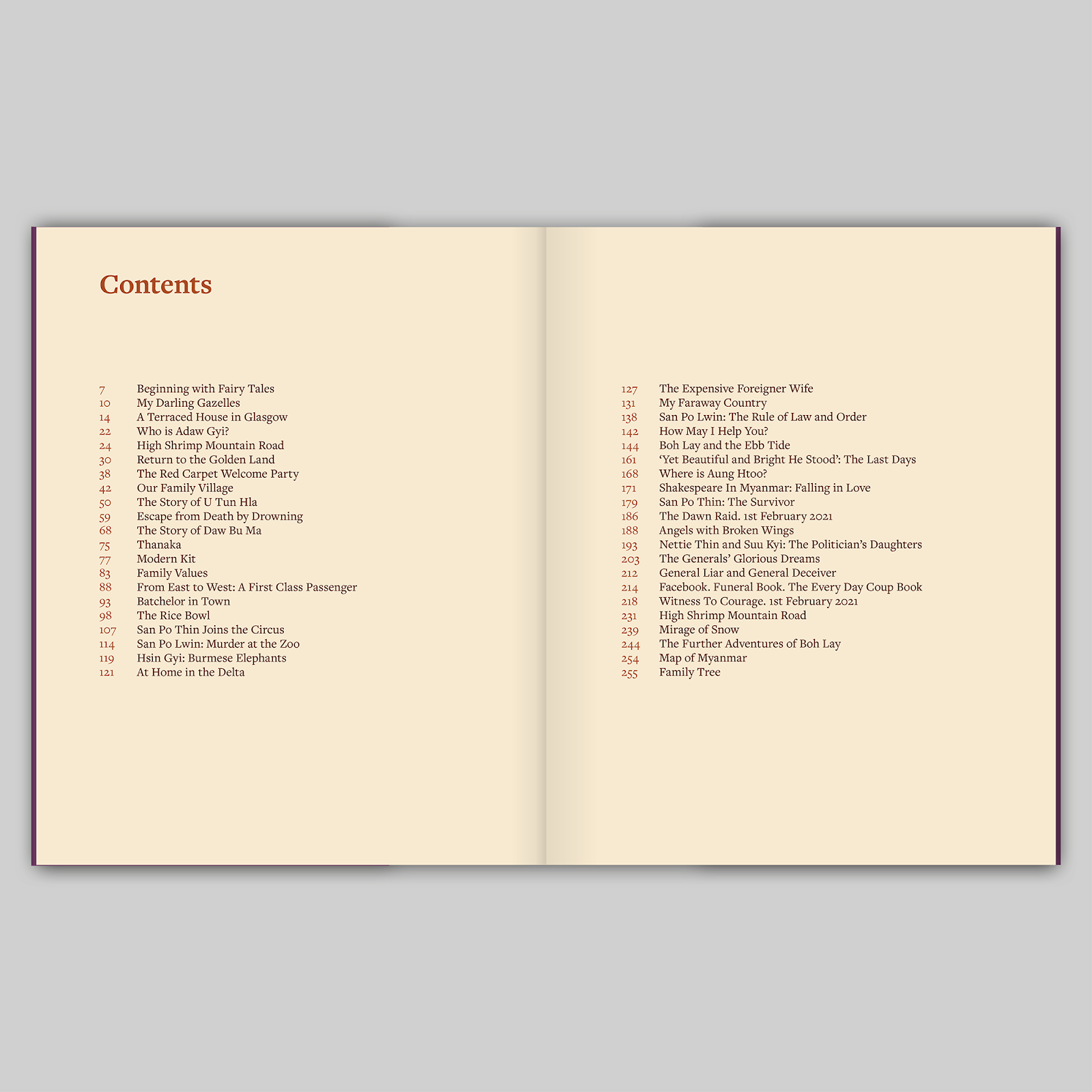


Linda Lewin: My Faraway Country: Myanmar is my first book and I couldn’t be more pleased with the result. James is an artist and an expert in all details of his trade but most importantly he cared about My Faraway Country: Myanmar as much as I did. He was always there to listen and advise when I needed help but I never felt rushed or pressured. If you are looking for someone who knows how to collaborate and if you want your book to stand out from the crowd James is your man.
From the Archive: System, Chance by Carson & Miller

Carson & Miller
Published by National Galleries of Scotland, 2016
Designed and typeset by James Brook
ISBN 978 1 911054 03 0
Soft cover | 213 x 148 mm | 32 pages | Printed on 160gsm Vision Superior by Allander
From the National Galleries of Scotland website: ‘This publication is a record of a relationship between an institutional archive and two artists, working in collaboration. The artists Carson & Miller proposed in 2013 that they might pursue their established practice of play and game-playing in the archives of the Scottish National Gallery of Modern Art, and a series of games and play took place during 2014 and 2015 before culminating in the exhibition Archive Games, 11 July – 25 October 2015.
Carson & Miller use play and game-play in their collaborative practice as a tool with which to navigate archives and collections, but also as a means of exploring wider archival notions of memory, keeping and caring. These themes are among those investigated in this book.’

I typeset the chapter headings at an angle to give a punky, playful feel and to reflect the slightly anarchic hand-written texts that the artists had written on the walls in the exhibition at the Gallery of Modern Art. I also liked the secondary connotation of rubber-stamped due dates in library books. In contrast to the chapter headings I typeset the essays in a far more traditional and refined style – the essays included endnotes, references and quotations so this traditional style seemed to suit and created a nice tension on the page with the more playful headings. The essays were aligned left with a ragged right edge and I worked hard to make sure that the line endings were balanced and there were no odd words left hanging.
The artists had indicated where images needed to appear in the essays so, in such a modest publication, it was a bit of a jigsaw that required some juggling to respect their wishes. I wanted the images to be at a reasonable and consistent size throughout the book and placed consistently on the page: this helped create a much greater emphasis and tension when one of the images (at the artists’ request) broke this system and appeared at a larger scale and not placed within the text. To make the image captions more distinct from the essay text I used Akzidenz Grotesk Light, which also had the advantage of being more compact than Courier so I was able to fit more text in the available spaces. I also used Akzidenz for the colophon, which appeared on the last page: as it needed to sit next to the notes and references of the final essay, this change of typeface made the break more clear – as did a change in column width.
This modest publication was printed on Vision Superior 160gsm by Allander, Edinburgh. The same weight of paper was used for the cover and text pages so that there was no break in the artists’ visual essay, which started on the front cover.


Seeing Things by James Greene

Seeing Things by James Greene
Published by Golden Hare, Edinburgh, 2023
Designed by James Brook
ISBN 978 1 8384 0654 7
Paperback with flaps | 210 x 148mm | 32 pages | Printed by Gomer Print, Wales, on 120gsm Munken Pure Rough with anti-scuff laminated cover printed on 280gsm Cartel Lumina Silk single sided board
For this publication, I worked very closely with the poet, his partner Nicky Sherrott and his ‘virtual secretary’ Mae Walsh, working through several options for the layout and design of the book. The book is A5, 210 x 148mm, chosen to match another book of poetry published by Golden Hare, and I worked hard to find a layout that accommodates the length of the longest poems on one page and also accommodates the longest line of each poem without breaking at this size – only one very long poem had to be broken across two pages.
The book is typeset in Minion Pro which I selected because of its relatively tall x-height and because of its open character and clarity of reading. The poems are set in 11 point Minion while the secondary information (Acknowledgements, Notes, Contents etc) are typeset in 9.5 point Minion – it was necessary to go smaller on these sections as there was a lot of information to fit in a small space but the positive effect of this is that the poems have precedence because of the larger point size that they are set in. Titles and section headings are typeset in uppercase Century Gothic. A strong underlying grid gives structure to the book and helps unify the different sections. The grid and typography is continued on to the cover and the cover flaps.
The cover features a drawing by Ken Kiff given to James Greene. The drawing itself had become stained and discoloured so, working from an image of the drawing I Photoshopped away the staining and removed the drawing from its backgound – I also adjusted the colour balance based on feedback from the poet and his partner. I generated a textured coloured background for the cover which wraps around the front, back and flaps of the cover; I gave several options for the colour but it was this orange that appealed to the poet. The cover is printed on 280gsm Cartel Lumina Silk – it is coated on one side only allowing the cover to be matt laminated but I decided that the white tone of the paper would have sat starkly next to the creamy colour of the text paper, 120gsm Munken Pure Rough, so I suggested that the inside of the cover should be printed in a soft off-white colour that is sampled from the Ken Kiff drawing. This sampled colour also appears on the cover typography.
The back cover includes a photograph of the poet, aged two-and-a-half, and there is a reproduction of a drawing by Oskar Kokoschka next to the contents page – both of those images needed some adjusting to make ready for print.
This is the first book of poetry that I have designed and I feel privileged to have had some very illuminating conversations with the poet about the typographic layout and form of his poems including an interesting debate about whether some of the poems should be justified left and right and some ranged left (as specified in the poet’s original manuscript). James Greene died on 19 May 2023. I am delighted to have been involved with this ‘farewell collection’.


Perspectives Issue 3

Published by Haileybury, 2023
Editor: Toby Parker
Contributors: Jeanette Wight
Photography: Steve Beeston
Designed by James Brook
210mm x 245mm | 48 pages | Printed on 150 gsm Edixion Offset with 300 gsm machine-sealed soft cover by Gomer, Wales
This is the third issue of Perspectives, a magazine that I designed, published by Haileybury School. The publication was developed from a desire to showcase the school’s heritage, current academic and cultural issues and new research about the school’s collections. Edited by Toby Parker, Director of Learning and Research at Haileybury, the magazine has been established in order to examine its role in a variety of cultural practices and issues, and to think critically about the way in which it interacts with other cultural institutions locally, nationally and globally.
Perspectives is published quarterly with issues in Spring, Summer, Autumn and Winter. Each issue is themed, with this one titled ‘Memorials and Memories’. This issue is the biggest issue to date with 48 pages and includes an extended essay, in three parts, that examines the legacy of the architect Herbert Baker. It was interesting to use the design and layout of the magazine – established in the previous two issues – and push it in a different direction. The client and myself are really pleased with the design of this issue and I think it proves the versatility of the original design.
The design is based around a flexible layout that can accommodate different types of information, giving each section of the magazine its own distinct identity. The basic layout is a three column grid with type arranged on one or two columns giving a variety that helps differentiate each article. Titles, body text and images are often hung from a guideline that runs through the magazine giving a sense of order which is occasionally broken to create emphasis or visual energy. I have used type at different sizes, weights and combinations to create interesting titles and headers, arranged in sometimes playful ways with the text and images.


Subscribe to:
Posts (Atom)