Yesterday I went to see the Archie Brennan: Tapestry Goes Pop! exhibition at Dovecot Studios. It really is a wonderful exhibition – thoughtfully curated by Kate Grenyer and Lisa Mason of Dovecot and National Museums Scotland – that showcases Archie Brennan’s work and reveals the breadth of his practice and its connections to a wider fine art practice, as well as his skills and knowledge as a weaver and as a draughtsman (his drawings are beautiful). It was a delight to finally see the works after designing with them on screen for so long (my visit was partly to look at the colours on the tapestries ahead of us starting to colour proof the forthcoming book on Archie Brennan that I have been working on with the curators).
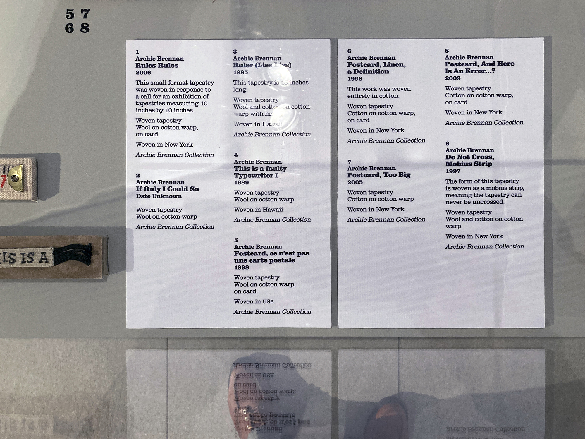
As well as developing the identity for the exhibition which appears on a cohesive suite of marketing and publicity materials, I have also designed the exhibition graphics: vinyl wall texts including the opening graphics, interpretation panels, and a timeline, labels and other signage. The exhibition graphics are set in various weights of Clarendon which also appears on the marketing material as a secondary typeface alongside Stencil. I selected Clarendon because it sits well with Stencil and also captures the nostalgic mood that appears in some of Brennan’s tapestries such as My Victorian Aunt from 1967 – there is also a small poster for an exhibition, c.1973, featuring Archie’s Muhammad Ali series, in the form of boxing poster that uses a version of Clarendon, which Dovecot had shown me in the early days of developing the identity last year, and which I had forgotten about until I saw it in the exhibition yesterday. I had originally planned to use a contrasting sans-serif typeface for the body text on the exhibition graphics and the book that accompanies the exhibition but, in the end, after some experiments with other typefaces, I found Clarendon, particularly in its light version, to be surprisingly readable for extended bodies of text. Seeing the graphics in situ yesterday confirmed this.


