Ewan McClure: Inside and Out Catalogue

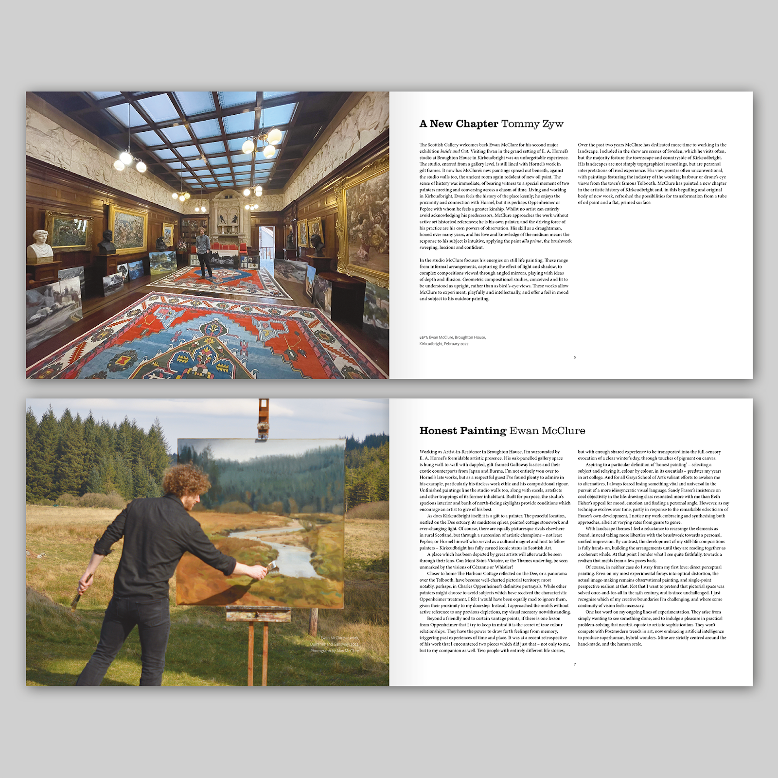
This is Ewan McClure: Inside and Out, a catalogue that I designed for The Scottish Gallery in Edinburgh. Ewan McClure is a painter who studied at Gray’s School of Art in Aberdeen; he practises observational still-life and landscape painting as well as portraiture; his work hangs in private and public collections including The Robert Fleming collection, Princeton Theological Seminary and The Royal Scottish Academy. 

The artist lives and works in Kirkcudbright, known as the ‘artists’ town’ – while I was working on this catalogue, I had a short holiday in the town, witnessing at first-hand some of the views that have inspired the artist. The image on the front cover is a detail of Kirkcudbright, Summer, a painting from 2021, which is very typical of the works in this exhibition. 

As well as views of Kirkcudbright, the exhibition includes still-lives alongside paintings of the artist’s travels in Sweden. The final section of the catalogue, Veiled Light, really attracted my interest: these experimental departures for the artist are painted on various panel surfaces with patterns of defects, such as cork tiles and mosaics of jigsaw puzzle pieces. For the back cover (above), I selected one of these paintings Light and Moisture, a landscape painted on polyester mesh, as a foil to the more traditional painting on the front cover. The mesh-like fabric of the painting has a translucency which allows for a design in the space behind to show through the matrix of holes, creating an almost 3-D effect which, although difficult to reproduce in print, I hope is revealed in this close-up detail. 

The book is typeset in Clarendon URW, Minion Pro and Freight Sans Pro. It is 190mm x 240mm and is printed on white silk paper with a matt finish by Pureprint. 

Ewan McClure: Inside and Out was at The Scottish Gallery, 16 Dundas Street, Edinburgh EH3 6HZ, from 5 May to 28 May 2022. 


From the Archive: Discover RSA Covers, 2016-2021

These are covers of Discover RSA, the newsletter that I designed for the Royal Scottish Academy in Edinburgh from 2016-2021. The first three issues that I designed were A4 in size, folded to A5 for posting, following the format of the previous newsletters. Having re-designed this newsletter in 2016 and then working on three subsequent issues, the Royal Scottish Academy decided to use their in-house designer instead. 

I was approached again in early 2018 to update the design of the newsletter, which had now become a 16 page A5 booklet; a change I had planned in 2016, but never implemented as the Academy had not approved this move while I was doing the design. For the new design, I wanted to create a clean, rationalised design based on a grid, with a limited palette of colours and with just one typeface in different weights throughout. By keeping – almost – all of the typography aligned to the same baseline grid the newsletter looks ordered and rationalised. 

Taking visual cues from the design of the RSA Friends membership leaflet that I had designed the previous month, and using the burgundy that I had used in my refresh of the RSA Friends logo (which appears top right on the masthead) as an accent colour alongside an extended palette of greys. I typeset the newsletter in Aktiv Grotesk, a typeface that sits well with the Akzidenz Grotesk that I used on the RSA Friends logo and that is easy to read, even at a small scale. In 2020, the logo was dropped altogether to reflect the fact that the newsletter was being sent out to a wider audience of RSA members. The design and layout has constantly adapted to include different types of information and new features – the only real constant has been the design and layout of the covers.

The newsletter is 210 x 148 mm with 16 pages and is printed on an uncoated paper by Events Armoury in Edinburgh.


Perspectives Issue 1

Perspectives Issue 1: Innovation

Published by Haileybury, 2022

Editor-in-chief: Toby Parker

Editor: Kathryn Koon

Photography: Steve Beeston

Designed by James Brook

210mm x 245mm | 32 pages | Printed on 150 gsm Edixion Offset with 300 gsm machine-sealed soft cover by Gomer, Wales


This is the first issue of Perspectives, a magazine that I have designed, published by Haileybury School. The publication was developed from a desire to showcase the school’s heritage, current academic and cultural issues and new research about the school’s collections. It has been established in order to examine its role in a variety of cultural practices and issues, and to think critically about the way in which it interacts with other cultural institutions locally, nationally and globally. 

For the design of the magazine, I worked closely with Toby Parker, the Director of Learning and Research at Haileybury. Through a series of conversations and exchanges of visual material, I developed a design that makes some nods to Haileybury’s visual identity but which is distinct enough to stand alone. 

The design is based around a flexible layout that can accommodate different types of information, giving each section of the magazine its own distinct identity. The basic layout is a three column grid with type arranged on one or two columns giving a variety that helps differentiate each article. Titles, body text and images are often hung from a guideline that runs through the magazine giving a sense of order which is occasionally broken to create emphasis or visual energy. I have used type at different sizes, weights and combinations to create interesting titles and headers, arranged in sometimes playful ways with the text and images. 

My initial thoughts for the choice of typeface was to use a serif and sans-serif that have been designed to work together – I initially considered Meta Pro and Meta Serif Pro or Freight Sans Pro and Freight Text Pro. The school’s branding is based around the typefaces Calluna and Calluna Sans, so, although not a requirement to do so, it made sense to use these typefaces in the magazine. Calluna has some interesting characteristics that are revealed when the typeface is used at a larger scale, as on the masthead.

Images are prioritised in the magazine: some were specifically chosen to be placed within particular articles but I was also given another set of images to be placed throughout the magazine to act as punctuation and to create an alternative dialogue that runs alongside the main articles. It was wonderful to be given a free rein to arrange these images and I hope I have placed them in a way that creates another level of reading in the publication.

The plan is to publish the magazine quarterly with issues in Spring, Summer, Autumn and Winter. Each issue will be themed, with this one titled ‘Innovation’. The magazine was launched on 14 May and we are already working on the next issue. 
 

Archive

Search

Categories

Click here to subscribe to James Brook / Design

Please visit www.jamesbrook.net for more information

The content (content being images and text) of this website is copyright © James Brook
All rights expressly reserved
Powered by Blogger.