Genevieve Draper: Slow painting

Genevieve Draper: Slow painting

Published by GD Publishing, 2025

Photography by Antonia Reeve

Designed by James Brook 

ISBN 978 1 0369 2174 3

Soft cover  | 230 x 170 mm | 64 pages | Printed by Gomer Print, Wales, on 150 gsm Edixion Offset with cover printed on 300 gsm Edixion Offset

Slow painting is a publication that I designed for the painter Genevieve Draper. Although it was published to coincide with the artist’s exhibition at the Scottish Arts Club, it is intended as a survey of the artist’s work rather than an exhibition catalogue as it features work not displayed at the gallery. The publication is non-chronological and is structured around several themes and series of works taken from the artist’s practice, including early works painted while the artist was a student at Camberwell College of Art. It is book-ended with illuminating essays by Penelope Curtis and Erlend Clouston. Photography is by Antonia Reeve. 

The book is typeset in Freight Sans Pro and Freight Text Pro and is based on a simple grid that allows for works of different sizes to be shown alongside each other. The design and layout was established after several meetings and discussions with the artist and was initially designed with placeholder text and images, ahead of the bulk of the work being photographed by Antonio Reeve. This is the first time that the artist has made a publication so I worked very closely with her, guiding her through the various stages of making a book, and keeping her her up-to-date with how the design was developing. As the book was populated with text and images the grid proved to be very flexible and was able to accommodate different needs such as multiple images on pages and headings that weren’t present in the original brief. 

The book originally included a title page on the first page – a publishing convention that offers the viewer a pause, after the cover, before the book begins. In early drafts, Penelope Curtis’s essay about the artist’s practice followed immediately after the title page, but the artist decided the book needed an introduction from her, so, as we were tight with space, and had already reached the agreed page count, we placed this text on the first page, losing the title page. Originally titled To begin… this addition on page one, with an accompanying image of a painting on the inside cover means the reader is straight in to the main body of the book, an unconventional move that – I feel – is one of the design elements that positions the book as an artist’s book rather than a straightforward exhibition catalogue. For balance, the last page of the publication and inside of the back cover was designed in a similar way – as a double-page spread of biographies.

Originally titled Genevieve Draper: A Retrospective, the title changed several times to become Genevieve Draper: Slow painting, to reference the artist’s identity as a Slow artist and her carefully considered approach to painting. I have documented the title changes in a previous blog post, where the arrangement of type on the cover comfortably accommodates these variations. I had initially given the artist several options for cover images based on paintings that I felt made a strong statement but, in the end, we both agreed that the detail from the 1979 painting In the Garden at the Oval, London was the one – sometimes things just fall in to place.

It has been a pleasure working on this book with Genevieve, not least because of the many interesting conversations that we have had about painting, art school education, and maintaining an art practice. 


Genevieve Draper: Slow painting was at the Scottish Arts Club, 24 Rutland Square, Edinburgh,
EH1 2BW, from 3 July to 2 August 2025.
www.genevievedraper.com


Folkestone Triennial 2025 Catalogue

How Lies the Land? Folkestone Triennial 2025

Designed by James Brook

Edited by Sorcha Carey

Copyediting by Sophie Haydock

Installation photography by Thierry Bal

Cover illustration by Tangent Graphic, Glasgow

Inside cover: Details from J Maizlish Mole, Folkestone in Ruins, 2025

Published by Creative Folkestone, 2025

ISBN: 978 1 0369 2500 0

Soft cover  | 245 x 210 mm | 128 pages | Printed by Gomer Print, Wales, on 150 gsm Horizon Offset with cover printed on 300 gsm Horizon Offset

This is a catalogue that I designed for How Lies the Land? Folkestone Triennial 2025, one of the UK’s leading exhibitions of contemporary art in public space. Every three years, artists from around the world are invited to make new work that responds to the town – its coastal landscapes, its stories and the people who live there. The 2025 edition of the Triennial was curated by Sorcha Carey and I worked closely with her on this accompanying publication. How Lies the Land? invited eighteen artists to respond to the layers and contours of Folkestone, finding in the deep ground an imaginative space to explore themes including migration and climate change, creation of community, interdependency of species, and the ancestral memories as well as future possibilities contained within the land.

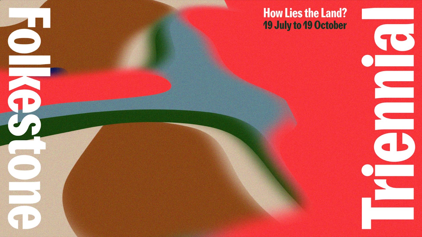
Tangent Graphic in Glasgow designed the visual identity for the Triennial; it features a series of generative images that were developed in Adobe After Effects in a palette of six colours. When I started work on the catalogue, Tangent’s identity was already being rolled out, so I suggested that we use one of these images on the cover of the catalogue to visually connect the publication with the other materials that Tangent were producing – posters, leaflets, social media, marketing and interpretation materials. I selected an image that could wrap around the cover, front to back, that created a dynamic composition within the rectangle of the front cover, and that included all six colours from the palette of the visual identity. 

I developed several typographic solutions for the title that made a nod to the typography of Tangent’s identity but which also stood independently from it. Sorcha and the team at Creative Folkestone were keen that the publication should be able to stand alone, as well as sitting within the identity – marking a difference between printed material that was given away, and a catalogue that was sold and would became a lasting legacy after the Triennial was over. 

I used two typefaces, Clarendon Text Pro and Founders Grotesk, to generate a typographic arrangement of the title for the cover which was then developed and used for the typography throughout the book. The two typefaces work together well as they both have a slightly quirky archaic feel, evident in certain letterforms that visually connect the two typefaces. The obvious contrasts between the slab serif Clarendon Text Pro and sans-serif Founders Grotesk allowed lots of flexibility for setting different types of information and creating hierarchies of information. Clarendon Text Pro was used for titles, captions and headers while the sans-serif Founders Grotesk was used for most of the body text which gave a contemporary feel to the publication while still keeping a traditional look which I felt suited the sense of history and connection to stories rooted in the land within the artists’ work. 

There are eighteen commissioned artists in the Triennial: we decided that each artist should have four pages dedicated to their work including their written proposal for the Triennial alongside contextual images and – where possible – images of their work in situ in Folkestone. Each of the sections were developed in collaboration with the curator and the individual artists (and sometimes their galleries) so each section became quite different, a reflection of each artist’s practice. 

Copies of the catalogue were needed for the press and VIP launches ahead of the public opening of the Triennial, so we were working to a very tight print deadline and it became obvious that not all of the work could be documented as it would not be completed until just before the opening of the Triennial. For the artists where we expected documentation to be available, I added image holders of grey squares before sending the artwork to the printer for proofs. The installation photography was done by Thierry Bal and it was useful to show him the layouts and discuss with him what image formats would work within the layout. Final installation images, were available, were added at the very latest deadline for print.

Alongside the artist pages there is an essay, How Lies the Land? written by Sorcha Carey that introduces the artists and explains the thinking behind her curation of the Triennial. The essay is illustrated with contextualising images of the artists’ work and further installation and location images. Other sections include a preface by the CEO of Creative Folkestone; artist biography pages; project credits and acknowledgements; information about Creative Folkestone and the history of the Triennial; curator thanks; and a funders and supporters page with logos. All these pages required a different layout and typographic treatment with the combination of Clarendon Text Pro and Founders Grotesk working well together to create clear and understandable hierarchies of information to enable the reader to navigate these pages.

The cover was originally going to include flaps that would, as in previous Triennial catalogues, fold out to reveal a map of Folkestone showing the location of the projects and commissions. I suggested that this map might be more practical and user-friendly included in the free guide to the Triennial rather than in the catalogue, so the flaps were removed from the cover and we included a different map – one of J Maizlish Moles’s hand-drawn maps from his Folkestone in Ruins project – printed on the inside cover.  

The publication was printed by Gomer in Wales on 150gsm Horizon Offset with Horizon Offset 300gsm for the cover. Horizon is my favourite paper at the moment – not only does it take ink well, retaining detail and colour, it feels good to the touch and also, when it is bound as a book, it opens well without the resistance of some papers. 

How Lies the land? Folkestone Triennial 2025 opened on Saturday 19 July and runs until Sunday 19 October. Further information can be found here: creativefolkestone.org.uk


Work in Progress with Folkestone Triennial

I have been designing a catalogue for the Folkestone Triennial 2025, one of the UK’s leading exhibitions of contemporary art in public space. Curated by Sorcha Carey, How Lies the Land? invites eighteen artists to respond to the layers and contours of Folkestone, finding in the deep ground an imaginative space to explore themes including migration and climate change, creation of community, interdependency of species, and the ancestral memories as well as future possibilities contained within the land.

The cover of the catalogue is based on an image produced by Tangent Graphic in Glasgow as part of their visual identity for the Triennial – which will appear on posters, leaflets, social media, marketing and interpretation materials (see below). I developed several typographic solutions for the title that made a nod to the typography of Tangent’s identity but which also stood independently from it. I used two typefaces, Clarendon Text Pro and Founders Grotesk, to generate a typographic arrangement of the title for the cover which was then developed and used for the typography throughout the book. 

How Lies the land? Folkestone Triennial 2025 opens on Saturday 19 July and runs until Sunday 19 October. Further information can be found here: creativefolkestone.org.uk


Cover of Meeting Point Within the Lewisian

This is the cover of a publication that I have designed with sculptor Jake Harvey and book artist Helen Douglas for their exhibition, Meeting Point Within the Lewisian, at the Taigh Chearsabhagh Museum and Arts Centre in Lochmaddy, North Uist. The exhibition opens on 19 July 2025 and continues until 27 September; it will then tour to various venues including the Royal Scottish Academy in Edinburgh. 

The cover is foil blocked with Foilco 612 Metro Grey on Wicotex Brillianta BRI4003 Light Grey fabric with grey head and tail bands. The book was printed and bound by Gomer in Wales who have taken great care and attention with the printing and finishing. 

 Find out more about the exhibition here.


Archive

Search

Categories

Click here to subscribe to James Brook / Design

Please visit www.jamesbrook.net for more information

The content (content being images and text) of this website is copyright © James Brook
All rights expressly reserved
Powered by Blogger.