Kate Downie: Between Seasons Catalogue

Kate Downie: Between Seasons

Published by The Scottish Gallery, Edinburgh, 2021

Texts by Kate Downie, Susan Mansfield and Tommy Zyw

Photography by Michael Wolchover

Designed by James Brook

ISBN 978 1 912900 34 3

Soft cover | 235 x 220 mm | 56 pages | Printed by Gomer, Wales on 170gsm Galerie Art Matt with a cover of 350gsm Galerie Art Matt

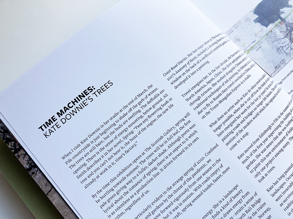
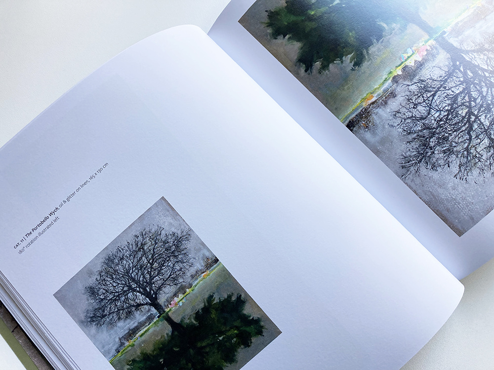
Between Seasons is a catalogue that accompanied Kate Downie’s exhibition at The Scottish Gallery in Edinburgh from 3-26 June 2021. At the heart of the exhibition was a series of ten paintings of trees painted throughout the seasons, during the time of the Covid-19 pandemic lockdown. The paintings are all divided by a central horizon line with two representations of a tree in different seasons; the bare branches of winter contrasting with the full canopy of summer. Each painting can be turned through 180 degrees so that one of the the two representations is uppermost, changing the atmosphere of the painting completely – during the course of the exhibition, the paintings were rotated periodically. In the catalogue, this problem of there being no right way up for the paintings has been solved by having a larger image of the painting on one page and a smaller image of the painting turned full circle on the facing page; some of these images are accompanied by a further photograph showing Kate working on the painting in her studio (often on a ladder) to give a sense of scale – they are vast! 

I worked closely with the artist on the book along with Tommy Zyw, the director of The Scottish Gallery. I typeset the book in a combination of Freight Sans Pro and Freight Text Pro, a clear and understated typeface that, with its unified serif and san-serif versions and a wide range of weights and styles, offers a wide palette of contrasts to design with. The choice of typefaces, combined with the use of white space, has given a clean and contemporary feel to the book that gives the paintings room to breathe and allows them to shine. I have cut out some of the works on paper and given them a subtle drop shadow to amplify the sense of them being objects. The book has a strong physical presence, and, as the artist remarked: “It feels just great ‘in the hand’ as an object. The size is just right.” I’m very pleased with the design of the front cover: the combination of a detail from Kate’s painting and the arrangement of type that I devised for the title treatment works very well, I think, offering a hint of the typography and layout of the book as well as a teaser for Kate’s wonderful series of paintings.

You can find more about the Between Seasons exhibition here.


Tommy Zyw, Director, The Scottish Gallery: I have had the pleasure to work on several exhibition catalogues with James Brook. James understands the individual requirements of the artist, gallery and audience. He has an in-depth knowledge of design and printing. This he combines with creative flair and a practical and hardworking approach.  


Archie Brennan: Tapestry Goes Pop! Book

This is a the cover of the book that I designed for Dovecot Studio’s Archie Brennan: Tapestry Goes Pop!, an exhibition which tells the story of this much-loved Edinburgh native – a pop artist, weaver, and former Mr Scotland, who changed the course of modern weaving with his innovative approach to tapestry.

The cover of the book is based on the poster that forms the core of the identity I designed for the exhibition. The lead image of the identity – which appears in a circle so it can easily be adapted for use in lots of different formats – is a detail from Brennan’s 1973 tapestry, Muhammad Ali, one of many tapestries that he made featuring the famous boxer. A photograph of Archie Brennan (in Hawaii!) appears on the back cover, in a circle that echoes the one on the front cover.  

The colours that form the identity are sampled directly from the photograph of the Muhammad Ali tapestry: dark blue as the main colour, with a lighter blue used elsewhere for emphasis, alongside oranges and yellows, to give a zingy pop art feel. 

The title is set in Stencil, a typeface often associated with pop art, and the rest of the cover is set in Clarendon, a typeface that sits well with Stencil and also captures the nostalgic mood that appears in some of Brennan’s tapestries such as My Victorian Aunt from 1967. 

After some printed tests, I found Clarendon, particularly in its light version, to be surprisingly readable for extended bodies of text so the main body of the book is set in this typeface – for contrast, I used Adelle Sans light for captions and secondary information. 

The book is 210 mm x 240 mm, 48 pages, and was printed by Allander on Gallerie Art Matt, with a scuff-resistant matt laminate on the cover. It can be purchased directly from the Dovecot website or at the exhibition, which runs until 30 August. Don’t miss it, it’s a great exhibition with five star reviews from both The Scotsman and The Times.


Kate Downie: Between Seasons Catalogue

Between Seasons is a catalogue that accompanies Kate Downies exhibition at The Scottish Gallery in Edinburgh from 3-26 June 2021. At the heart of the exhibition is a series of ten paintings of trees painted throughout the seasons, during the time of the Covid-19 pandemic lockdown. The paintings are all divided by a central horizon line with two representations of a tree in different seasons; the bare branches of winter contrasting with the full canopy of summer. Each painting can be turned through 180 degrees so that one of the the two representations is uppermost, changing the atmosphere of the painting completely – during the course of the exhibition, the paintings will be rotated periodically. In the catalogue, this problem of there being no right way up for the paintings has been solved by having a larger image of the painting on one page and a smaller image of the painting turned full circle on the facing page; some of these images are accompanied by a further photograph showing Kate working on the painting in her studio (often on a ladder) to give a sense of scale – they are vast! 

I have worked closely with the artist on the book along with Tommy Zyw, the director of The Scottish Gallery. Photographs in the catalogue are by Michael Wolchover and it includes an essay by Susan Mansfield. The book was printed by Gomer Press in Wales on Gallerie Art Matt paper. I have typeset the book in a combination of Freight Sans Pro and Freight Text Pro, a clear and understated typeface that, with its unified serif and san-serif versions and a wide range of weights and styles, offers a wide palette of contrasts to design with. The choice of typefaces, combined with the use of white space, has given a clean and contemporary feel to the book that gives the paintings room to breathe and allows them to shine. I have cut out some of the works on paper and given them a subtle drop shadow to amplify the sense of them being objects. The book has a strong physical presence, and, as the artist remarked: “It feels just great ‘in the hand’ as an object. The size is just right.” I’m very pleased with the design of the front cover: the combination of a detail from Kate’s painting and the arrangement of type that I devised for the title treatment works very well, I think, offering a hint of the typography and layout of the book as well as a teaser for Kate’s wonderful series of paintings.

You can find more about the Between Seasons exhibition here.


Archie Brennan: Tapestry Goes Pop! Exhibition Graphics

Yesterday I went to see the Archie Brennan: Tapestry Goes Pop! exhibition at Dovecot Studios. It really is a wonderful exhibition – thoughtfully curated by Kate Grenyer and Lisa Mason of Dovecot and National Museums Scotland – that showcases Archie Brennan’s work and reveals the breadth of his practice and its connections to a wider fine art practice, as well as his skills and knowledge as a weaver and as a draughtsman (his drawings are beautiful). It was a delight to finally see the works after designing with them on screen for so long (my visit was partly to look at the colours on the tapestries ahead of us starting to colour proof the forthcoming book on Archie Brennan that I have been working on with the curators). 

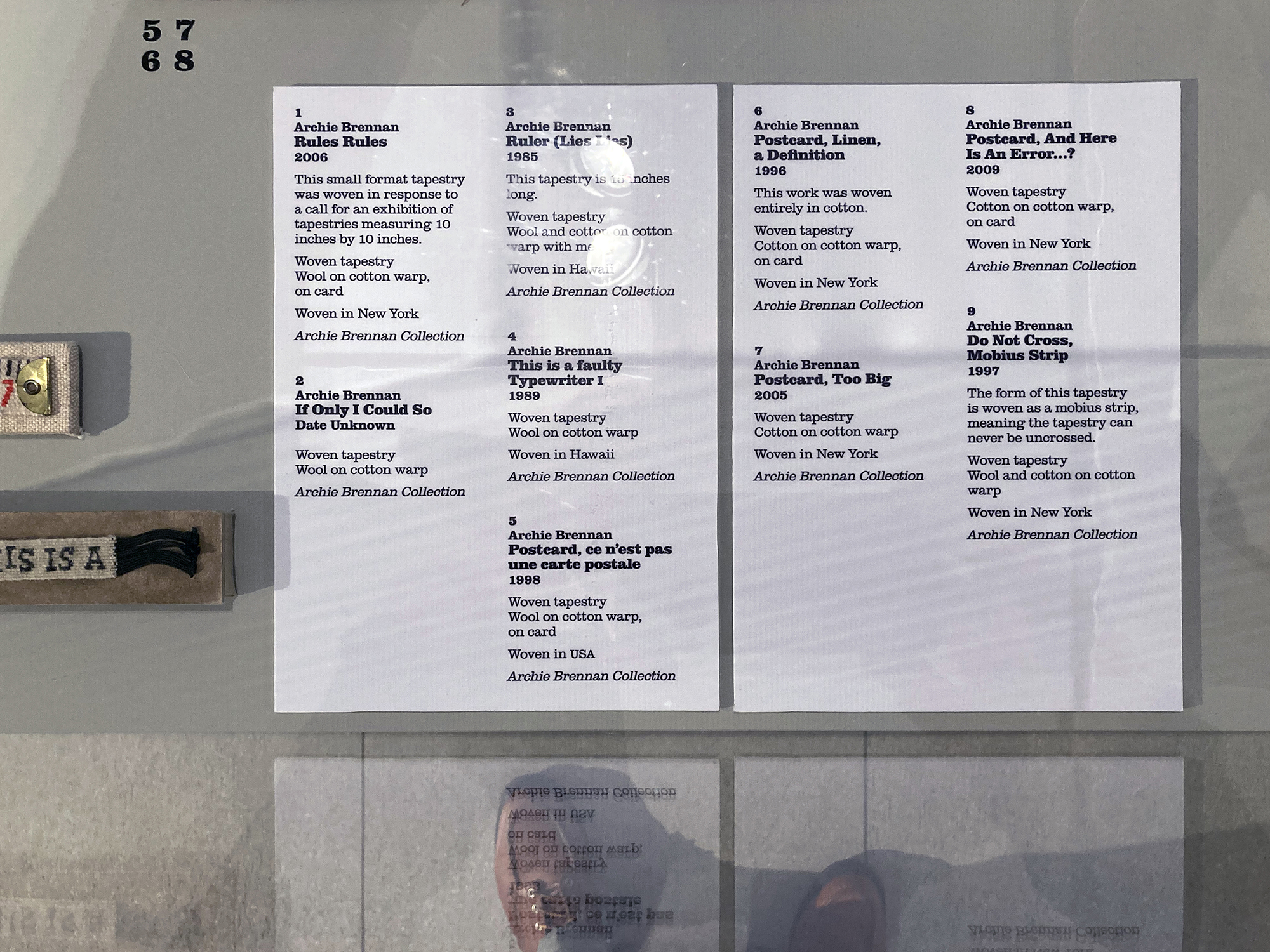
As well as developing the identity for the exhibition which appears on a cohesive suite of marketing and publicity materials, I have also designed the exhibition graphics: vinyl wall texts including the opening graphics, interpretation panels, and a timeline, labels and other signage. The exhibition graphics are set in various weights of Clarendon which also appears on the marketing material as a secondary typeface alongside Stencil. I selected Clarendon because it sits well with Stencil and also captures the nostalgic mood that appears in some of Brennan’s tapestries such as My Victorian Aunt from 1967 – there is also a small poster for an exhibition, c.1973, featuring Archie’s Muhammad Ali series, in the form of boxing poster that uses a version of Clarendon, which Dovecot had shown me in the early days of developing the identity last year, and which I had forgotten about until I saw it in the exhibition yesterday. I had originally planned to use a contrasting sans-serif typeface for the body text on the exhibition graphics and the book that accompanies the exhibition but, in the end, after some experiments with other typefaces, I found Clarendon, particularly in its light version, to be surprisingly readable for extended bodies of text. Seeing the graphics in situ yesterday confirmed this.

Archie Brennan: Tapestry Goes Pop! continues at Dovecot until 30 August 2021 – you can find out more about the exhibition here.


Discover RSA Summer 2021

Discover RSA | Issue 115 | Summer 2021 

Designed by James Brook for the Royal Scottish Academy, Edinburgh, 2021 

Booklet | 210 x 148 mm | 16 pages 
Printed by Events Armoury, Edinburgh 

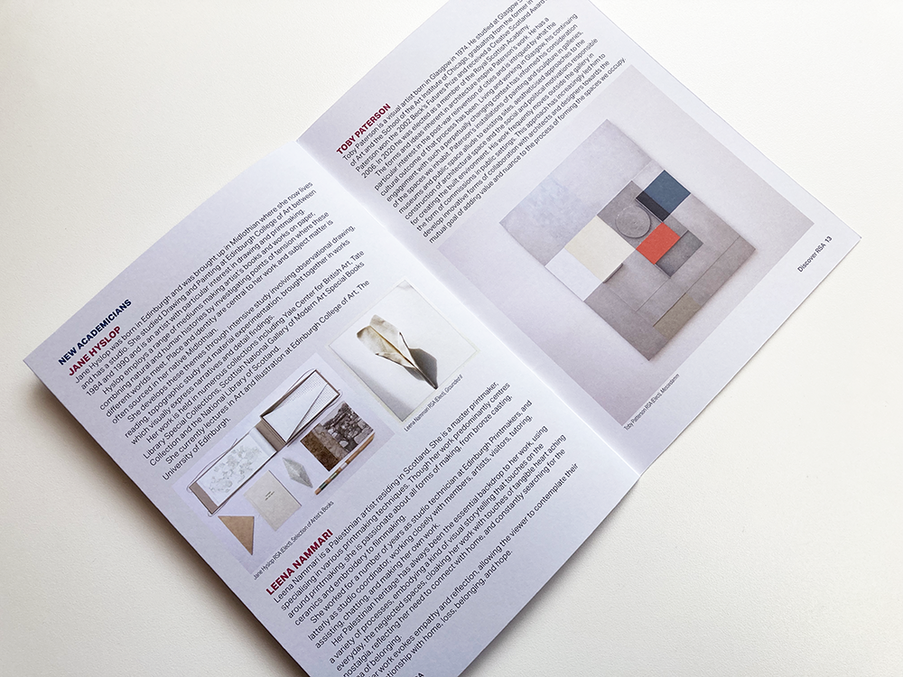
After another break, when the newsletter (which is usually published four times a year and lists exhibitions, talks and events at the Royal Scottish Academy in Edinburgh) was suspended because of the Covid-19 lockdown, I was once again asked to design the RSA newsletter. This is the eighth edition that I have designed, following the design that I established in early 2018. The newsletter is sent to the Friends and to other RSA supporters schemes and this issue lists some of the RSA-organised events that were being held online during the pandemic. The cover image is by Bill Scott PPRSA from his exhibition at the RSA – I was proud and delighted to design the catalogue for that exhibition. The newsletter is printed on an uncoated paper by Events Armoury in Edinburgh.

 
>

Archie Brennan: Tapestry Goes Pop! Banners

These are the banners that I designed as part of the identity that I developed for Dovecot Studio’s Archie Brennan: Tapestry Goes Pop! exhibition. The banners, which are installed outside Dovecot Studios, sit alongside a cohesive suite of marketing and publicity materials that I have designed including graphic images for use on social media, roll-up banners, and posters. The team at Dovecot have also adapted my design for use on other items. See previous post for more information about the exhibition and the identity that I created for it. I will post separately about the exhibition graphics that I have designed as well as about the forthcoming book that accompanies the exhibition which I am currently designing, edited by Kate Grenyer and Lisa Mason.

Archie Brennan: Tapestry Goes Pop! continues at Dovecot until 30 August 2021 – you can find out more about the exhibition here.


Meadow Arts: the first 20 years Book

Meadow Arts: the first 20 years

Published by Meadow Arts, 2021

Edited by Tom Jeffreys and Anne de Charmant

Designed by James Brook

ISBN 978 1 5272 8036 6

240 x 165 mm | 80 pages | Printed by Gomer, Wales on 170 gsm Galerie Art Matt with laminated printed paper over board cover with UV spot gloss varnish on the title and quarter bound spine of Fedrigoni Woodstock

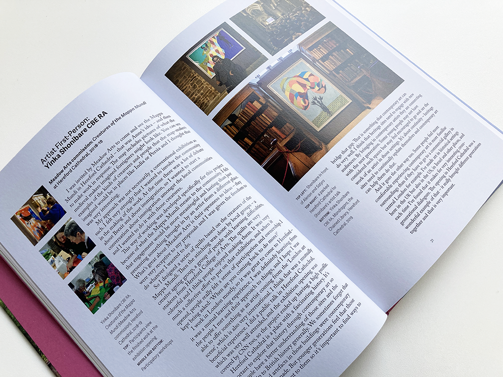
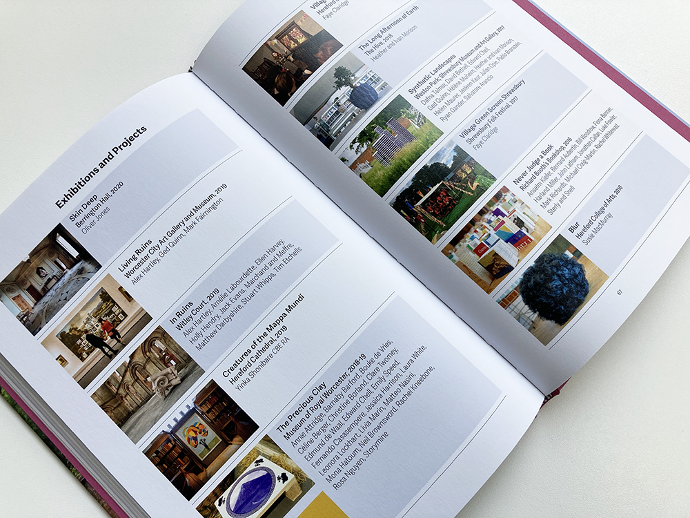
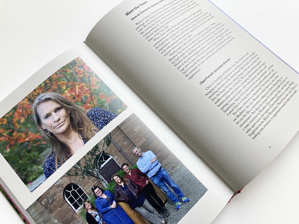
This is a book that I designed for Meadow Arts, an organisation that brings unique contemporary art projects to places where art is not usually shown, supporting artists by commissioning new work and creating inspiring events and exhibitions. In 2021, the organisation celebrated twenty years of delivering ambitious and accessible projects in unexpected rural places – Meadow Arts: the first 20 years is a celebration and long-lasting record of these extraordinary – and temporary – projects, featuring contributions from Yinka Shonibare, Alex Hartley, Laura White and Harminder Judge, alongside photo stories from Mariele Neudecker, Philippa Lawrence and Faye Claridge; it includes a foreword by Jonathan Watkins, an essay by art critic Tom Jeffreys, and an in-depth interview with founder and curator Anne de Charmant.

The book is visually rich with almost 200 colour images that are placed next to their references within the various texts – working closely with Meadow Arts, there were several iterations before the final position of the images was settled. The design is based on a strict underlying grid and rigorous typography which, nevertheless, is highly adaptable to accommodate different types of information. The book is typeset in various weights and styles of Adelle Sans alongside Caslon Pro creating a rich palette that could be adapted to create multiple hierarchies and emphases on the page. The book is divided into several sections each requiring a different typographic treatment; the sections were made even more distinct by the subtle use of colour – I created a palette of colours, sampled from some of the imagery in the book, that were used throughout the publication.

For the cover, I was keen to use a photograph of a work by Pablo Bronstein, Chinese Bridges in Landscape, a Meadow Arts commission from 2017, because I felt that, in a single image, it encapsulated all that Meadow Arts is about. The cover is laminated printed paper over board with a printed quarter spine of Fedrigoni Woodstock – after much deliberation, we selected the colour ‘Malva’ as it picks up on the colour of the wildflowers in the foreground of the photograph. The spine is printed with the title of the book in black, and there are head and tail bands that also pick up on these colours. The endpapers of the book are also in Fedrigoni Woodstock Malva giving a tactile feel and a contrast to the matt laminate on the cover. As a final flourish, to amplify the celebratory feel, the reversed out white letters of the title on the cover are picked out with a gloss UV spot varnish. 


Anne de Charmant, Artistic Director & Curator, Meadow Arts: Working with James on our first publication was an incredibly stress-free and rewarding experience. He immediately understood what type of publication we wanted and he gently steered us towards the finish line with a very special blend of calm and purpose. His careful planning of the work-load and attention to detail bought out the best in all involved. At all time we felt we were in the safest of hands. 


Archive

Search

Categories

Click here to subscribe to James Brook / Design

Please visit www.jamesbrook.net for more information

The content (content being images and text) of this website is copyright © James Brook
All rights expressly reserved
Powered by Blogger.