Barry McGlashan Between The Dream And Waking Catalogue

Barry McGlashan: Between The Dream And Waking 

Published by The Scottish Gallery, Edinburgh, 2021 

Texts by Tommy Zyw and Barry McGlashan 

Photography by Stuart Johnstone 

Designed by James Brook 

ISBN 978 1 912900 43 5 

Soft cover | 245 x 190 mm | 80 pages | Printed by J Thomson Colour Printers, Glasgow on Galerie Art Matt  

Barry McGlashan is a painter based in Aberdeen, this is a catalogue that I designed for his exhibition, Between The Dream And Waking, at the Scottish Gallery, Edinburgh, from 28 October to 27 November 2021. 

McGlashan studied painting at Grays School of Art, graduating in 1996; in 1998 he returned to Grays where he taught in the drawing and painting department until 2005 when he left teaching to pursue painting full-time. Informed by his knowledge of literature and art history, his wonderful paintings create immersive worlds for the viewer to inhabit that range from the intimate to the monumental.  

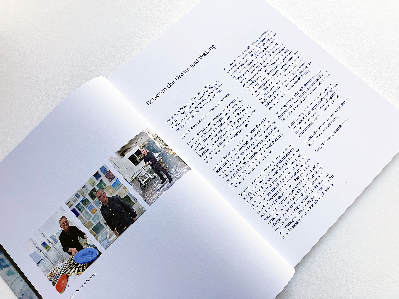
The works themselves also vary in size: in the exhibition there are paintings as small as 13 x 12 centimetres and works as large as 170 x 140 centimetres. For the catalogue, I devised a system of scaling that used the most common size of works in the exhibition, 30 x 21.5 centimetres, as a reference point for sizing the images in relation to each other; smaller images were scaled up and larger images were scaled down so that all are at a decent size on the page and no details are lost, but giving a sense of the scale of the works in relation to each other.  

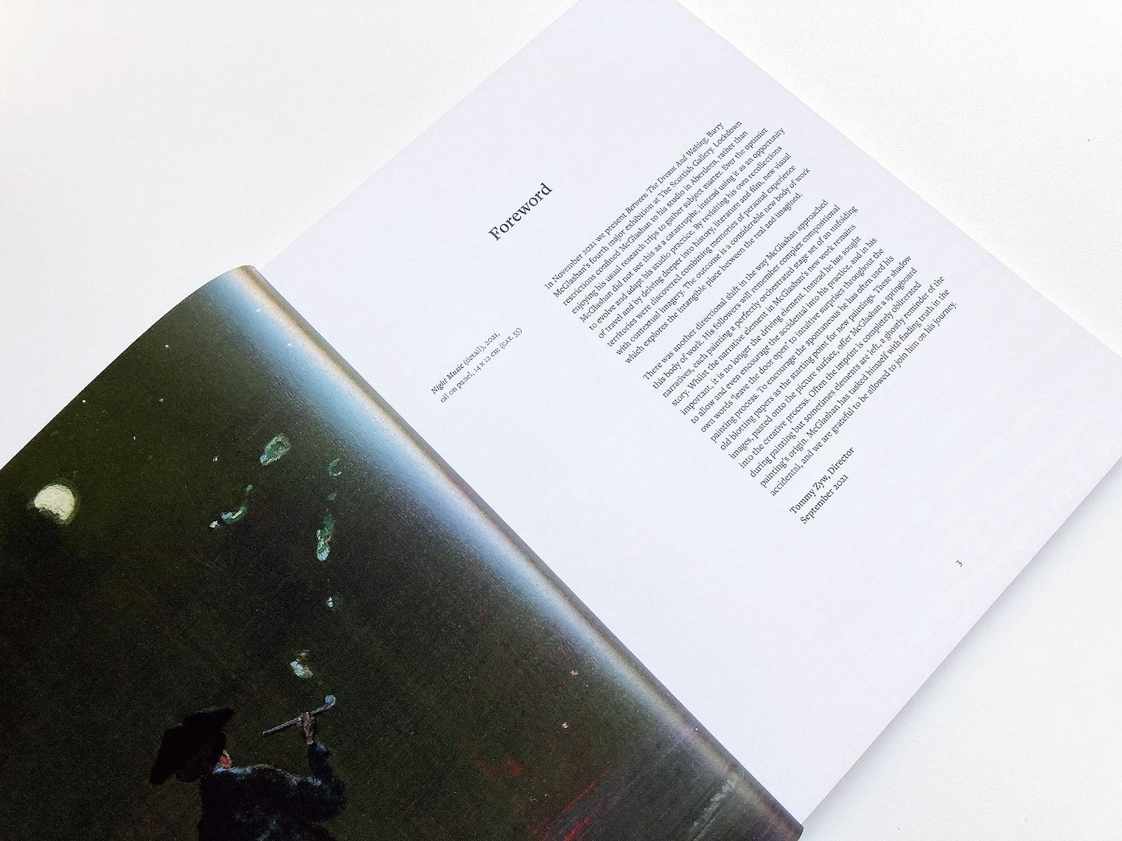
The storytelling in the artist’s work suggested a serif typeface, as traditionally used for text in story books; I used Freight Text Pro, a contemporary serif typeface, throughout the main body of the book with its sans-serif sibling, Freight Sans Pro for the secondary information at the front and back of the book. On the image pages, I used Freight Text Pro in various weights to create a hierarchy of information for the captions; the type was centred in short line lengths, with the caption centred on the page underneath the centred image creating a formal and traditional feel. Page numbers are also centred, giving a consistent baseline for the other elements to sit on. Elsewhere in the book, this centred layout is disrupted with ranged left typography and layouts based on the underlying grid, creating a tension in the design.  

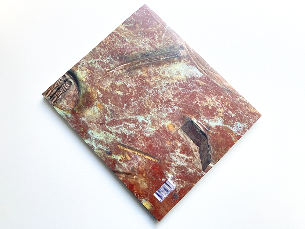
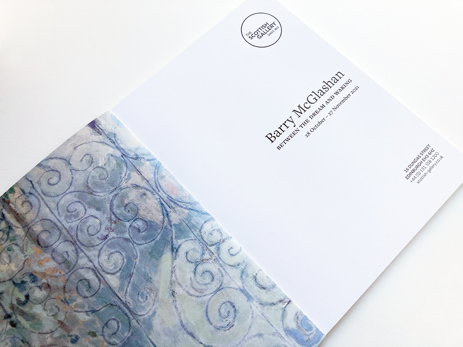
The front cover features a full bleed detail of McGlashan’s painting, The Blue Hour, a small oil painting on canvas of 30 x 26 centimetres that I felt encapsulated the title of the exhibition; the title is set in Freight Text Pro and is centred, giving a taste of the layout inside. On the back cover, I placed a full bleed detail of another small painting, Wake, this time more abstract, which sits well with the cover image, continuing the dreamlike feel and showing some of the diversity of McGlashan’s practice. On the inside covers, I used details from Veil, adding an unexpected decorative element to the book and, at this scale, revealing some of the beautiful brushwork in the painting. 


Tommy Zyw, Director, The Scottish Gallery: I have had the pleasure to work on several exhibition catalogues with James Brook. James understands the individual requirements of the artist, gallery and audience. He has an in-depth knowledge of design and printing. This he combines with creative flair and a practical and hardworking approach.  


Joanna Kessel Illumination Cards

Here are some folded cards that I designed for the mosaic artist, Joanna Kessel. There are five card designs in the set, each showing a different work from a fantastic new series of beautiful mosaics called Illumination which ‘explores the simple geometry and inherent beauty of the circle’. The cards are 120mm square and are printed on 300gsm silk card with a matt lamination. Photography is by Alix McIntosh and the text on the back of the card follows the typography of the leaflet that I designed for Joanna in 2019 – click here to see the leaflet.


Oor Mad History Book Cover

This the cover of Oor Mad History, a book I have been designing for CAPS, an independent advocacy organisation which provides collective advocacy to different groups of people across Lothian with mental health issues. The book celebrates the community history of mad activism and collective advocacy in Lothian, 2010-2020, and follows a book celebrating the organisation’s first ten years, published in 2010, which captured people’s memories and stories from the 1980s, 1990s, and 2000s. This new book shares the memories and experiences of people who have been involved in recent years and looks at what has happened in local collective advocacy and activism from 2010. 

For the design of the book, I collaborated with members of the Oor Mad History collective advocacy group, who steered, through a series of consultation meetings, how the book would look and feel. The group took inspiration from book covers they liked, sending me images of covers which I used as a starting point to work up various options for the cover. The initial brief for the cover was to create a celebratory feel, so, based on an idea for the cover by one of the group – a painting that featured bunting – I created a design based on abstracted bunting with a palette of colours sampled from the painting. 

The group felt that the bunting was a little too celebratory for the cover and didn’t reveal the complex issues faced by the group, which are not always positive. The group suggested that an idea of key words and phrases associated with the collective advocacy movement, presented as graffiti on a brick wall, might be more ‘provocative’ and might tie in better with the activist side of collective advocacy and the struggle to have their voices heard. I presented several versions of this idea along with an alternative typographic treatment that created a wall of words – this was the version that the group felt was strongest and we went with this idea for the cover, with the bunting appearing on the inside of the cover and on the title page (below) where the title was accompanied by a sub-title, A celebration of collective advocacy and mad activism in Lothian 2010-2020, to give a context for the bunting.


I am proud to have collaborated on this project and it has been really interesting to learn more about the work of CAPS, the Oor Mad History collective advocacy group, and the struggles faced by people with mental health issues. Feedback for the design has been very positive and I look forward to seeing the finished book. The book is being printed by Gomer in Wales – we have approved proofs and the book is due in mid-December in time for the celebrations to mark CAPS’ 30th anniversary.

Below is the back cover of the book.


You can find out more about CAPS here.


Barry McGlashan: Between The Dream And Waking Catalogue

Barry McGlashan is a painter based in Aberdeen, this is a catalogue that I have designed for his forthcoming exhibition, Between The Dream And Waking, at the Scottish Gallery, Edinburgh, from 28 October to 27 November 2021.

McGlashan studied painting at Grays School of Art, graduating in 1996; in 1998 he returned to Grays where he taught in the drawing and painting department until 2005 when he left teaching to pursue painting full-time. Informed by his knowledge of literature and art history, his wonderful paintings create immersive worlds for the viewer to inhabit that range from the intimate to the monumental. 

The works themselves also vary in size: in the exhibition there are paintings as small as 13 x 12 centimetres and works as large as 170 x 140 centimetres. For the catalogue, I devised a system of scaling that used the most common size of works in the exhibition, 30 x 21.5 centimetres, as a reference point for sizing the images in relation to each other; smaller images were scaled up and larger images were scaled down so that all are at a decent size on the page and no details are lost, but giving a sense of the scale of the works in relation to each other. 

The storytelling in the artist’s work suggested a serif typeface, as traditionally used for text in story books; I used Freight Text Pro, a contemporary serif typeface, throughout the main body of the book with its sans-serif sibling, Freight Sans Pro for the secondary information at the front and back of the book. On the image pages, I used Freight Text Pro in various weights to create a hierarchy of information for the captions; the type was centred in short line lengths, with the caption centred on the page underneath the centred image creating a formal and traditional feel. Page numbers are also centred, giving a consistent baseline for the other elements to sit on. Elsewhere in the book, this centred layout is disrupted with ranged left typography and layouts based on the underlying grid, creating a tension in the design. 

The front cover features a full bleed detail of McGlashan’s painting, The Blue Hour, a small oil painting on canvas of 30 x 26 centimetres that I felt encapsulated the title of the exhibition; the title is set in Freight Text Pro and is centred, giving a taste of the layout inside. On the back cover, I placed a full bleed detail of another small painting, Wake, this time more abstract, which sits well with the cover image, continuing the dreamlike feel and showing some of the diversity of McGlashan’s practice. On the inside covers, I used details from Veil, adding an unexpected decorative element to the book and, at this scale, revealing some of the beautiful brushwork in the painting.
Discover RSA Autumn 2021

Discover RSA | Issue 116 | Autumn 2021 

Designed by James Brook for the Royal Scottish Academy, Edinburgh, 2021 

Booklet | 210 x 148 mm | 16 pages | Printed by Events Armoury, Edinburgh 

This is the ninth edition of the RSA newsletter that I have designed following the layout that I established in early 2018. The design is constantly being adapted to include different types of information and new features – in this issue, a new series of articles from artists describing their experience at residency centres throughout Scotland, which required a different treatment from other features. The newsletter is sent to the Friends of the RSA and to other RSA supporters schemes. The cover image is by Alexander Fraser RSA from an exhibition at the RSA, 20th Century Boys: A Memorial. The newsletter is printed on an uncoated paper by Events Armoury in Edinburgh.

Public Faculty No 14 Poster and Leaflet

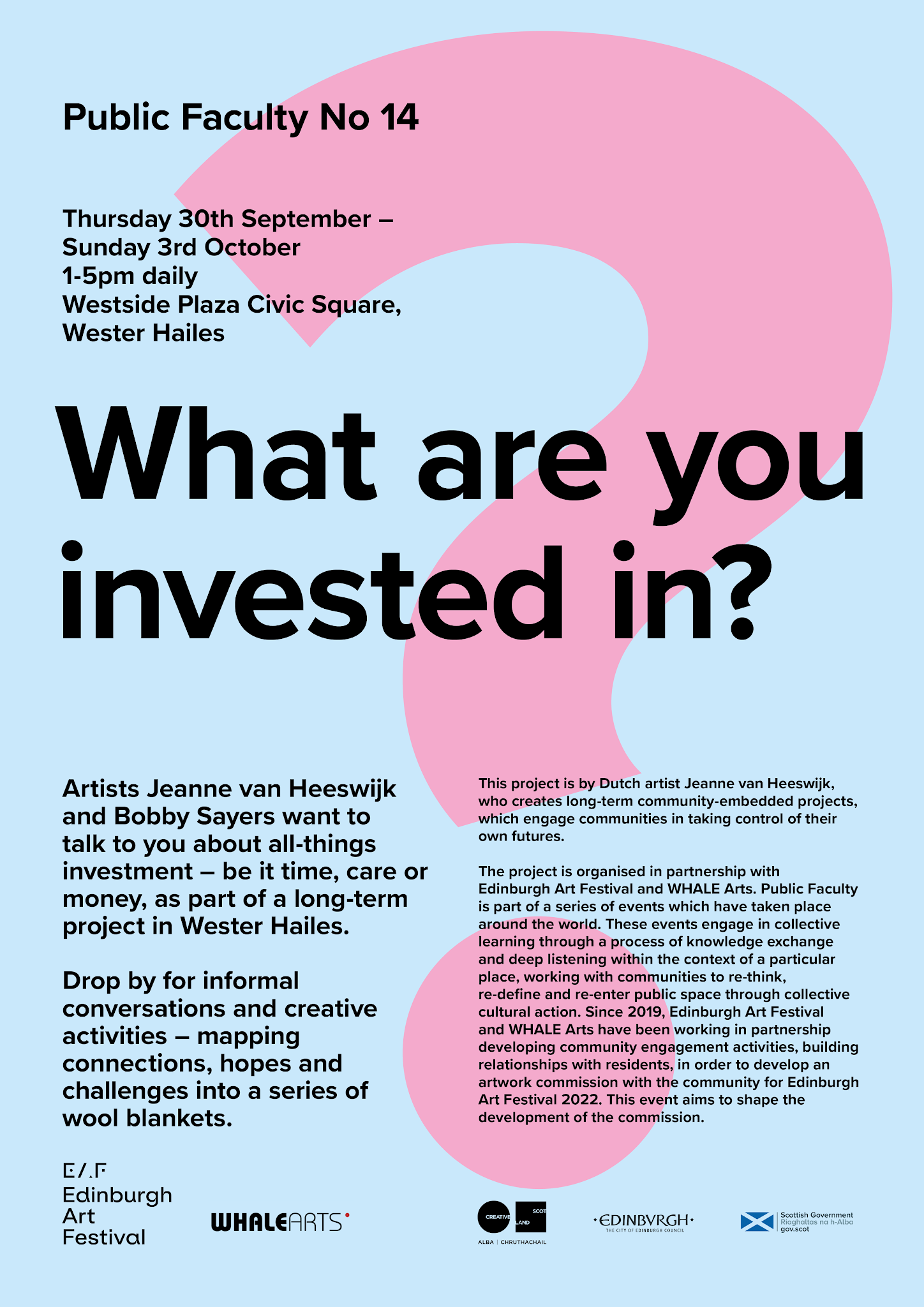
This is a poster and leaflet that I have designed for Public Faculty No 14, a project organised in partnership with Edinburgh Art Festival and WHALE Arts, by Dutch artist Jeanne van Heeswijk. The artist creates long-term community-embedded projects, which engage communities in taking control of their own futures. Public Faculty is part of a series of events which have taken place around the world, working with communities to re-think, re-define and re-enter public space through collective cultural action. This event aims to shape the development of a commission for Edinburgh Art Festival 2022.

The poster (above) is A3, 297 x 420 mm, and the double-sided leaflet is A5, 148.5 x 210 mm, both have been printed by the Edinburgh Copyshop.

 
www.edinburghartfestival.com 


Moyna Flannigan MATTER Book Cover

Hot on the heels of the printed running sheets that I posted last week, here is a finished copy of MATTER, a publication that I have been working on with the brilliant artist Moyna Flannigan. MATTER forms part of the artist’s forthcoming exhibition, Moyna Flannigan MATTER, at Ingleby Gallery, Edinburgh from 2 October to 18 December 2021. It has been a pleasure working on the book with Moyna and we are both delighted with how it has turned out. 

The book is 48 pages, 155 x 210 mm with a soft cover and dust jacket and was printed and bound by Gomer in Wales. As well as featuring Moyna’s paintings and collages, the book features texts written especially for the publication by the artist, combining words and images to form a collage of interconnected ideas. Here you can see the front and back of the wraparound dustjacket as well as the cover of the book, which is printed in Pantone 226UP with reversed out lettering echoing the text on the front – this luscious pink is also printed in the inside cover – it looks great! 

You can find out more about the exhibition on the Ingleby Gallery website, here and more about Moyna’s practice on her own website, here.


Bill Scott Book

Bill Scott

Published by The Bill Scott Estate to accompany a major retrospective of Scott’s work at the Royal Scottish Academy, Edinburgh, 2021

Edited by Jeanie Scott

Main photography by John McKenzie

Designed by James Brook

ISBN 978 1 5272 9649 7

Soft cover | 245 x 210 mm | 96 pages | Printed by Gomer, Wales on 170gsm Arctic Volume White with a laminated cover printed on 350gsm Galerie Art Matt

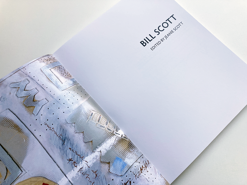
I am delighted to have designed this book about the work of the Scottish sculptor and past President of the Royal Scottish Academy, Bill Scott (1935-2012). Scott was a prominent and much respected Scottish sculptor who established and developed his practice in Edinburgh, whilst creating work for public spaces and exhibiting nationally and internationally. The book accompanied a major retrospective of Scott’s work at the Royal Scottish Academy, 1 August to 5 September 2021, that re-presented Scott’s work for contemporary audiences and explored its key themes and influences. Importantly, the exhibition was also an opportunity to fully explore Scott’s role as an educator, mentor and influence on the many artists he taught and supported. 

The cover image is a detail of Exploration / Mapping, 2010 and the title text is Scott’s own lettering, drawn and modelled by the artist for his 1986 memorial to the football player and manager, Jock Stein, commissioned by Dunfermline Athletic Football Club. Bill’s family were very keen to have this hand-drawn text on the cover as it carries much of the warmth and character of this much-loved Scottish artist. The inside cover is a detail from an untitled collage from 1999, a nice contrast to the weightiness of the bronze sculpture on the outside.

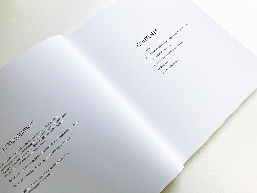
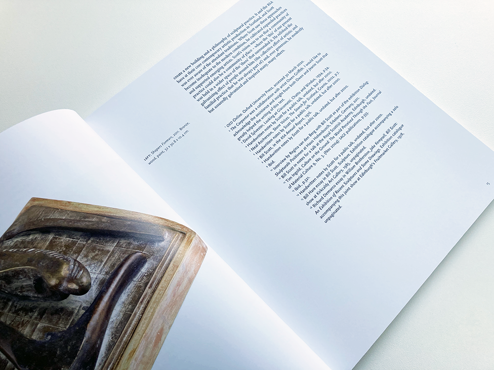
The book is typeset in a mixture of Minion Pro for most of the body text; different weights of Scala Sans Pro for the captions, page numbers and other information; and for the titles, different weights of Hypatia Sans, chosen because of the typeface’s closeness to the artist’s own lettering on the cover of the book. The layout makes use of white space that gives the images space to breathe – I worked closely with the artist’s daughter, Jeanie Scott, on the placement of the images, paying particular attention to how the images an works related to each other both in terms of scale and subject.  


Jeanie Scott, The Bill Scott Estate: It was a real pleasure to work with James on a monograph on the work of the late sculptor Bill Scott. James was engaged and enthusiastic from the start, he responded to the brief with great care and sensitivity and offered just the right amount of guidance and support in terms of the book’s design, feel and production.
 
Creating a publication during lockdown brought all sorts of challenges – James’ patience, experience and skill meant we were able to negotiate all sorts of hurdles together to deliver, on time, a book that beautifully presents the artist’s work, allowing it to breathe on the page and speak for itself. Above all James is a generous collaborator – he is genuinely interested in working with you to achieve the best design outcome. I can’t recommend him highly enough.


Archive

Search

Categories

Click here to subscribe to James Brook / Design

Please visit www.jamesbrook.net for more information

The content (content being images and text) of this website is copyright © James Brook
All rights expressly reserved
Powered by Blogger.