Bill Scott Book

Bill Scott

Published by The Bill Scott Estate to accompany a major retrospective of Scott’s work at the Royal Scottish Academy, Edinburgh, 2021

Edited by Jeanie Scott

Main photography by John McKenzie

Designed by James Brook

ISBN 978 1 5272 9649 7

Soft cover | 245 x 210 mm | 96 pages | Printed by Gomer, Wales on 170gsm Arctic Volume White with a laminated cover printed on 350gsm Galerie Art Matt

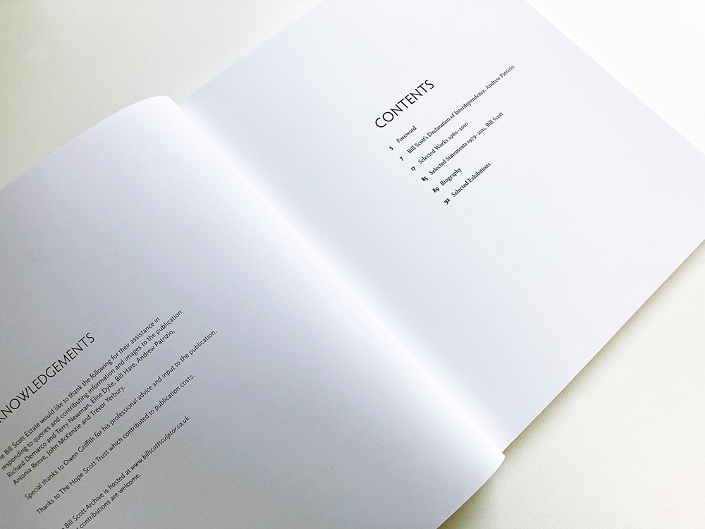
I am delighted to have designed this book about the work of the Scottish sculptor and past President of the Royal Scottish Academy, Bill Scott (1935-2012). Scott was a prominent and much respected Scottish sculptor who established and developed his practice in Edinburgh, whilst creating work for public spaces and exhibiting nationally and internationally. The book accompanied a major retrospective of Scott’s work at the Royal Scottish Academy, 1 August to 5 September 2021, that re-presented Scott’s work for contemporary audiences and explored its key themes and influences. Importantly, the exhibition was also an opportunity to fully explore Scott’s role as an educator, mentor and influence on the many artists he taught and supported. 

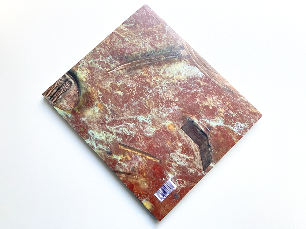
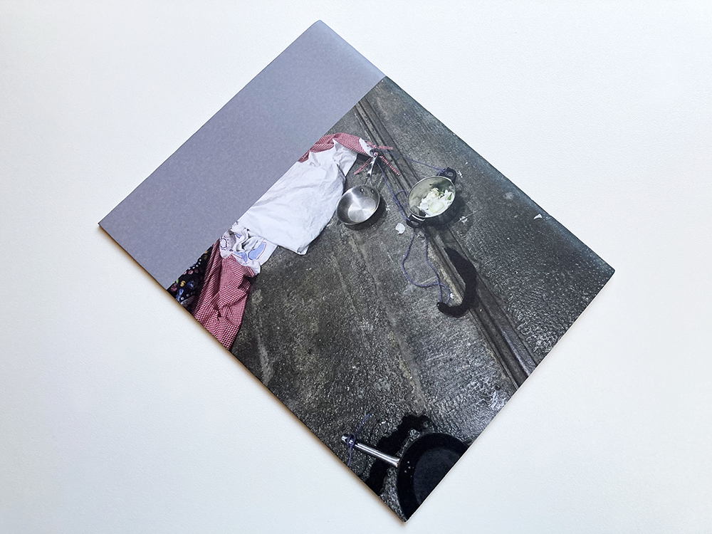
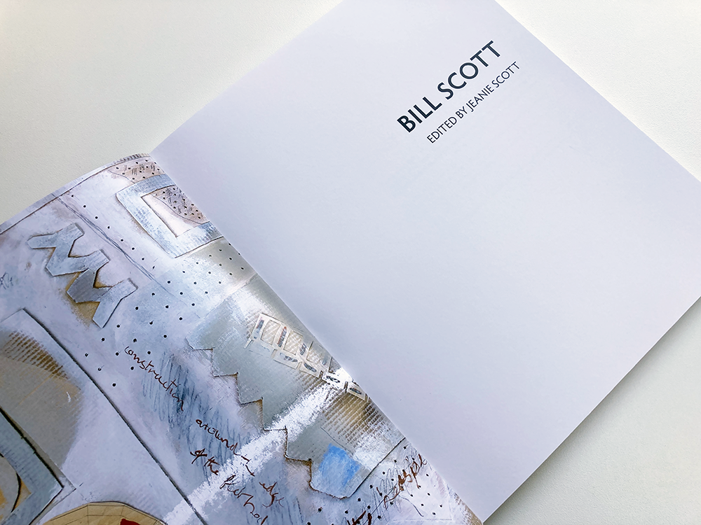
The cover image is a detail of Exploration / Mapping, 2010 and the title text is Scott’s own lettering, drawn and modelled by the artist for his 1986 memorial to the football player and manager, Jock Stein, commissioned by Dunfermline Athletic Football Club. Bill’s family were very keen to have this hand-drawn text on the cover as it carries much of the warmth and character of this much-loved Scottish artist. The inside cover is a detail from an untitled collage from 1999, a nice contrast to the weightiness of the bronze sculpture on the outside.

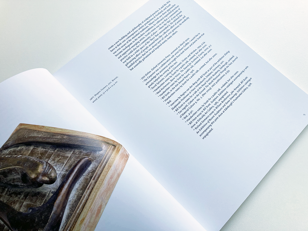
The book is typeset in a mixture of Minion Pro for most of the body text; different weights of Scala Sans Pro for the captions, page numbers and other information; and for the titles, different weights of Hypatia Sans, chosen because of the typeface’s closeness to the artist’s own lettering on the cover of the book. The layout makes use of white space that gives the images space to breathe – I worked closely with the artist’s daughter, Jeanie Scott, on the placement of the images, paying particular attention to how the images an works related to each other both in terms of scale and subject.  


Jeanie Scott, The Bill Scott Estate: It was a real pleasure to work with James on a monograph on the work of the late sculptor Bill Scott. James was engaged and enthusiastic from the start, he responded to the brief with great care and sensitivity and offered just the right amount of guidance and support in terms of the book’s design, feel and production.
 
Creating a publication during lockdown brought all sorts of challenges – James’ patience, experience and skill meant we were able to negotiate all sorts of hurdles together to deliver, on time, a book that beautifully presents the artist’s work, allowing it to breathe on the page and speak for itself. Above all James is a generous collaborator – he is genuinely interested in working with you to achieve the best design outcome. I can’t recommend him highly enough.


Moyna Flannigan MATTER Running Sheets

These are the running sheets for a publication that I have been working on with the artist Moyna Flannigan. I have been a long-time admirer of Moyna’s work and it has been a pleasure to work with her on this artist’s book. MATTER forms part of the artist’s forthcoming exhibition, Moyna Flannigan MATTER, at Ingleby Gallery, Edinburgh from 2 October to 18 December 2021. 
I am very much looking forward to seeing Moyna’s work installed in the gallery and, having seen these printed running sheets, I am very excited to see the finished book.

The book is 48 pages, 155 x 210 mm with a soft cover and dust jacket and is being printed by Gomer in Wales; the photographs of Moyna’s work are by the brilliant John McKenzie, except one, which is by Peter Tijhuis. As well as featuring Moyna’s paintings and collages, the book features texts written especially for the publication by the artist.

You can find out more about the exhibition on the Ingleby Gallery website, here and more about Moyna’s practice on her own website, here.


DIY Art – Pester & Rossi

Here is the latest activity pack that I have designed for the Community Engagement team at Edinburgh Art Festival, this time with Nadia Rossi. Nadia is an artist based in Glasgow, and she collaborates with artist Ruby Pester under the collaborative artist name Pester & Rossi. As Pester & Rossi, their practice derives from visual art, and leads to creating live art, sculpture, installation and public interventions, in response to people and places. DIY Art is a series of activity packs from EAF and selected artists, inviting people to get creative at home. The instructional creativity kits give insights into an artist’s practice, showing how to use their processes and techniques to create unique artworks. The other packs that I have designed were created by artist Alexa Hare, artist and illustrator Sofia Niazi, artist and educator Naomi Garriock, and artist Peter Liversidge. The packs can be downloaded here.

 
For this edition of DIY art, I have designed an envelope to house and protect the activity pack, printed with the DIY Art logo. Printed by the Edinburgh Copyshop, I had originally specified a white envelope but I was surprised and delighted to see that the finished packs were returned with a buff manilla envelope which somehow feels far more appropriate, carrying stronger connotations of the DIY office printing technologies that I love.


Bill Scott Book Cover

I am delighted to have designed this book about the work of the Scottish sculptor and past President of the Royal Scottish Academy, Bill Scott (1935-2012). Scott was a prominent and much respected Scottish sculptor who established and developed his practice in Edinburgh, whilst creating work for public spaces and exhibiting nationally and internationally. The book accompanies a major retrospective of Scott’s work at the Royal Scottish Academy, 1 August to 5 September 2021, that re-presents Scott’s work for contemporary audiences and explores its key themes and influences. Importantly, the exhibition is also an opportunity to fully explore Scott’s role as an educator, mentor and influence on the many artists he taught and supported. 

The bulk of the book was designed last year when the exhibition was originally scheduled for August 2020 but, because of the pandemic, the exhibition was postponed, and the book mothballed, which makes it even more of a pleasure to finally see finished copies of the book, beautifully printed by Gomer in Wales. I have been working on the book with Bill’s daughter, the arts consultant and Clore Fellow, Jeanie Scott. It has been a pleasure to work with Jeanie and fascinating to find out more about Bill’s practice and his legacy. Many of the photographs in the book are new images, taken by the brilliant John McKenzie, www.johnmckenziephotography.co.uk, that reveal Bill’s work in all its intricate detail. 

The cover image is a detail of Exploration / Mapping, 2010 and the title text is Scott’s own lettering, drawn and modelled by the artist for his 1986 memorial to the football player and manager, Jock Stein, commissioned by Dunfermline Athletic Football Club. Bill’s family were very keen to have this hand-drawn text on the cover as it carries much of the warmth and character of this much-loved Scottish artist. The inside cover (below) is a detail from an untitled collage from 1999, a nice contrast to the weightiness of the bronze sculpture on the outside.


Edinburgh Art Festival Commissions Programme 2021


Edinburgh Art Festival Commissions Programme 

Designed by James Brook for Edinburgh Art Festival, 2021

3 leaflets | 210 x 165 mm – flat size 210 x 492 mm | 6 pages roll folded
1 booklet | 210 x 165 mm | 24 pages plus cover
Printed by Allander, Edinburgh, on Edixion Offset 160gsm

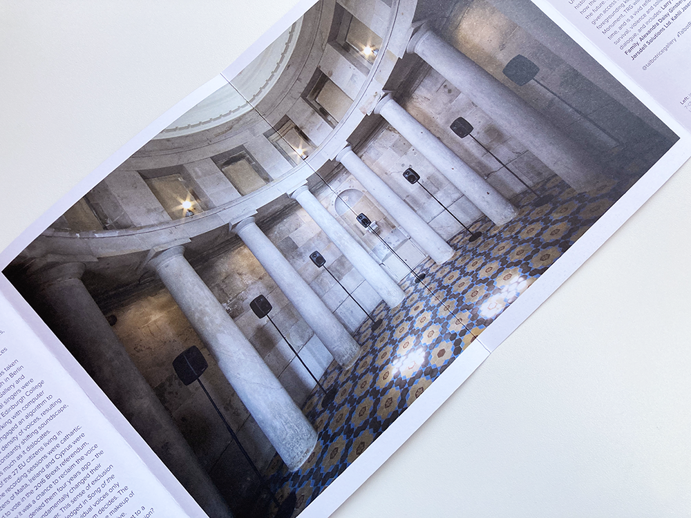
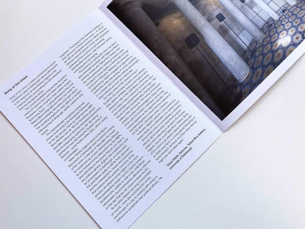
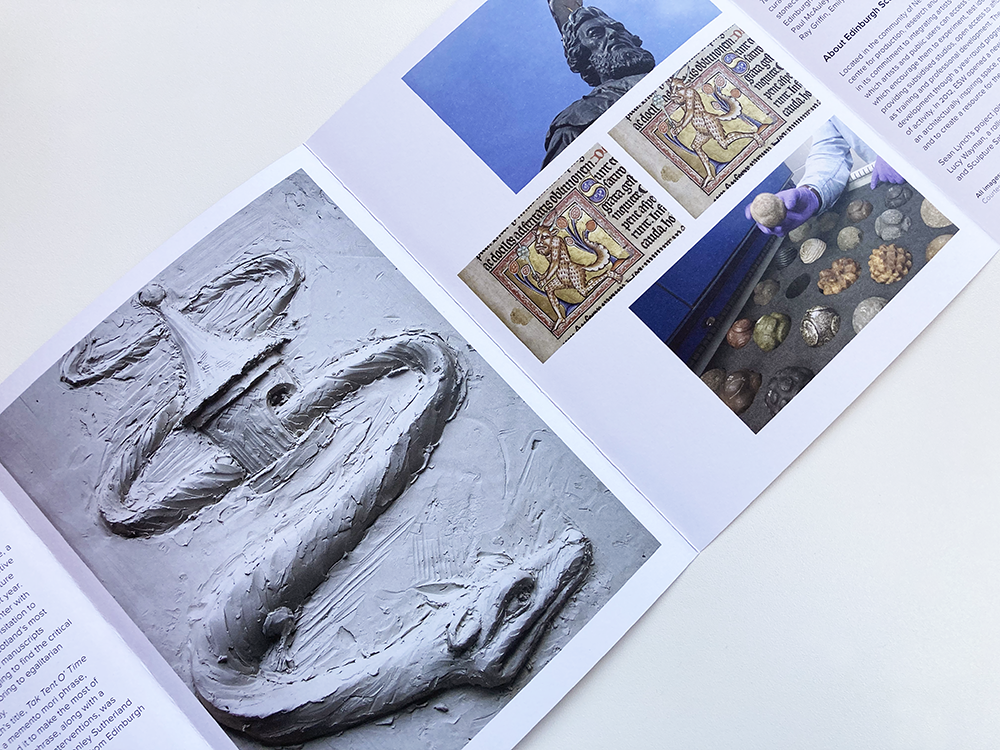
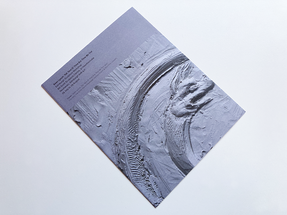
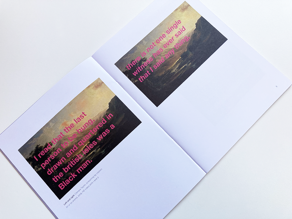
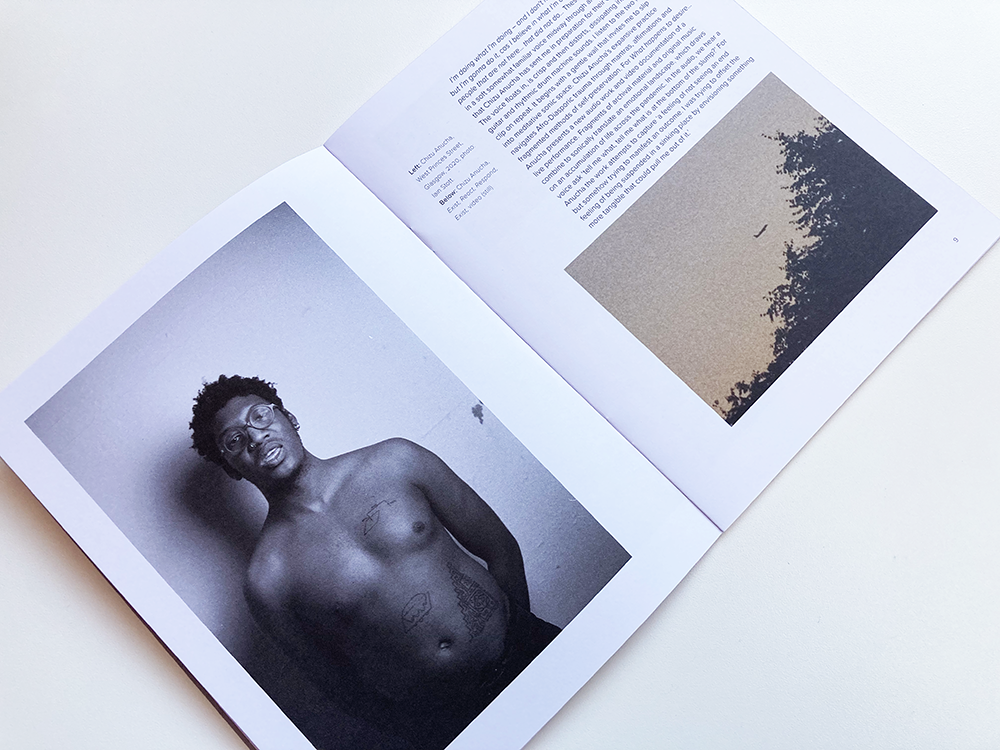
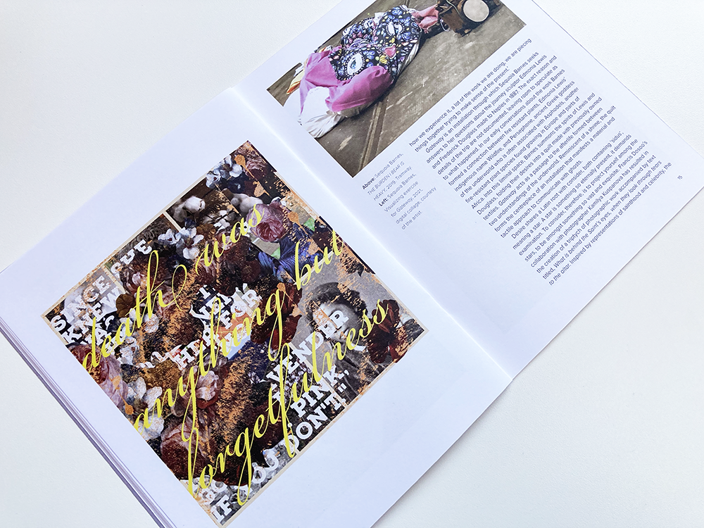
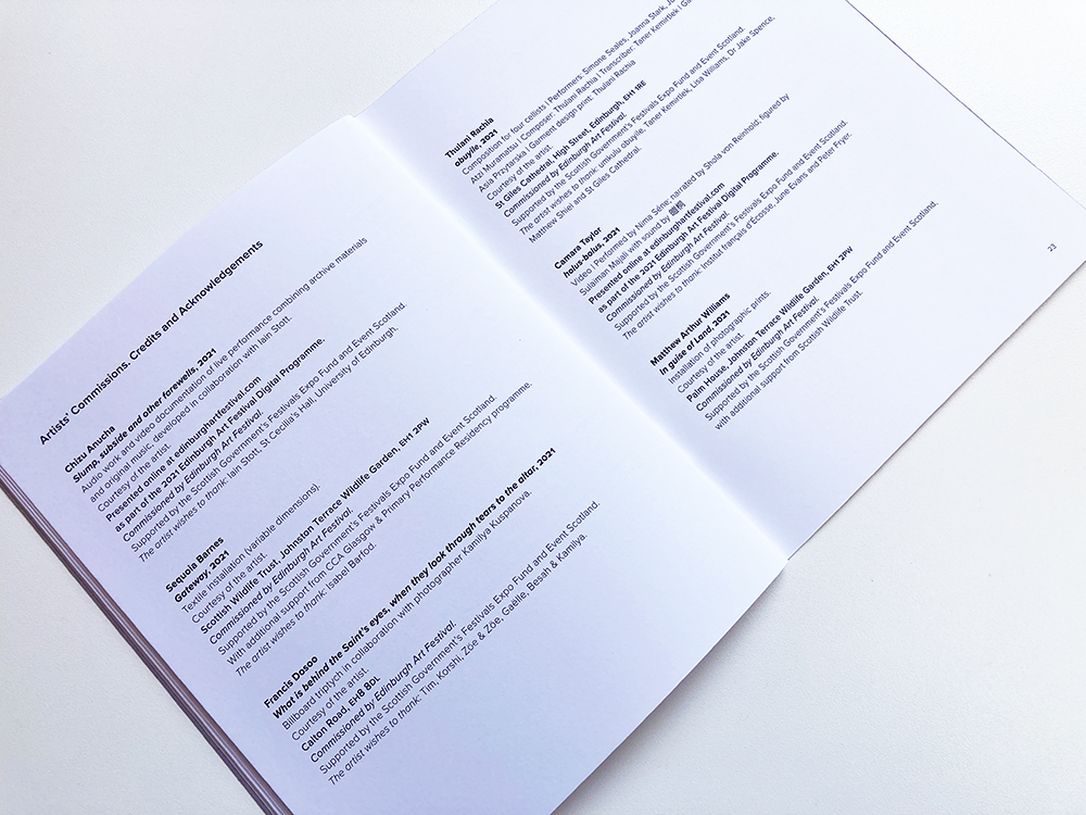
Printed matter that I designed for the Edinburgh Art Festival Commissions Programme 2021 interpretation material. Each year Edinburgh Art Festival invites Scottish and international artists to make and present new projects specifically for the festival. in 2021, EAF collaborated with a range of partners to support and present a programme of new commissions and UK premieres by artists working in Scotland, UK and internationally. The programme featured the UK premiere of Isaac Julien’s Lessons of Hour, in partnership with National Galleries Scotland; a new project, Tak Tent O’ Time Ere Time Be Tint, by Sean Lynch, co-commissioned with Edinburgh Sculpture Workshop; a sound installation, Song of the Union by Emeka Ogboh, co-commissioned with Talbot Rice Gallery; and What happens to desire…, curated by EAF associate artist, Tako Taal. 

The printed matter consists of one booklet and three leaflets, and was designed to present a cohesive identity for the commissions programme that is distinct from the main EAF identity and also highlights the contributions of the partner organisations. Unlike previous EAF commissions, there is no over-riding theme to this year’s programme so my design does not reflect a theme, instead it presents a common typographic stye and layout that is adaptable to the different content of each piece of print. Different logos from each partnership organisation (Edinburgh Sculpture Workshop, Talbot Rice Gallery and National Galleries Scotland) had to sit well with the new EAF logo and other typographic information – a balancing act, often with three different typefaces in play. 

I selected Proxima Nova as the typeface for this series as it has some similarities to the typeface that appears in the new EAF logo, but is sufficiently different that the designs are not solely linked to EAF but give equal weight to the partner commissioning organisations. I used a pared back palette of colour and type and suggested a new commissioning credit line that helps brings the partner organisation to the fore. Different weights of Proxima Nova were used to create a hierarchy of information and full bleed images from each commission have been used to create impact. The leaflets (for Isaac Julien, Sean Lynch, and Emeka Ogboh) are 8 page double-gatefolds, folded to 165mm x 210mm while the What happens to desire… booklet is 24 pages plus cover, trimmed to the same size – this is the size of the books, booklets, and leaflets that I have designed for EAF in previous years, building a connected set of print that documents the Edinburgh Art Festival’s growing series of artists’ commissions.


Emeka Ogboh: Song of the Union
 

Isaac Julien: Lessons of the Hour

Sean Lynch: Tak Tent O' Time Ere Time Be Tint

What happens to desire…

Archive

Search

Categories

Click here to subscribe to James Brook / Design

Please visit www.jamesbrook.net for more information

The content (content being images and text) of this website is copyright © James Brook
All rights expressly reserved
Powered by Blogger.