Caslon


Reviving Caslon
by William Berkson

Part 1: the snare of authenticity

How much should a revival of a typeface look like the original? Well, just as with performing an old song—an analogy Matthew Carter has made—there is something you have to like in the original in order want to revive it. And you can’t depart from the original too much, or you lose the charm of the old song that appealed to you in the first place. But if it is too much like the old versions, it might be stale and dated, irrelevant. So what do you keep and what do you change? And change in what way? That’s the challenge every revivalist faces.

In the process of working on my own revival of Caslon—Williams Caslon—I came to two conclusions about revivals generally. First, the pursuit of authenticity is a snare and a trap. Don’t go there. Second, particularly if it’s an old typeface, it’s going to be harder than you imagined, and you can lose your way in the process. So you’d better start with a very clear goal for your revival, and stick to it.


Numbers


A series of typographic experiments as part of my visual research to find a graphic language suitable for a cook book aimed at men who can't cook/won't cook. Although the end result will be a black and white newspaper, these colourful and playful experiments look at the different characters inherent in the numerals of different typefaces - especially interesting when the forms can not be read as words. From top to bottom: Bureau Grotesque, Bureau Grotesque, Akzidenz Grotesk Buch Stencil, DIN Schablonierschrift and DIN with DIN Alternate.

Spaghetti Bolognese


A poster that explores the graphic language for the cover of a book that I made about Spaghetti Bolognese. The book grew from an idea that I had to make a purely visual cook book about pork pies. After realising that pork pies were not something that were generally cooked at home, I decided that spaghetti bolognese was a much better idea as this was a dish that most people had heard of, could cook and whose authenticity was in dispute with many recipe variations. I used Google to collect many images of spaghetti bolognese, editing them down to 30 distinct images with the idea that this visual overload would - or could - act as a 'recipe'.

The cover was a challenge. I wanted the cover to be quite different from the content: because the images together represented an idea of spaghetti bolognese - a kind of visual recipe, to have one image of spaghetti bolognese on the cover would prioritise that version of the dish. I initially worked on a typographic version, using Georgia and Bureau Grotesque; in this context, using images that were found on the internet, Georgia, as a system font, designed for the web, seemed a perfect match. I had wanted to use Bureau Grotesque for some time and thought that it would combine well with Georgia for this project. I wasn't totally happy: I felt that the wobbly quirks of Bureau Grotesque needed a more elegant match. After some experimentation, and initially working on the interior text pages I found that Caslon was surprisingly pleasing with Bureau Grotesque (the text pages are an account of the tricks of food photography and a recipe for the perfect spaghetti bolognese - so not a totally visual book as I had originally planned).

From here I worked up the idea of the Italian flag - a hackneyed idea, possibly, but one that hinted at the inauthentic internationality of spaghetti bolognese. As a way of moving away from a flat image, I tried layering photographs under the colours of the flag eventually settling on a found image of a fork twirling spaghetti. Because the images inside the book are all full colour, I made the image grayscale so that it became more like an illustration and less in competition with the images inside which, for me, exist in a different space and carry a different meaning.

For the poster version above, I added another recipe for 'perfect' spaghetti bolognese, different from the one in the book, on what would have been the back cover of the book (the image wraps around with red on the front, white on the spine and green on the back). I like the way that the design feels slightly out of time, like something from an analogue past, which I think works well as a foil to the digital roots of the images.

Guilty Pleasures


A taster for a book that I have just sent to print. Guilty Pleasures is an assemblage of 40 found images of pork pies, one of my guilty pleasures. The book itself is also a guilty pleasure, an indulgence on my part as I thought it would be fun (and interesting) to make a book that was purely visual, as a parallel to my purely typographic cook book, How to Cook/What to Eat. Inevitably, typography won over and I sandwiched the pork pies with a text about the history of pork pies by Alan Davidson with a recipe for pork pies by Nigel Slater.

As a way of thinking about and investigating the graphic language for my final project, a cook book for men who can't cook/won't cook, I decided to juxtapose Adobe Caslon with Cooper Black, a typeface I have used before (in small amounts) and have been eager to use again.

Cooper Black is a heavy, old style serif typeface that was designed, in 1921, by Oswald Bruce Cooper. It has loads of character and, as well as feeling essentially masculine, it perfectly expresses the cheeky, guilty pleasures of a pork pie. Cooper Black has been used in lots of memorable contexts: the title sequence of Dad's Army; the EasyJet logo; the cover of David Bowie's The Rise and Fall of Ziggy Stardust and the Spiders from Mars album; and more recently, by Oxfam in their Be Humankind campaign.

Caslon is a number of serif typeface designed by the Englishman William Caslon I (1692–1766). Adobe Caslon was designed by Carol Twombly in 1990 and is based on specimen pages printed between 1734 and 1770. Because I wanted to contrast the chunky cheekiness of Cooper Black with a more refined and formal typeface, Adobe Caslon was perfect as it includes refinements such as small caps, ligatures, fractions and oldstyle numerals. Caslon has an interesting character, it is very pleasing to the eye with good readability but it also has a nice quirkiness, a playfulness, that is somehow amplified by juxtaposing it with Cooper Black. Although Caslon was based on Dutch letterforms, it feels very British, perfect for a book about pork pies.

British Food – Mark Hix


British Food
Mark Hix

Published by Quadrille, 2005 (Softback)
Creative director Helen Lewis
Art direction Vanessa Courtier
Design Ros Holder and Claire Peters
Photographer Jason Lowe
Food stylists Marx Hix and Stuart Gillies
Props stylist Jane Campsie

This is a concise book about British food and contains quintessential British recipes such as Cullen skink, Roast Rib Eye of Beef, Fish and Chips, and Spotted Dick alongside guides to British ingredients and the availability of seasonal British foods. It is written by Mark Hix, a respected chef and writer who worked at the Ivy and now runs several restaurants under his own name but the design of the book does little to establish the character of the author. On the surface, British Food ticks all the criteria for a good cook book: it is well-designed, with considered typography that aids the understanding of a recipe; it has attractive photography that serves a purpose of showing what the finished dishes look like; and it contains functional recipes that extol the virtues of British food. But, there is something missing: there is a generic feel and a blandness to the design of the book that makes it difficult to feel excited about. The design is competent and attractive but it does not amplify the idea of Britishness that is at the core of the book nor does it amplify the ‘brand’ of Mark Hix. The problem may lay in the fact that this book is part of a series: buried in the back flap of the cover is a list of other titles in the series: Smart Food, Easy Food, Easy Indian, Easy Italian etc. A quick scan of Amazon - as I finish writing this piece - reveals that the books in the series do, in fact, share a common design which may explain why the design is so bland: the design has to communicate so many disparate ideas that, by nature, it has to be nonspecific. I’m all for formatted design but, without a unifying raison d’être, a series of books is just a collection of books that all look the same.

Front Cover
The cover is a full-bleed photograph of Lancashire Hotpot: a roasted crust of sliced potatoes over a succulent lamb stew. The hotpot is photographed very close-up with a shallow depth of field: a serving spoon of the hotpot has been lifted from the serving dish close to the camera. Only the food on the serving spoon is in focus, the rest is blurred into abstraction. The dominant colours in the photograph are golden yellows and rich browns; most viewers will associate these colours with food that tastes good so the photograph communicates directly to the viewer’s sense of taste through the eyes. At the bottom edge of the image is the curve of the white baking dish which offers a contrast to the dark browns and blacks of the lamb stew and also makes for a pleasing abstract composition. The book has been laminated with a high gloss varnish with the title and author’s name unvarnished to create a contrast of textures.

The title of the book appears at the top of the page, arranged across two lines, reversed out of the photograph, in white. The author’s name appears at the foot of the page, at a smaller point size, ranged right and printed in a chestnut brown. The title and author’s name are set in Clarendon, in a mixture of bold and regular; the typeface was created in 1845, in England by Robert Besley. Although Clarendon carries connotations of Englishness - the typeface was named after the Clarendon Press in Oxford - it also has international associations: it has been used for logotypes of corporations such as Sony, Pitchfork Media, Wells Fargo and the Spanish newspaper El País.

The title is set in lowercase only; given that countries and nationalities are usually set in titlecase, this is an unconventional choice. Titles set in lowercase are visually appealing as they have connotations of informality - but they also feel childish and naive and transmit less authority than a title set correctly in titlecase or uppercase. This lack of authority could be interpreted as a lack of conviction, subtly engendering in the reader a lack of confidence in the book and its recipes. When combined with the abstraction of the cover image, the general feeling, to this reader at least, is of vagueness verging on blandness that reveals little about the contents of the book.


Inside Pages
The book measures 16 cm by 21 cm, a fairly compact size for a cook book. It is printed full colour, on a white matt coated paper with lots of body. The book has been designed with one recipe per page, usually with an accompanying photograph, although, to add variety, this format is not strictly adhered to: occasionally a photograph will occupy a double page spread with two recipes side by side on the next spread and sometimes recipes will extend over two pages. The body text and recipes have been set on a simple one column grid with equal margins on the inside, outside and top and with a deeper margin at the bottom containing page numbers and footers. The recipes have been designed with a very simple typographic hierarchy: the title, set in Clarendon, at a larger point size, is at the top of the page; the yield line, ingredients and method are set in Clarendon with bold to highlight the yield line and the numbers that show the stages of the method. Ingredients are set in two columns to save space. Page numbers and footers are set in Clarendon at the bottom of the page on the outside of the page and outside of the main column; like the title on the cover of the book, they are set in lowercase only.

Full colour photographs appear throughout the book. The photographs were taken by Jason Lowe, and concentrate on the food which is usually shot close-up, at an angle, slightly from above, with little or no background. Unlike the blurred and abstracted cover image, the majority of the shots inside the book adopt a naturalistic approach, with finished dishes that are plated up on neutral white china bowls, against white or neutral backgrounds: these are photographs that are intended to show, as clearly as possible, what the finished dishes look like as an instruction to the cook and as an incentive to cook them.

Most images are presented as full page and full bleed with occasional double page spreads. In places, a pair of smaller images are shown, side by side, fitted into the column width; these are usually accompanied by a commentary from the author that is printed in 50% black at a larger point size than the body text; these details help to create variety in the pages and break up the uniformity of the rather simple and somewhat static grid.

The book is divided into sections: British Soups, British Fish and Seafood, British Meat, etc. The section openings are marked with a full-page spread: over a photograph, that has been printed in a single tint from a limited palette of muted colours, one for each section, the title of the section is printed in black, lowercase Clarendon, ranged right with the first line aligned to the middle of the page. The following double page spread features the same full bleed photograph but, this time, in full colour. Like the image chosen for the cover, these images concentrate on details of food and are aiming for abstraction; but they don’t always succeed in their aim nor are they consistent: an image of uncooked cod is neither beautiful or engaging and the use of onions to open the section on meat is a little puzzling.

Andrew Shanahan on the tricks of food photography

Take your chicken. Baste with wood varnish ...
Those yummy pictures in cookbooks aren't always what they seem.

From The Guardian, Friday 13 October 2006

Here's a great kitchen tip. You know how bowls of soup in food magazines always have a few bubbles rising artfully to the surface, giving that freshly ladled-from-the-tureen appearance? Well, you can recreate this effect quite easily at home by lightly drizzling some washing-up liquid into your soups but, please, only use the best stuff; this is no time to cut corners. Next, take a plastic straw and gently blow into the soup, creating an entire bowlful of bubbles. Using a pin pop away until you are left with just those few artistic ones that will survive for hours. The taste might not be to die for but at least your bowl of soup will look just like it does in the food magazines.

In the curious world of food photography this is the sort of advice that passes for normal. After all, this is the industry that firmly believes that the first taste is with the eye. The importance of culinary aesthetics cannot be overstated. Humans are predisposed to assess food's nutritional value, or lack of it, by its appearance - so get the pictures wrong and you could be conveying the message that this food is not fit to eat. Besides, aspiration sells. Who would buy a book of recipes for dishes resembling what they usually have for tea?

It takes a lot of people to get food looking its best. There can be up to five bodies beavering behind the scenes with their various flexible roles and responsibilities. The photographer and stylist will compose the contents of the dish and decide exactly how they want the picture to work. A props person will source, say, the perfect cake-stand and a home economist will buy ingredients and prepare the food. Finally, the client is often present to make sure that the money they are forking out - a food photographer alone can charge thousands of pounds a day - results in a drool-inducing image.

The simple reason so much work and personnel are involved is that producing beautiful images of food is not easy. For starters there is the small matter that cooked food gives off steam, which can fog up a camera lens. "Lots of things can go wrong," says Georgia Glynn Smith, who has been a food photographer for 10 years and has worked with Nigel Slater, Gordon Ramsay and has just completed work on Allegra McEvedy's Colour Cookbook. "Lighting is probably one of the easiest things to get wrong. If you light a plate of food wrongly then you can make it look grey and cold. Light it wrongly another way and you see the fat and skin forming on sauces. Aside from the lighting there's the problem that if you use the wrong [type of] film then meat comes across as too red."

It's not only technical issues that hamper the shoots. According to Glynn Smith, some foods simply do not have what it takes to make it as a model. "Sausages are these rude, fatty, obscene things. I did a whole book on sausage and mash once and that was a challenge. Then there was an entire book on soups and that was logistically difficult because there's really only so many ways that you can photograph soup."

Perhaps because of these associated difficulties, the industry has developed an impressive repertoire of tricks to enhance the appearance of food. "Let's say you wanted to photograph a roast chicken," says Maureen Murray, a food stylist with more than 10 years' experience. "You can't use a normal roast chicken because from the second that it's out of the oven it starts to go wrinkly, so what you do instead is plump up an uncooked chicken by injecting it with boiling water. Then you either use wood varnish or a mixture of honey, Fairy Liquid and gravy browning and you paint the bird to achieve the roasted colour you want."

Washing-up liquid is by no means the stylist's only secret ingredient; if you have ever wondered how the breads and pastries in photographs get such a beautiful shine and want to replicate this look then you need to go to a DIY shop and ask for some button polish.

Murray also has the answer to one of the most pressing riddles of modern life - why does food never look the same when you cook it as it does on the front of the packaging? The answer is because the food in the "serving suggestion" photo might not even be cooked. "A blowtorch is a very useful tool for a food stylist. Say you were doing a photograph of a beefburger for a restaurant, you might use your blowtorch to cook the outside of the burger to get it looking really crisp and nice but the inside wouldn't be cooked at all. It's easier that way to get it looking absolutely perfect. You can even use the blowtorch to melt the cheese on the burger."

Although these shortcuts are still regularly used, Glynn Smith has pioneered a more natural style of food photography that dispenses with the trickery and fakery and instead relies on capturing the attractiveness of freshly prepared, beautifully cooked food. "I fell into food photography really and I would photograph very much off the cuff. Because I was new to the field it just totally never occurred to me why you would do these fake things to food. I only learned why you might have to do some of them through talking with home economists afterwards. But it's becoming much more acceptable to see food looking real in photographs now." One of the perks of this natural approach, he says, is that you get to eat the food after you have photographed it.

Along with this shift towards a more natural style of photography, greater policing by the Food Standards Agency has also led to the industry adopting a more honest approach. "There used to be a lot of cheating with the photographs for packaged foods," says Murray. "But nowadays you have to be absolutely spot on, so stylists have to work with what you get in the package. That can be quite difficult if you're just working with a basic supermarket lasagne say. You would love to be able to put a bit of parsley or basil on the top to improve the look but you can't, because you would end up with customers coming back into the shop saying, 'Where's my bit of parsley?'".

Food Photography


Summer 1965: Paul Levy on how we began to eat with our eyes
From the Observer, 30 July 2011

Food photography has changed a good deal since that old rogue Clement Freud was the Observer Magazine's cookery writer and people like me read him compulsively. But it hasn't got any wittier than this people-free image of a deconstructed picnic, with only the shooting stick and binoculars to tell you that we're off to the races. I don't believe we at the Observer ever used any of the shoe polish/gelatine/shaving foam for whipped cream tricks of the food photography trade. But like every article or cookery book published in the Delia era, we did go through a didactic phase when the purpose of the food image was not to amuse but to tell you how the finished recipe should look. We grew out of that when Angela Mason joined the magazine as food editor in the 1980s, and Ann Barr and I coined the word "foodie". Suddenly we began to acknowledge that food existed to be eaten, and people began to appear in the food pages, along with mangoes and radicchio. (I appeared on the cover a few times, once as Bacchus and once as Henry VIII.) At about the time that photorealist painting was in vogue, our food photography became hyperrealist. When Jane Grigson did her delightful last series Slow Down, Fast Food, we photographed a gigantic hamburger with an implausible bite taken out of it, our tasteful riposte to the cigarette-stubbed-out-in-the-fried-egg school of lurid food photography.

Paul Levy was the food and wine editor of the Observer for more than 10 years and wrote a prize-winning column for the paper. He is also the editor of The Penguin Book of Food and Drink.

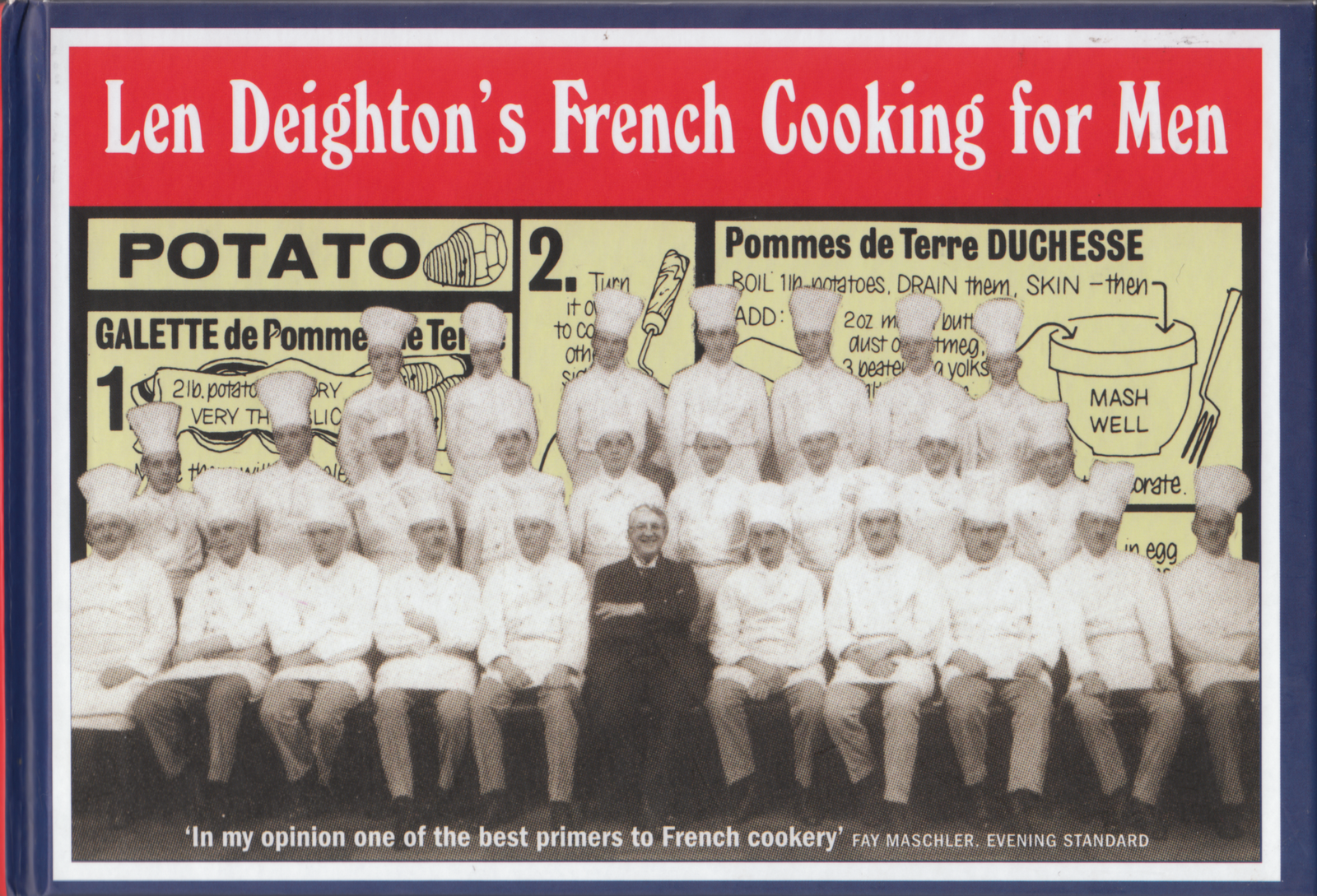
French Cooking for Men – Len Deighton


French Cooking for Men
Len Deighton

Published by HarperCollins, 2010 (Hardback)
Revised from Où est le Garlic?, 1965; Basic French Cooking, 1979; and Cookery Course, 1990
Cover design by Arnold Schwartzman

French Cooking for Men was originally published in 1965 as Où est le Garlic? It was written and drawn by Len Deighton, a military historian, cookery writer and novelist. The cookstrips were originally written and drawn by Deighton for The Observer and developed from notes that Deighton pinned to his kitchen walls whilst cooking.

The cookstrips are fantastically simple: they present, in a concise, considered and practical manner, the very basic details needed to cook authentic French food. Deighton uses drawings to annotate and illuminate the cooking process with a minimum amount of text: these are perfect for consulting whilst cooking and reveal the author’s mastery of cooking in his ability to strip each recipe or technique down to its bare essentials. In a text that runs alongside each cookstrip, Deighton elaborates on the individual dishes, further revealing his love for and the depth of his knowledge of French cookery, building the trust and confidence of the reader.

Deighton is firmly associated with London of the swinging sixties: his character, Harry Palmer, as played by Michael Caine in the 1965 film of Deighton’s novel The IPCRESS File, epitomised a cool, sharply-dressed, working class and cultured masculinity. Palmer shares with Deighton, a passion for cooking, which, given Deighton’s fanbase and the popularity of his character, must have helped sales of this book and introduced a generation of men to the joys of cooking. The over-riding tone of the book is masculine: cool, concise and clever; with its core of Deighton’s erudition and enthusiasm, French Cooking for Men, with its practical approach to demystifying the process of cooking, functions as a timeless instruction manual that is as useful and relevant today as when it was first published.

Front Cover
The cover is a collaged photograph which juxtaposes a cut-out detail from a vintage (probably early 20th Century) sepia-toned photograph of a team of chefs against one of Len Deighton’s cookstrips which is reproduced in black and creamy-yellow. The chefs are wearing traditional kitchen whites: white double-breasted jacket, striped trousers, white neckerchief and tall white hat. They are organised in three rows; the front row seated and the back row standing on a platform of some kind. In the centre of the photograph sits a man in a dark suit, possibly the restaurant owner; the cover designer, Arnold Schwartzman, has replaced his features with the smiling face of Len Deighton. The featured cookstrip is ‘Potato’, chosen, according to the cover designer, because ‘it seemed to capture the very essence of this book’s friendly and approachable method of instruction.’


Original Penguin cover, 1965

The title of the book and the author’s name appear above the photograph, reversed out of a red band, in white. The title and author’s name are set in Goudy Heavyface Condensed; at this scale the quirks and idiosyncrasies of the typeface are revealed, amplifying the slightly irreverent treatment of the photograph and, by extension, the playful authorial tone inside the book. At the bottom of the photograph, reversed out in white, is a quotation from the food writer Fay Maschler, which is set in Condensed Franklin Gothic, an approximation of one of the hand-drawn typefaces rendered by Deighton in his cooking strips.

Around the photograph and the red strip containing the title is a narrow white border which, in turn, is surrounded by a wider, navy blue border: the combination of red, white and blue is an obvious reference to the Tricolore, the French flag.

Through its design, the cover references two disparate periods of time: the 1960s when the book was first published; and the early twentieth century. This melding of history highlights Deighton’s nostalgia for traditional French cooking and also plays on the current day nostalgia for the retro masculinity of characters featured in the TV series Mad Men and Len Deighton's own creation, Harry Palmer.


Inside Pages
The book is landscape format, with a modest size of 19.5 cm by 13.5 cm, it is printed one colour, black, on a grey-white uncoated paper which is not very substantial and gives lots of see-through. The landscape format, unusual for a cook book, has been designed to fit the size and format of the 50 cookstrips which form the heart of the book. The body text has been set on a two column grid with equal inside, outside and top margins with a deeper margin at the bottom containing page numbers and footers. The two columns of text are separated by a rule which although slightly unnecessary and decorative, fits with the elaborate use of borders and fleurons used elsewhere in the book. The body text is set in Optima and is justified. Titles, sub-titles, footers, page numbers and section openings are set in Clarendon in regular and bold, in various combinations of uppercase and sentence case.

The book is divided into sections, each dealing with, as you might expect for a cook book, types of food: meat, cheese, wine, etc. The book also includes sections on French and English culinary words; menu planning; advice on pots, pans and serving dishes for the kitchen; a complete description of French sauces; and, finally, the 50 cookstrips - ‘Basic French cooking in 50 simple lessons.’ The sections openings are announced with a full-page decorative design: the title is set in centred, uppercase bold Clarendon with a sub-title in centred, sentence case Clarendon below it; a flamboyant line border with fleur-de-lys corners and a printers ornament separates the title and the sub-title; in addition, each section features a historical black and white line engraving that relates to the content of the section. I would suggest that these section openings are knowingly kitsch, adopting bourgeois design affectations that gently poke fun at the perceived idea, by most English people, that the French are unnecessarily obsessed with taste and refinement.

The book contains no photographs but is illustrated with numerous black and white line drawings that appear throughout the text, usually at a modest scale and fitting into the width of the column. Some of these illustrations are in the same style as the drawings in the famous cookstrips. The cookstrips were produced by Deighton in the mid 1960s, when, instead of taking cook books into the kitchen with him, he drew comic strips of the recipes and stuck them to his kitchen wall. The cookstrips have a simple charm, drawn in black on white, they have a naive yet sophisticated style that places them firmly in the swinging sixties.

The cookstrips present a complete cooking course: the earliest strips begin with the basics of measuring heat and bulk, then progress to how to perfectly slice vegetables, make various sauces and pastry then on to more complex dishes such as daubes and poached chicken. The tone is wonderfully simple throughout: each strip usually consists of five numbered panels at most, but usually less; a minimum of written instructions or lists of ingredients is supplemented by line drawings that illustrate a process or particular ingredient. The cookstrips are mainly annotated with handwriting which is consistent, clear and readable; the handwriting is accompanied by titles and subtitles that are mainly set in different weights and widths of Bureau Grotesque - occasionally, these titles appear to be hand-rendered, adding to the quirky charm of the cookstrips.

It is perfectly possible to cook the dishes from the information supplied in the cookstrips but Deighton supplements them with a page of commentary that runs on the opposite page; here, Deighton offers his thoughts on the dish in question with tips for its preparation and variations that can transform it. This text is set in the same two column style as elsewhere but with the addition of a fleuron at the foot of the text, centred on the two columns, that balances the two pages and anchors the text.

The original drawing of the cookstrips are supplemented with found images - clip art - that are from a variety of sources but mainly appear to be Victorian. The selection of these images perhaps reflects the 1960s interest in Victoriana - Peter Blake’s use of Victorian ‘scraps’ for his collages for the Beatles’ Sgt. Pepper’s Lonely Hearts Club Band album cover, is a good example. Like the collage that appears on the cover, the use of these found images is interesting in terms of history and nostalgia and how the meaning an image can change with time and context.

Diagrams, in different styles, are used throughout the book: there are simple line drawings of animals showing French cuts of meat; simple tables that detail the preparation of food for freezing; drawings with hand-rendered type that explain the intricacies of French culinary language; simple but informative line drawings of kitchen equipment; and flow-charts that show the relationship between different types of French sauces.

Kenneth Grange at the Design Museum

“Perhaps it’s selfish, but I think every designer should want to own and live with what he or she designs.” – Kenneth Grange


Kenneth Grange: Making Britain Modern, Design Museum, 20 July – 30 October

Images from top: Kenwood Chef A701, restyled by Kenneth Grange, 1978; Wilkinson Protector razor, designed by Kenneth Grange, 1991; InterCity 125, exterior silhouette and interior designed by Kenneth Grange, 1976.


Archive

Search

Categories

Click here to subscribe to James Brook / Design

Please visit www.jamesbrook.net for more information

The content (content being images and text) of this website is copyright © James Brook
All rights expressly reserved
Powered by Blogger.