Meadow Arts: the first 20 years Book

Meadow Arts: the first 20 years

Published by Meadow Arts, 2021

Edited by Tom Jeffreys and Anne de Charmant

Designed by James Brook

ISBN 978 1 5272 8036 6

240 x 165 mm | 80 pages | Printed by Gomer, Wales on 170 gsm Galerie Art Matt with laminated printed paper over board cover with UV spot gloss varnish on the title and quarter bound spine of Fedrigoni Woodstock

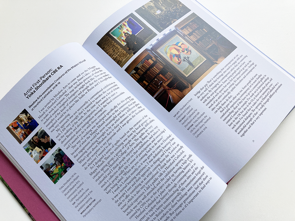
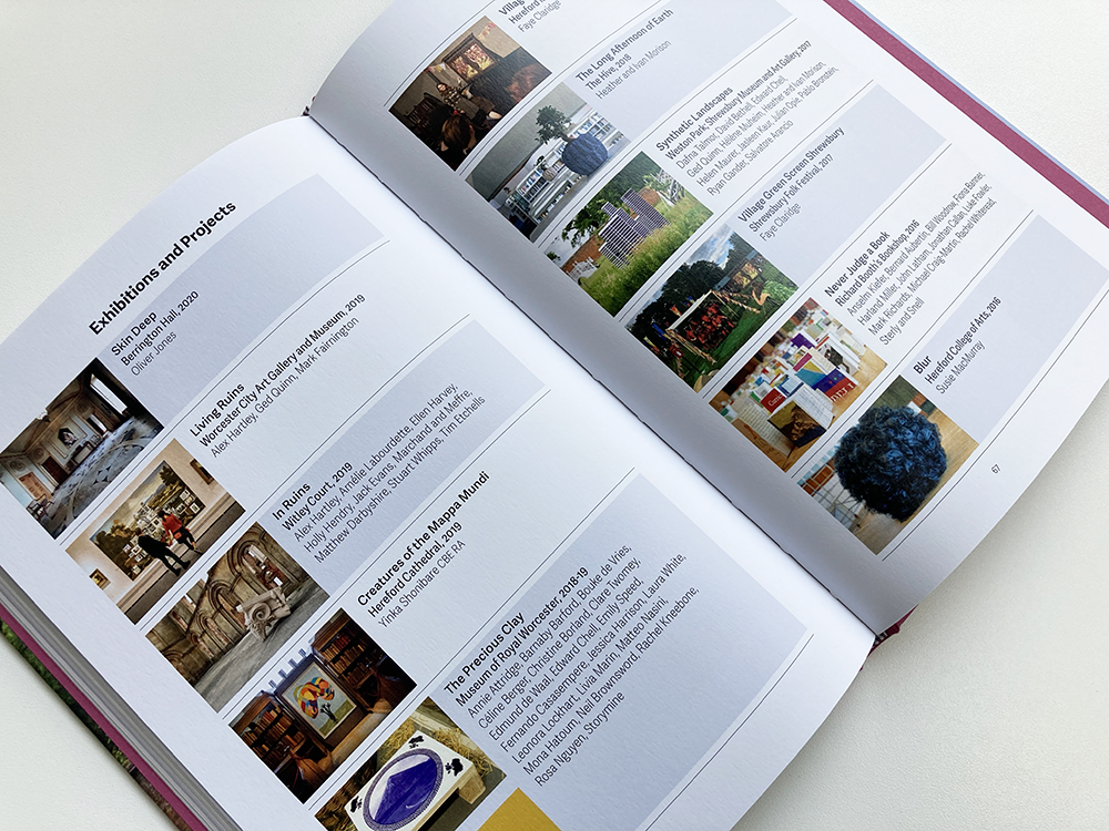
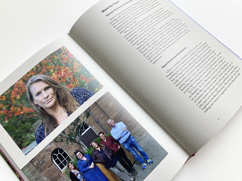
This is a book that I designed for Meadow Arts, an organisation that brings unique contemporary art projects to places where art is not usually shown, supporting artists by commissioning new work and creating inspiring events and exhibitions. In 2021, the organisation celebrated twenty years of delivering ambitious and accessible projects in unexpected rural places – Meadow Arts: the first 20 years is a celebration and long-lasting record of these extraordinary – and temporary – projects, featuring contributions from Yinka Shonibare, Alex Hartley, Laura White and Harminder Judge, alongside photo stories from Mariele Neudecker, Philippa Lawrence and Faye Claridge; it includes a foreword by Jonathan Watkins, an essay by art critic Tom Jeffreys, and an in-depth interview with founder and curator Anne de Charmant.

The book is visually rich with almost 200 colour images that are placed next to their references within the various texts – working closely with Meadow Arts, there were several iterations before the final position of the images was settled. The design is based on a strict underlying grid and rigorous typography which, nevertheless, is highly adaptable to accommodate different types of information. The book is typeset in various weights and styles of Adelle Sans alongside Caslon Pro creating a rich palette that could be adapted to create multiple hierarchies and emphases on the page. The book is divided into several sections each requiring a different typographic treatment; the sections were made even more distinct by the subtle use of colour – I created a palette of colours, sampled from some of the imagery in the book, that were used throughout the publication.

For the cover, I was keen to use a photograph of a work by Pablo Bronstein, Chinese Bridges in Landscape, a Meadow Arts commission from 2017, because I felt that, in a single image, it encapsulated all that Meadow Arts is about. The cover is laminated printed paper over board with a printed quarter spine of Fedrigoni Woodstock – after much deliberation, we selected the colour ‘Malva’ as it picks up on the colour of the wildflowers in the foreground of the photograph. The spine is printed with the title of the book in black, and there are head and tail bands that also pick up on these colours. The endpapers of the book are also in Fedrigoni Woodstock Malva giving a tactile feel and a contrast to the matt laminate on the cover. As a final flourish, to amplify the celebratory feel, the reversed out white letters of the title on the cover are picked out with a gloss UV spot varnish. 


Anne de Charmant, Artistic Director & Curator, Meadow Arts: Working with James on our first publication was an incredibly stress-free and rewarding experience. He immediately understood what type of publication we wanted and he gently steered us towards the finish line with a very special blend of calm and purpose. His careful planning of the work-load and attention to detail bought out the best in all involved. At all time we felt we were in the safest of hands. 


Archie Brennan: Tapestry Goes Pop! Poster

This is a poster that forms part of the identity that I designed for Dovecot Studio’s Archie Brennan: Tapestry Goes Pop! exhibition. Archie Brennan (1931-2019) was a pop artist, weaver, and bodybuilder – a former Mr Scotland – who changed the course of modern weaving and is considered one of the greatest unrecognised pop artists of the twentieth century. In the exhibition, the curators argue that a reason he was unrecognised is most likely because his medium of choice was tapestry. Dovecot’s exhibition, co-curated with National Museums Scotland, tells the story of this much-loved Edinburgh native in the first major exhibition of his work, bringing together over 80 tapestries as well as archive material. 

I had great fun designing this identity and it was wonderful to get a sneak preview of some of the works from the exhibition. For the lead image – which appears in a circle so it can easily be adapted for use in lots of different formats – I decided to go with a detail from Brennan’s 1973 tapestry, Muhammad Ali, one of many tapestries that he made featuring the famous boxer. The colours that form the identity are sampled directly from the photograph of the tapestry and, after presenting the curators with several colour options, we settled on this dark blue as the main colour, with a lighter blue used elsewhere for emphasis.

The exhibition title is set in Stencil, a typeface often associated with pop art – Tom Phillips, an artist who has collaborated with Dovecot Studios and whose work appears in the exhibition, uses a stencil typeface extensively in his work and Brennan has also used the typeface in his wonderfully witty and inventive 1978 tapestry, Burn. For the title, the colours are once again sampled from the photograph of the Muhammad Ali tapestry. 

The rest of the text is set in Clarendon, a typeface that sits well with Stencil and also captures the nostalgic mood that appears in some of Brennan’s tapestries such as My Victorian Aunt from 1967. I had originally planned to use a contrasting sans-serif typeface for the text, particularly for the body text that appears on the exhibition labels, interpretation panels, and the book that accompanies the exhibition but, in the end, after some experiments with other typefaces, I found Clarendon, particularly in its light version, to be surprisingly readable for extended bodies of text. 

The poster has been designed to be printed at A4, A3, A2 and A1; it sits alongside a cohesive suite of marketing and publicity materials that I have designed including graphic images for use on social media, roll-up banners, and outdoor banners. The team at Dovecot have also adapted my design for use on other items. I will post separately about the exhibition graphics that I have designed as well as about the forthcoming book that accompanies the exhibition which I am currently designing, edited by Kate Grenyer and Lisa Mason.

Archie Brennan: Tapestry Goes Pop! continues at Dovecot until 30 August 2021 – you can find out more about the exhibition here.


Meadow Arts Book

Fresh from the printers! Delighted to see a finished copy of this book that I designed for Meadow Arts, an organisation that brings unique contemporary art projects to places where art is not usually shown, supporting artists by commissioning new work and creating inspiring events and exhibitions. Edited by Tom Jeffreys and Anne de Charmant. Printed by Gomer in Wales. Cover image by Pablo Bronstein. 

More information and images coming soon.


Guia de Campo App


I was commissioned to design the visual identity and interface for an app that has been developed as part of Guia de Campo (Field Guide), an environmental education research project. Although interactive digital design is not my area of expertise, the leader of the project, Sónia Matos invited me to collaborate because she believed my skills and knowledge in graphic design for print could be utilised for the project, offering a different approach than might be taken by someone from a purely tech background. 

Guia de Campo takes as a departing point the questions posed by children and teenagers regarding their surrounding environment. Through a commitment to place-based learning, it emphasises the importance of connecting younger generations to local environments. The project designs, develops and tests interactive technologies for place-based learning in conversation with local communities as a means to explore pedagogical strategies in the context of environmental education. 

The development of the app was a close collaboration between myself and Daniel Sousa, a programmer working from Lisbon, alongside Sónia Matos, who is based in Madeira, with input from the rest of the Guia de Campo team. Throughout our discussions about the design and functionality of the app, our main focus was the end user – how they would understand the app, and how they would interact with it. My approach to the design of the interface was informed by the results of the research that the team had already undertaken that looked at how young people engage with technology and with the natural environment. 

As well as designing the interface for the app I was commissioned to develop a visual identity for the project: the central feature of the identity is the Guia de Campo logo (above), a circle split in to two equal parts along the horizon, and coloured blue and green – a simplified echo of the landscape of the Azores. The logo appears on a grey background on the app’s loading page (above) along with the name ‘Guia de Campo’, set in the typeface Roboto regular. This typeface is used throughout the app; it was selected because, as a Google typeface, it is widely available on all platforms; Roboto also fitted the brief, which specified a clean, contemporary typeface.

The home page (below) consists of the navigation bar and a map with a marker which shows the user’s location alongside content (photographs, videos, sound files and questions to scientists) that has been uploaded by other users. The content is represented by a set of icons that I designed: a camera for images; a microphone for sound files; a video camera for videos; and a question icon which refers to questions asked in the Comunica section. The lozenge at top left allows the user to zoom in on the map. 
One of the key aims of my design for the interface was that it should be completely intuitive and easy to navigate without a manual: the app is used in the ‘field’, with the initial test location an area of outstanding natural beauty in the heart of Terceira Island in the Azores archipelago called Mistérios Negros (in English: Black Mysteries), where the young people would be using the app with minimal intervention from adults. The navigation bar at the bottom of the screen is present on almost every ‘page’ of the app allowing the user to understand their position in the app and to quickly return to the home page by pressing the centrally-placed Guia de Campo logo; the icons in the navigation bar increase or decrease in size to indicate the user’s position in the app. The icons allow the user to access other pages on the app, from left to right: Adicionar Conteúdo (Upload Content); Ver Arquivo (Search Archive); Comunica (Contact); and Informações Adicionais (Additional Information).
Clicking on the icons on the map brings up the content uploaded by other users at that location; in this instance, the camera icon brings up a photograph taken at that location (above). Icons below the photograph allow the user to share the photo to social media and to expand the image to full screen (below). If the photograph is part of an album, icons below the image allow the user to scroll through the album. I designed the interface without words or instructions, refining the design over several iterations, and in collaboration with the programmer and the Guia de Campo team so that it is simple and intuitive to use.
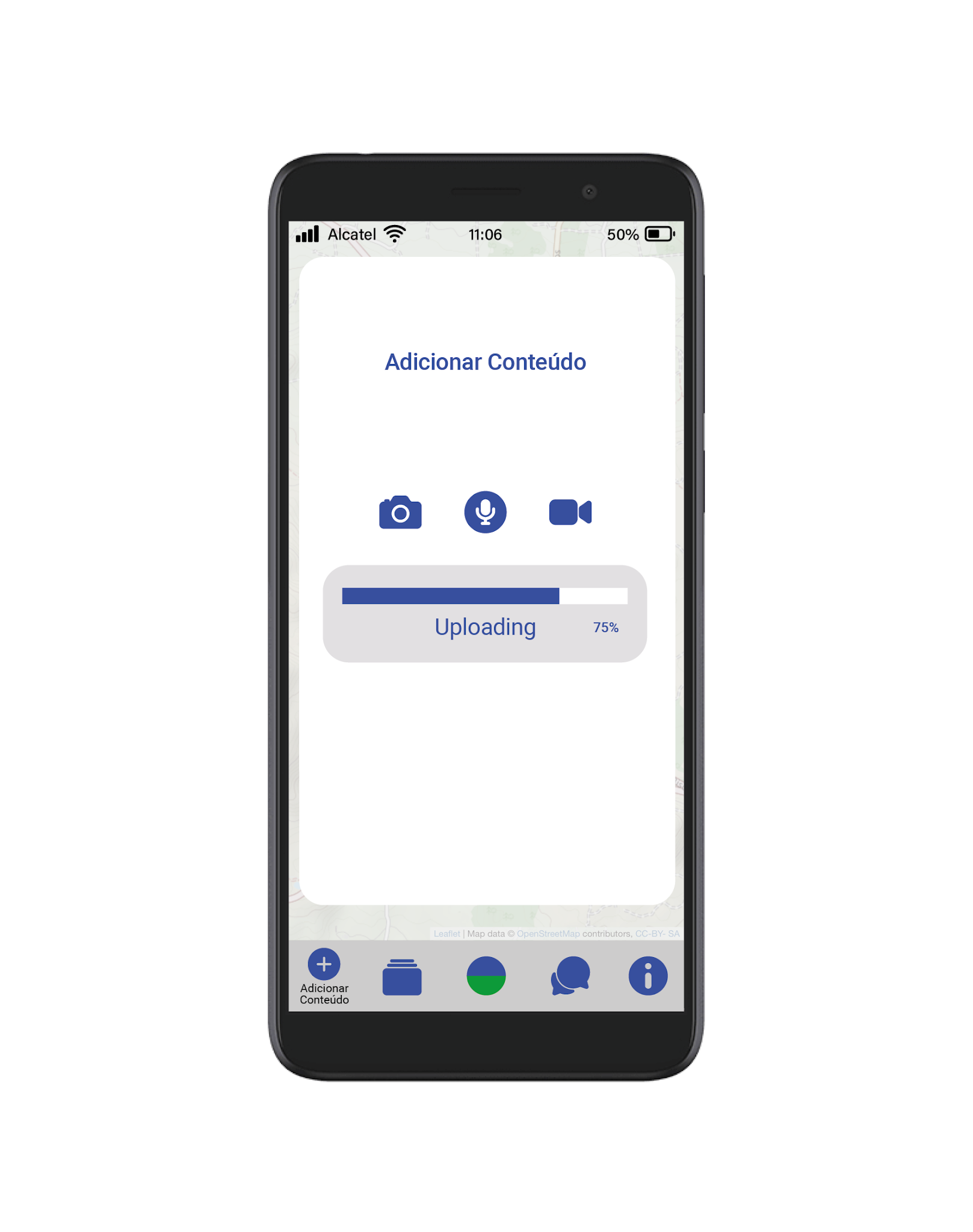
On the Adicionar Conteúdo page (first image below) the user can add content by clicking on the map – the add content icon appears in the user’s location. When the user clicks on the add content icon a pop-up window opens (second image below). When the user clicks on one of the upload icons the app will locate the relevant file (image, sound or video) on the user’s phone and will upload it to the location of the user. The functionality of the app was built by the programmer following my specifications and designs – as part of the brief for the project I had to submit fully annotated working drawings of the app with specific instructions, measurements, proportions, and colours for the programmer to work from.
The Ver Arquivo page (beow) allows the user to search the archive by entering keywords in the search box which brings up a drop-down list of items from the archive. The list can be further refined by type (sound, image, video or question) by clicking on the icons, versions of the icons that I designed for the home page, below the search box. The scroll bar allows the user to scroll down a long list of content.
The Comunica page (below) allows the user of the app to communicate or ask a question to a scientist. This page appears as a pop-up window over the greyed-out map to make a connection between the location of the user and the question (and subsequent answer). The answered question, as with all user-uploaded content, appears on the map on the home page, and is indicated by a location marker. Finally, the Adicionar Conteúdo page (not shown here) contains information about the project, links to the websites of the organisations taking part in it, as well as funding credits for the project.
It has been really interesting to collaborate on this project, one that is outside the familiar world of design for print that I usually inhabit. It has been fascinating to see my working drawings and specifications translated in to the code that makes the app function and to test various iterations of the app on a phone. I have had to think very carefully, through the designs that I have generated, about how they will be translated, by the programmer, into a functioning app, and also how they will be used and understood by the end user. My default design position is generally to take a minimal stripped back approach with few unnecessary elements and this approach has worked very well with this project, creating an uncluttered design that prioritises the user experience. 

Guia de Campo is an environmental education research project funded by the FCT – Foundation for Science and Technology, Portugal, Project Number 31182. The project was developed by a team of researchers working at Madeira Interactive Technologies Institute and the Azorean Biodiversity Group at the University of the Azores.

Code developed by Daniel Sousa.


Not Going Back to Normal Book

Not Going Back to Normal 

Published by Collective Gallery, Edinburgh, 2020 

Edited by Harry Josephine Giles and Sasha Saben Callaghan 

Produced by Siobhan Carroll 

Designed by James Brook 

Soft cover | 210 x 148 mm | 48 pages | Printed by Gomer, Wales, on UPM Offset 

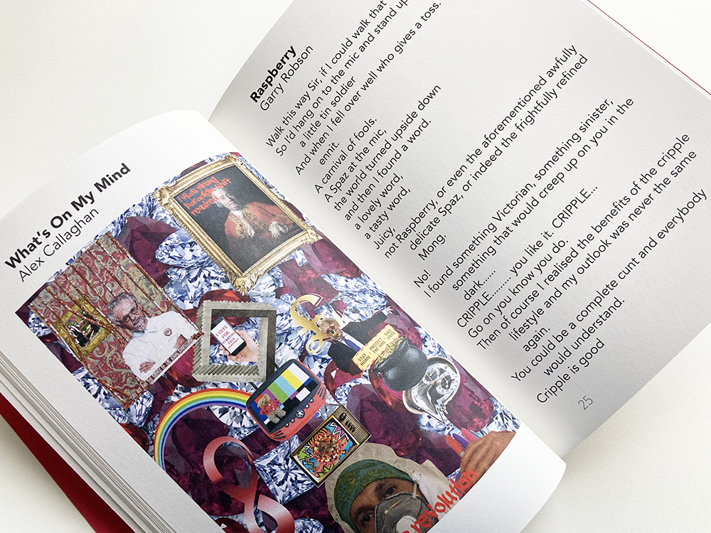
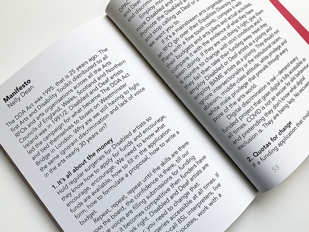
Not Going Back to Normal is a book that I designed for Collective Gallery, Edinburgh, that looks at disability arts access and inclusion; it is focused towards the visual art sector and policy makers. I am very proud to have been involved in Not Going Back to Normal, a ‘provocation about how things are and an idea for how things could be. This gallery manifesto gathers disabled artists in their diversity, rage, and imagination to call out the institutional ableism in the Scottish arts and picture a future in which disabled artists are central.’ It includes contributions from artists, writers, poets and photographers from across Scotland. 

The book was designed to make it more accessible to people with visual impairments and for people with dyslexia and other neurodiversities. The book has a clear layout that uses the typeface Avenir, which, after some research, I selected as an approved typeface for people with dyslexia, in one part because of Avenir’s clear distinction between similar letterforms. In addition, the book is printed on a tint of yellow which helps dyslexic people to read more easily than a bright white page. For people with visual impairments, I typeset the book at a minimum of 14 point type size and the book is printed on matt paper which also helps with the reading experience. For inclusivity, the book was designed at a modest size that could be comfortably held in the hand.  

Not Going Back to Normal is produced by Collective and is supported by a group of Scottish visual arts organisations working on improving disability access and inclusion. They are: Arika, Artlink, CCA, DCA, Glasgow School of Art Exhibitions, Project Ability and the Scottish Sculpture Workshop. 


Cover of Merlin James: River

This is the cover of Merlin James: River a book I designed for the Glasgow-based artist, Merlin James. The book accompanies River, a solo exhibition of new paintings by Merlin James, at Sikkema Jenkins & Co. contemporary art gallery in New York, running from 21 November, 2020 to 23 January 2021. 

I have worked with Merlin before: firstly, in 2013, on the book that Merlin wrote about the work of the Franco-Russian painter Serge Charchoune, published to coincide with an exhibition of Charchoune’s work that was shown at Talbot Rice Gallery in Edinburgh and the Smart Art Museum Chicago; and, more recently on the monograph about the work of Merlin’s partner, the painter Carol Rhodes, that was published by Skira, Milan in 2018. 

This is a wonderful body of work of paintings and drawings, mainly of the view from Merlin’s home and studio on Carlton Place, overlooking the River Clyde in Glasgow. It has been a pleasure to work with these images that have become very familiar to me as the book has taken shape. The book is 165 x 240mm, 80 Pages with a soft cover, printed by Allander in Edinburgh on GalerieArt Matt 170gsm with a cover of GalerieArt Matt 300gsm, a coated matt paper with a tactile quality that has allowed the detail in the works to shine through. The book is typeset in a combination of Meta Serif Pro and Meta Pro with pared back typography and layout that prioritises the artist’s paintings and drawings. The photographs of Merlin’s work were taken by Jack McCombe and the book features an interview with the artist with Louis Block, courtesy of The Brooklyn Rail.


Posterspotting!

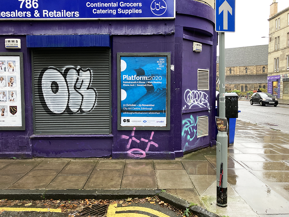
On a wet Sunday afternoon, I managed to spot and photograph most of the posters that I designed for Platform:2020 in locations around Edinburgh. Platform is the Edinburgh Art Festival’s annual showcase supporting artists in the early stages of their careers to make and present new work. For previous editions of Platform, an 8 page folded leaflet has been the main focus; this year, I was asked to expand the design to include a 16 page booklet; exhibition graphics, signage and labels; print advertisements; digital advertisements; and this series of posters displayed around the city. The posters are 1016mm x 1524mm and are printed by JackArts. Each poster follows the same template with an image from the four participating artists: Rabindranath A Bhose, Mark Bleakley, Rhona Jack and Susannah Stark.


Archive

Search

Categories

Click here to subscribe to James Brook / Design

Please visit www.jamesbrook.net for more information

The content (content being images and text) of this website is copyright © James Brook
All rights expressly reserved
Powered by Blogger.