Merlin James: River Book

Merlin James: River 

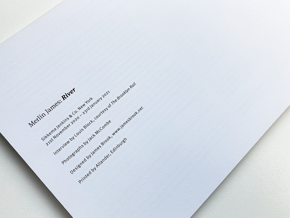
Published to accompany the exhibition Merlin James: River at Sikkema Jenkins & Co., New York, 2020

Interview by Louis Block, The Brooklyn Rail 

Photography by Jack McCombe 

Designed by James Brook 

Soft cover | 165 x 240 mm | 80 pages | Printed by Allander, Edinburgh on Galerie Art Matt  

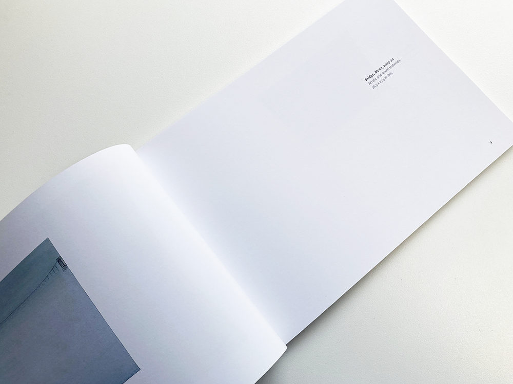
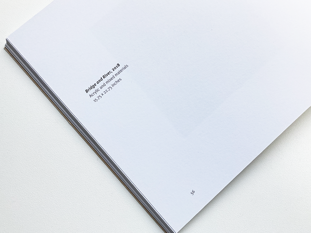
Merlin James: River is a book I designed for the Glasgow-based artist, Merlin James. The book accompanied a solo exhibition of new paintings by the artist, at Sikkema Jenkins & Co. contemporary art gallery in New York, which ran from 21 November 2020 to 23 January 2021.  

I have worked with Merlin before: firstly, in 2013, on the book that Merlin wrote about the work of the Franco-Russian painter Serge Charchoune, published to coincide with an exhibition of Charchoune’s work that was shown at Talbot Rice Gallery in Edinburgh and the Smart Art Museum Chicago; and, more recently on the monograph about the work of Merlin’s late partner, the painter Carol Rhodes, that was published by Skira, Milan in 2018.  

This is a wonderful body of work of paintings and drawings, mainly of the view from Merlin’s home and studio on Carlton Place, overlooking the River Clyde in Glasgow. It was a pleasure to work with these images that became very familiar to me as the book took shape. The book is printed on Galerie Art Matt 170 gsm with a cover of Galerie Art Matt 300 gsm, a coated matt paper with a tactile quality that has allowed the detail in the works to shine through. The book is typeset in a combination of Meta Serif Pro and Meta Pro with pared back typography and layout that prioritises the artist’s paintings and drawings. 


Merlin James:
James Brook is a terrific book designer and a pleasure to work with. I have been involved with three publications with him, of different kinds, one with a major international publisher. He’s rigorous but intuitive, flexible and versatile. He always listens closely to the client’s ideas and prioritises them. Nothing is too much trouble. He understands and communicates well with printers. I look forward to collaborating with him in future. 


A Drama in Time Learning Resource


A Drama in Time is a visual poetry resource by poet and performer Courtney Stoddart that I have designed with Holly Yeoman of the community engagement team at Edinburgh Art Festival. Courtney Stoddart has created a series of creative writing activities to help secondary school pupils explore the lesser discussed parts of renowned poet Robert Burns’ life and to use their understanding of Edinburgh and thoughts on their identity to imagine the future, by creating a visual poem. 

The activities have been inspired by Graham Fagen’s artwork A Drama in Time, and the quote the artwork takes its title from, by Edinburgh city planner Patrick Geddes (1854-1932) – “a city is more than a place in space, it is a drama in time”. The artwork and its title invite us to think of the people, sites and events which create the city’s sense of place: past, present, and future.

Available as a download, the PDF has been designed in a landscape format so that it can be printed and also be displayed by teachers on a smartboard as prompts with pupils writing/drawing on paper or jotters.  

 
The resource can be downloaded here.
More information about the resource here.

Holly Yeoman, Community Engagement Manager, Edinburgh Art Festival: I have been working with James since 2020 to develop Edinburgh Art Festival’s DIY Art home creativity kit series, which through their strong identity, visual appeal and easy-to-use format, designed by James, have supported us to introduce artist’s practice and process to audiences, helping us to maintain and grow our audience through the challenges of the Covid-19 pandemic. I always look forward to working with James. 


Oor Mad History Book

Oor Mad History: Ten Years On 

Published by CAPS Independent Advocacy, 2021 

Designed by James Brook 

ISBN 978 1 399910 02 6

Soft cover | 235 x 165 mm | 128 pages | Printed by Gomer, Wales, on 150 gsm UPM Offset with a scuff-free laminate cover of 350 gsm Claro Silk  

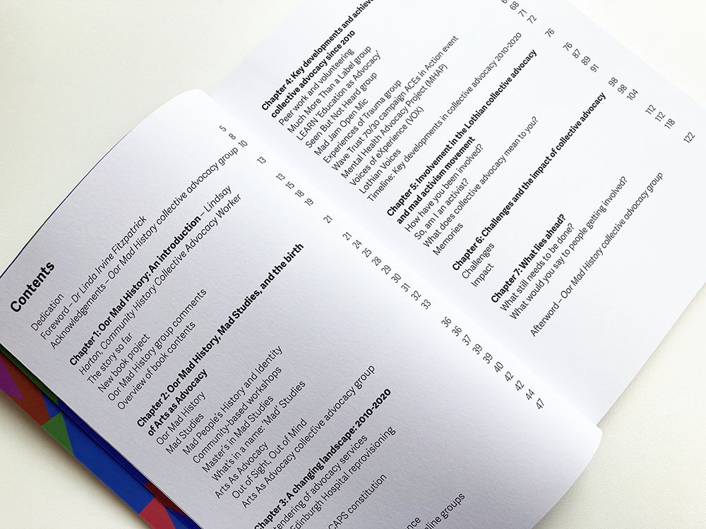
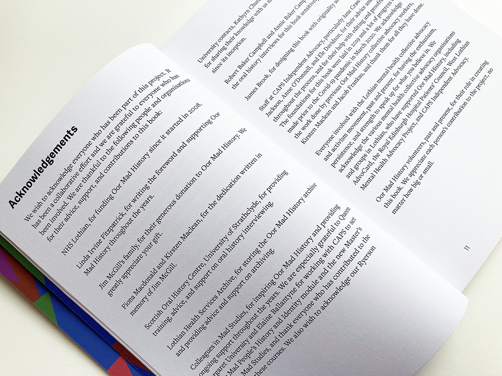
Oor Mad History is a book I designed for CAPS, an independent advocacy organisation which provides collective advocacy to different groups of people with mental health issues across Lothian. The book celebrates the community history of mad activism and collective advocacy in Lothian, 2010-2020, and follows a book celebrating the organisation’s first ten years, published in 2010, which captured people’s memories and stories from the 1980s, 1990s, and 2000s. This new book shares the memories and experiences of people who have been involved in recent years and looks at what has happened in local collective advocacy and activism from 2010. 

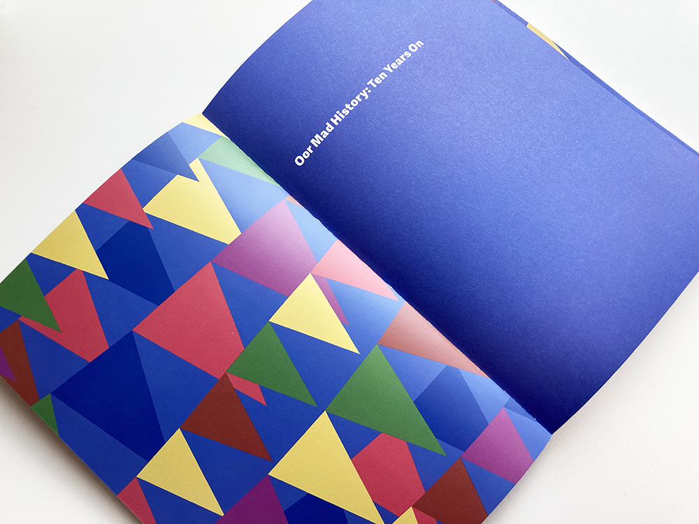
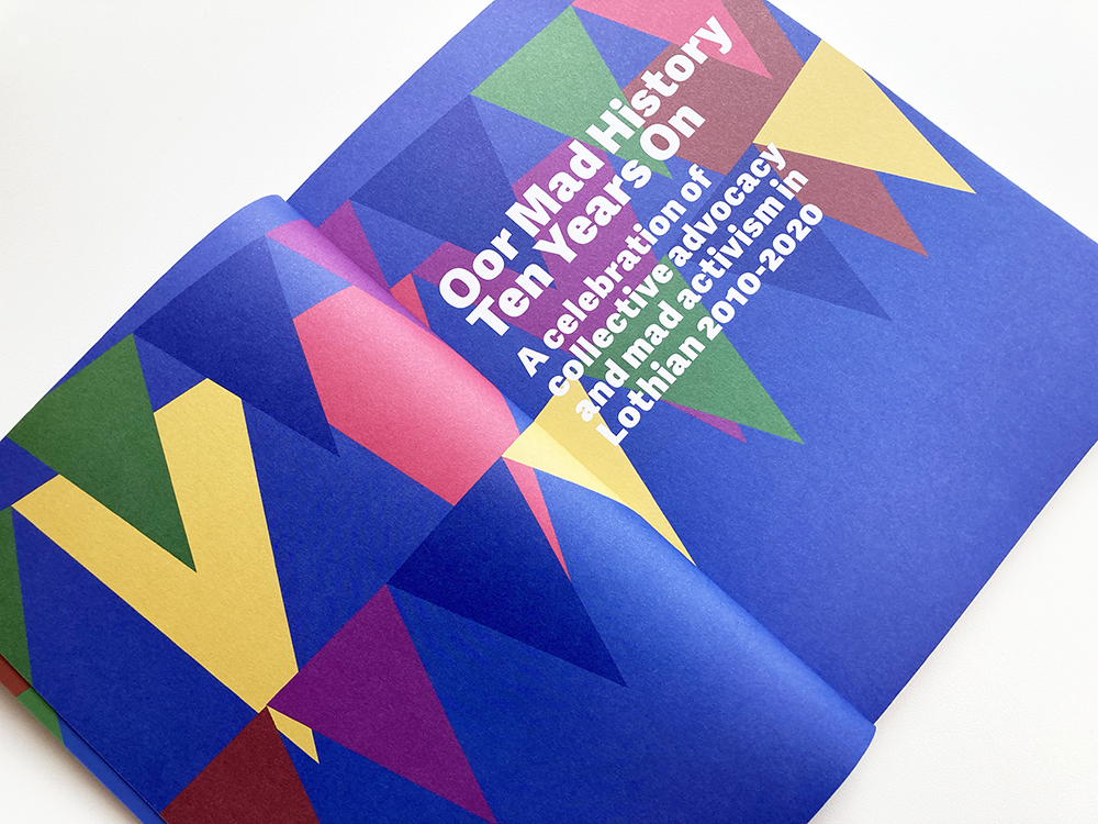
For the design of the book, I collaborated with members of the Oor Mad History collective advocacy group, who steered, through a series of consultation meetings, how the book would look and feel. The group took inspiration from books and book covers they liked, sending me images of covers which I used as a starting point to work up various options for the cover. The initial brief for the cover was to create a celebratory feel, so, based on an idea for the cover by one of the group – a painting that featured bunting – I created a design based on abstracted bunting with a palette of colours sampled from the painting.

The group felt that the bunting was a little too celebratory for the cover and didn’t reveal the complex issues faced by the group, which are not always positive. The group suggested that an idea of key words and phrases associated with the collective advocacy movement, presented as graffiti on a brick wall, might be more ‘provocative’ and might tie in better with the activist side of collective advocacy and the struggle to have their voices heard. I presented several versions of this idea along with an alternative typographic treatment that created a wall of words – this was the version that the group felt was strongest and we went with this idea for the cover, with the bunting appearing on the inside of the cover and on the title page (below) where the title was accompanied by a sub-title, A celebration of collective advocacy and mad activism in Lothian 2010-2020, to give a context for the bunting. 

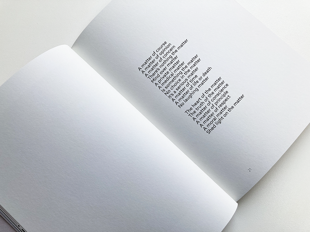
The book is typeset in various weights and styles of Adelle Sans for the headings, subtitles, page numbers, and other information alongside Freight Text Pro for the body text. The main body of the book consists of interviews with people who have been involved in mental health advocacy over the last ten years but the layout also had to be flexible to accommodate different types of information. The colour palette that I developed for the cover is used throughout the book with a colour for each chapter as well as splashes of colours throughout and enlarged coloured ‘bulletpoints’ to create interest and to break up the text. Many of the images were of fairly low quality and couldn't be printed at a large scale, so I placed them on coloured backgrounds to create a scrapbook feel and to give the images a strong presence despite being relatively small. 

The book is printed on an uncoated paper – I had a lot of discussions with the group about paper choices and showed them examples of paper types before arriving at this choice, keeping in mind that an uncoated paper might be more sympathetic to some of the lower quality images. The previous book, charting the first ten years of the organisation was printed on a silk paper with a gloss cover so this new book offers quite a contrast whilst still maintaining a connection with it as it is designed at the same size. 

You can find out more about CAPS here.

 
Oor Mad History collective advocacy group: Our group worked well with James. He took on board our colours, designs and ideas for the book. We wanted the theme to be a celebration of the 30-year anniversary of CAPS Independent Advocacy and James came up with designs based on our thoughts and ideas. We were super-impressed with his portfolio and knew he would do us proud. He has taken the idea of a graffiti wall and run with it and has also included a wonderful bunting design on the inside covers. He has included lots of colourful photos as part of the book design. All in all, he has done a fabulous job of making our book look amazing.


Moyna Flannigan MATTER Book

Moyna Flannigan: MATTER

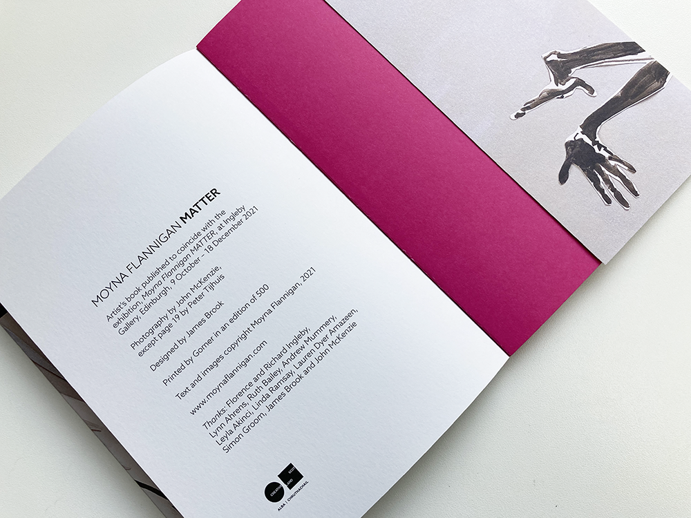
Artist’s book published to coincide with the exhibition MATTER at Ingleby Gallery, 
Edinburgh, 2021

Photography by John McKenzie (except page 19 by Peter Tijhuis)

Designed by James Brook

Soft cover with dust jacket | 210 x 155 mm | 48 pages | Printed by Gomer, Wales, 
on UPM Offset

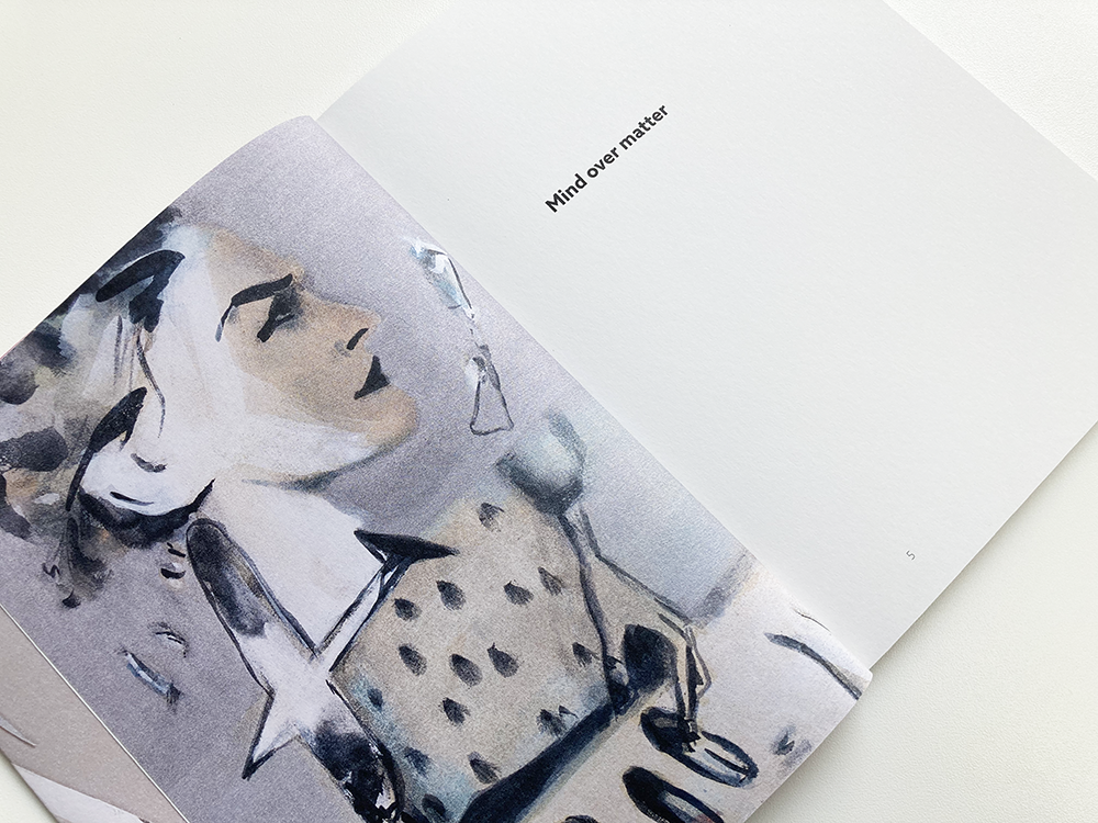
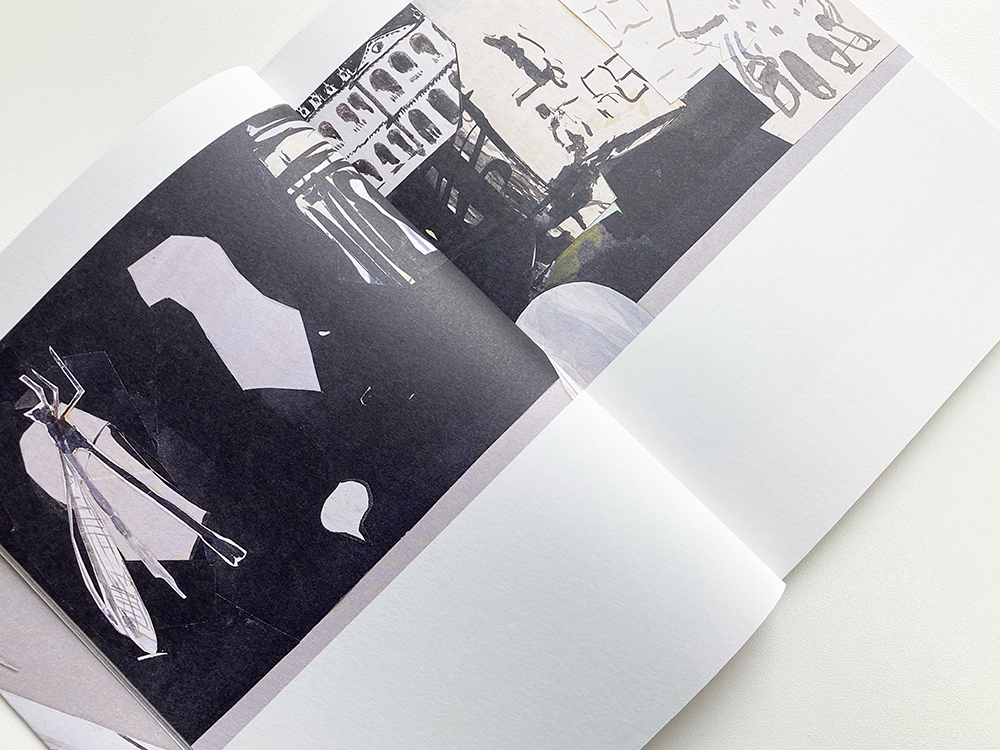
This is MATTER, a publication that I designed for the artist Moyna Flannigan. MATTER formed part of the artist’s exhibition, MATTER, at Ingleby Gallery, Edinburgh, which ran from 2 October to 18 December 2021. Supported with a grant from Creative Scotland, the book is largely composed of a series of paintings on paper and canvas – some of which appeared in the exhibition – that have been arranged on the page in various combinations, sometimes as complete works and sometimes as fragments, to create a narrative that, through repetition and other visual techniques, makes links between different works.

As well as featuring Moyna’s paintings and collages, the book includes texts written especially for the publication by the artist, combining words and images to form a collage of interconnected ideas. The book is typeset in Azo Sans and is laid out on a subtle underlying grid that gives structure to the typography but doesn’t detract from the artist’s work. For the titles, I created an outline version of Azo Sans that reflected a preliminary sketch by the artist of how she wanted the book to look. 

The book has a wraparound dust jacket; the cover of the book and the inside cover are printed in Pantone 226UP, a luscious pink. Reversed out lettering on the front cover echoes the text on the dust jacket. MATTER is printed on UPM Offset, an economical white paper that takes ink well and that has a pleasing texture – we printed a subtle tint of yellow on every page that softens the whiteness of the paper and is more sympathetic to Moyna’s work (it also gives the feel of a  more expensive paper!). It was a pleasure to work on the book with Moyna and we are both delighted with how it has turned out: this is one of those projects – evolving from a series of discussions with the artist – that came together easily and feels just right.


Moyna Flannigan: Making a book, especially one about your own work, can be a stressful experience, but not if you’re working with James. He is in complete command of what he’s doing. He designed and produced my artist’s book MATTER on time and on budget using an excellent printer, and, at the same time, was thoughtful and respectful of my work and how I wanted to see it on the page.


The Art of Wallpaper Poster

This is a poster that I have designed for Dovecot’s forthcoming exhibition, The Art of Wallpaper: Morris & Co., which looks at the legacy of William Morris (1834-1896). Morris was a poet, craftsman, radical socialist and one of the world’s most successful pattern designers. The exhibition features over 130 works from the Morris & Co. archives and includes some of Morris’s most famous patterns as well as wallpapers by acclaimed 19th and 20th Century designers such as Owen Jones, Dresser, Pugin, and Voysey. 

The poster was designed following brand guidelines from the Sanderson Design Group that include the use of the William Morris designed typeface, Goldentype Original, alongside a palette of four colours drawn from Morris’s designs. The wallpaper image, Acanthus, was supplied by Sanderson from the Morris archive – I cut out the image from its background so it could be placed on a Morris Green background, giving it more of a sense of a physical object (the wallpaper samples will be framed in the exhibition and have a strong physical presence). As well as the poster, I have designed indoor and outdoor banners – other assets will be produced by Dovevot based on my poster design. 

The exhibition runs at Dovecot from 28 January to 11 June 2022. Find out more here.


DIY Art – Louise Fraser

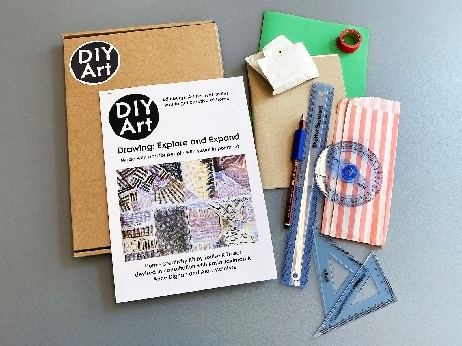
DIY Art is a series of activity packs from EAF and selected artists, inviting people to get creative at home. The instructional creativity kits give insights into an artist’s practice, showing how to use their processes and techniques to create unique artworks. Here is the latest pack that I have designed with Holly Yeoman of the Community Engagement team at Edinburgh Art Festival, this one was created by Louise K Fraser, a neurodivergent teaching artist and educator based in Edinburgh. Louise works across Scotland collaborating, co-creating, devising and delivering imaginative and original participatory workshops. The other packs that I have designed were created by artist Alexa Hare, artist and illustrator Sofia Niazi, artist and educator Naomi Garriock, artist Peter Liversidge, and artists Pester & Rossi. The packs can be downloaded here.  

Drawing: Explore and Expand is Edinburgh Art Festival’s first home creativity kit made with, and for, people with visual impairment, it was devised by Louise K Fraser in consultation with visually impaired artists Anne Dignan, Kasia Jakimczuk and Alan McIntyre. Together the artists worked through how materials and new techniques could be explored by visually impaired people in a home creativity kit. Through three sections, Drawing: Explore and Expand supports building confidence in materials, style, composition and ideas. 

The design of this pack follows the design of the previous activity packs but with some differences that make it accessible to visually impaired people; following guidelines and feedback from the artists involved, I adapted the design to suit these needs. One of the major changes was that the pack needed to be downloadable as a Word document so that users could have the option to increase the type size (or change it completely) to suit their needs – as Metallophile Sp8 (the typeface used on the other packs) is not freely available, I typeset the document in Century Gothic, which closely resembles the basic structure of Metallophile but is available on most computers. Century Gothic has a taller x-height than Metallophile as well as a clarity of letterforms and distinct differences between characters – the document is typeset at 16 points so, even without scaling, it should be comfortable for readers with visual impairment.

Following consultation with the artists, we added some design elements that guide the user to the three different sections of the activity, with clear indications of how much time each section would take and with different sections highlighted in one of three colours. We also added image descriptions for Louise’s illustrations that are presented throughout the pack. It has been very interesting to learn more about the needs of people with visual impairment and how these needs can be assisted through design features – any future packs will build on what we have learned in this project. 

As well as a download, Louise created a pack that included her home-made wax crayons as well as the tools, paper, pencils and tape that are used in the activities. These are all housed in a cardboard box with a printed version of the kit – I designed a DIY Art sticker to go on the box that brings everything together with the DIY Art logo branding.

Image credit: Edinburgh Art Festival

Holly Yeoman, Community Engagement Manager, Edinburgh Art Festival: I have been working with James since 2020 to develop Edinburgh Art Festival’s DIY Art home creativity kit series, which through their strong identity, visual appeal and easy-to-use format, designed by James, have supported us to introduce artist’s practice and process to audiences, helping us to maintain and grow our audience through the challenges of the Covid-19 pandemic. I always look forward to working with James. 


Oor Mad History Book Running Sheets

These are the running sheets (folded, gathered and trimmed sections ready for binding) of Oor Mad History, a book that I have designed for CAPS, an independent advocacy organisation which provides collective advocacy to different groups of people with mental health issues across Lothian. The book celebrates the community history of mad activism and collective advocacy in Lothian, 2010-2020, sharing the memories and experiences of people who have been involved with the project and looking at what has happened in local collective advocacy and activism since 2010. 

I am proud to have collaborated on this project and it has been really interesting to learn more about the work of CAPS, the Oor Mad History collective advocacy group, and the struggles faced by people with mental health issues. After approving several sets of proofs, feedback for the design has been very positive and I am excited to see the finished book – the running sheets represent the (almost) final stage of the books journey from idea to finished printed object. The book is being printed by Gomer in Wales and is due in mid-December – in time for the celebrations to mark CAPS’ 30th anniversary.
You can find out more about CAPS here.


Archive

Search

Categories

Click here to subscribe to James Brook / Design

Please visit www.jamesbrook.net for more information

The content (content being images and text) of this website is copyright © James Brook
All rights expressly reserved
Powered by Blogger.