Designed by James Brook for Edinburgh Art Festival, 2020 – ongoing
Booklets | 297 x 210 mm | variable page count
Printed by Edinburgh Copyshop on 120 gsm matt digital stock
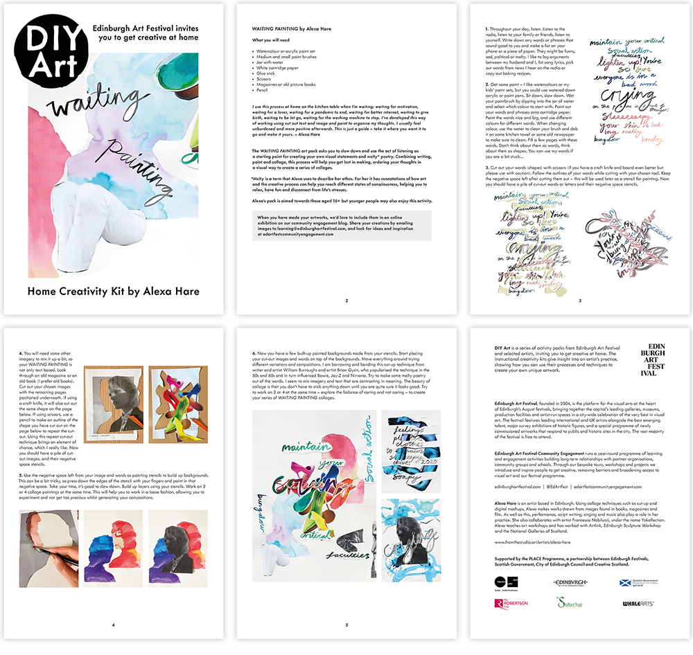
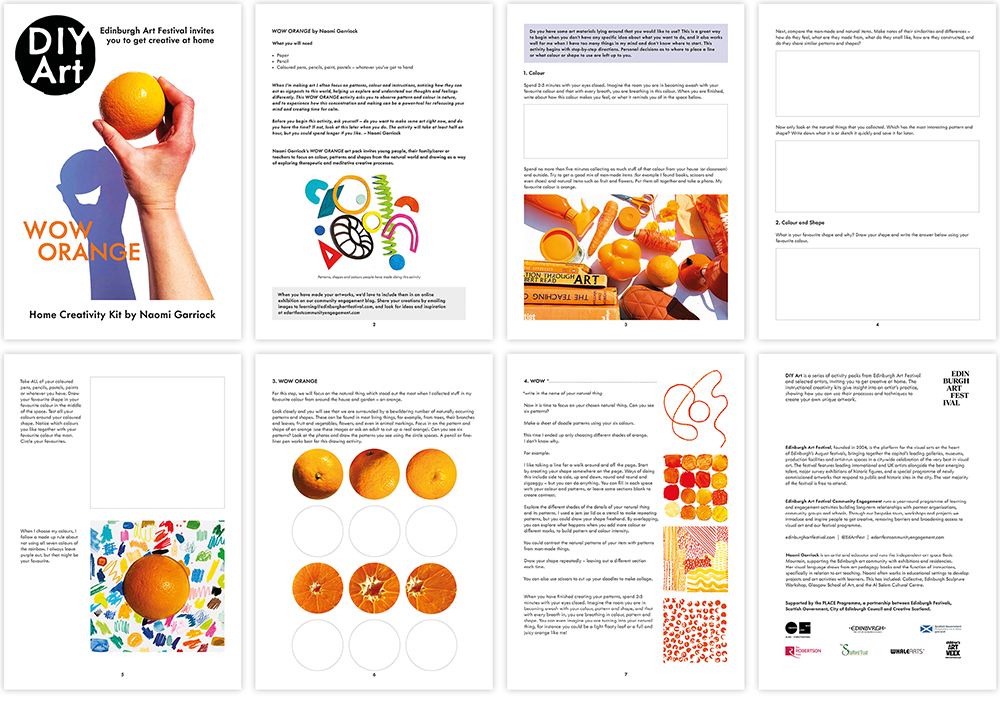
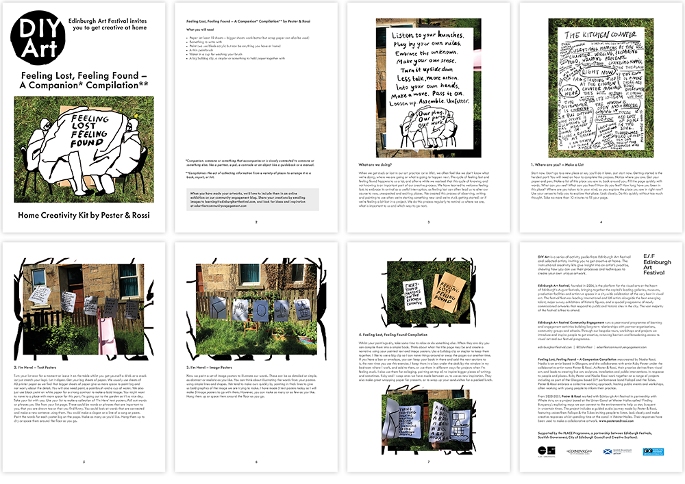
I have been collaborating with Holly Yeoman of the Community Engagement team at Edinburgh Art Festival on DIY Art, a series of activity packs from EAF and selected artists, that invite people to get creative at home. The instructional creativity kits give insights into an artist’s practice, showing how to use their processes and techniques to create unique artworks.
For the series, I created an identity that has a DIY/homemade aesthetic but is underpinned by a cool, pared-back rationality that reflects the previous work I have done with the Festival. The brief was to create a simple contemporary design that was flexible and could accommodate different types of information but that would still present a cohesive series appealing to children, teenagers and adults alike. Produced during lockdown, a major consideration was that, although a number of packs were being printed and distributed by the Festival, most would be downloaded and printed at home so I took care to keep the artwork within standard print margins and not to use areas of unnecessary flat colour that would drink up lots of ink!
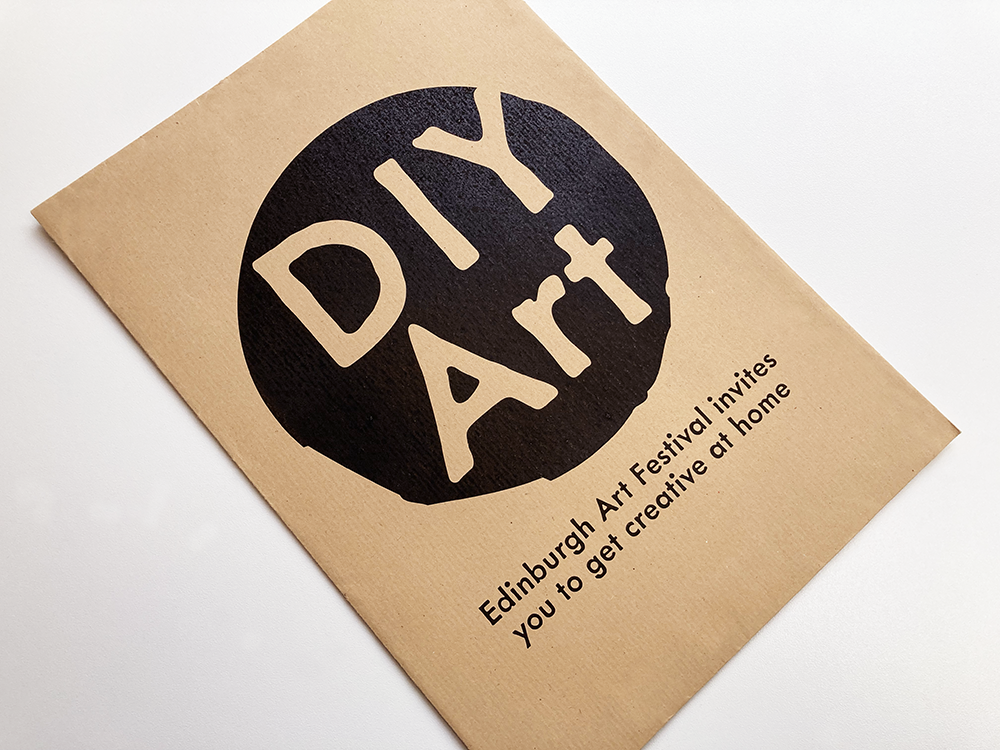
As a starting point, the Festival gave me some examples of activity packs from other arts organisations to look at, which gave me some clues for the initial direction of the design, particularly the choice of typeface: a common feature of the packs was the use of simple, geometric sans serif typefaces. Having assembled a list of appropriate typefaces I then started to think about the DIY element and how this could be expressed in the design. I was thinking about rubber stamps, potato prints and other DIY printing techniques so I started to investigate display typefaces that carried this aesthetic. Using an initial selection of typefaces I developed a series of logos, eventually settling on a circular motif, hopefully reminiscent of a potato print. I presented a shortlist of iterations using different typefaces to the team at EAF and we finally settled on Metallophile Sp8, designed by Mark Simonson, not only for the logo but also for the typesetting of the text inside.
The text and images for the activity instruction pages from each artists are quite different, requiring a different approach for each pack, but all packs have elements that are consistent, and are underpinned by the same grid, making a cohesive, connected series that also respects the artists’ very different practices.
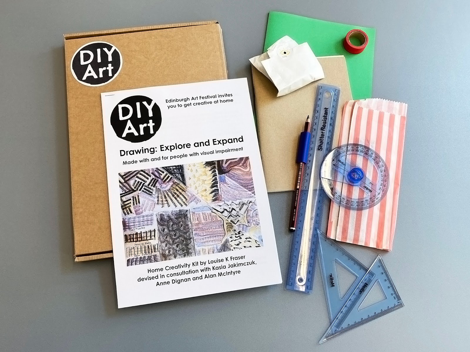
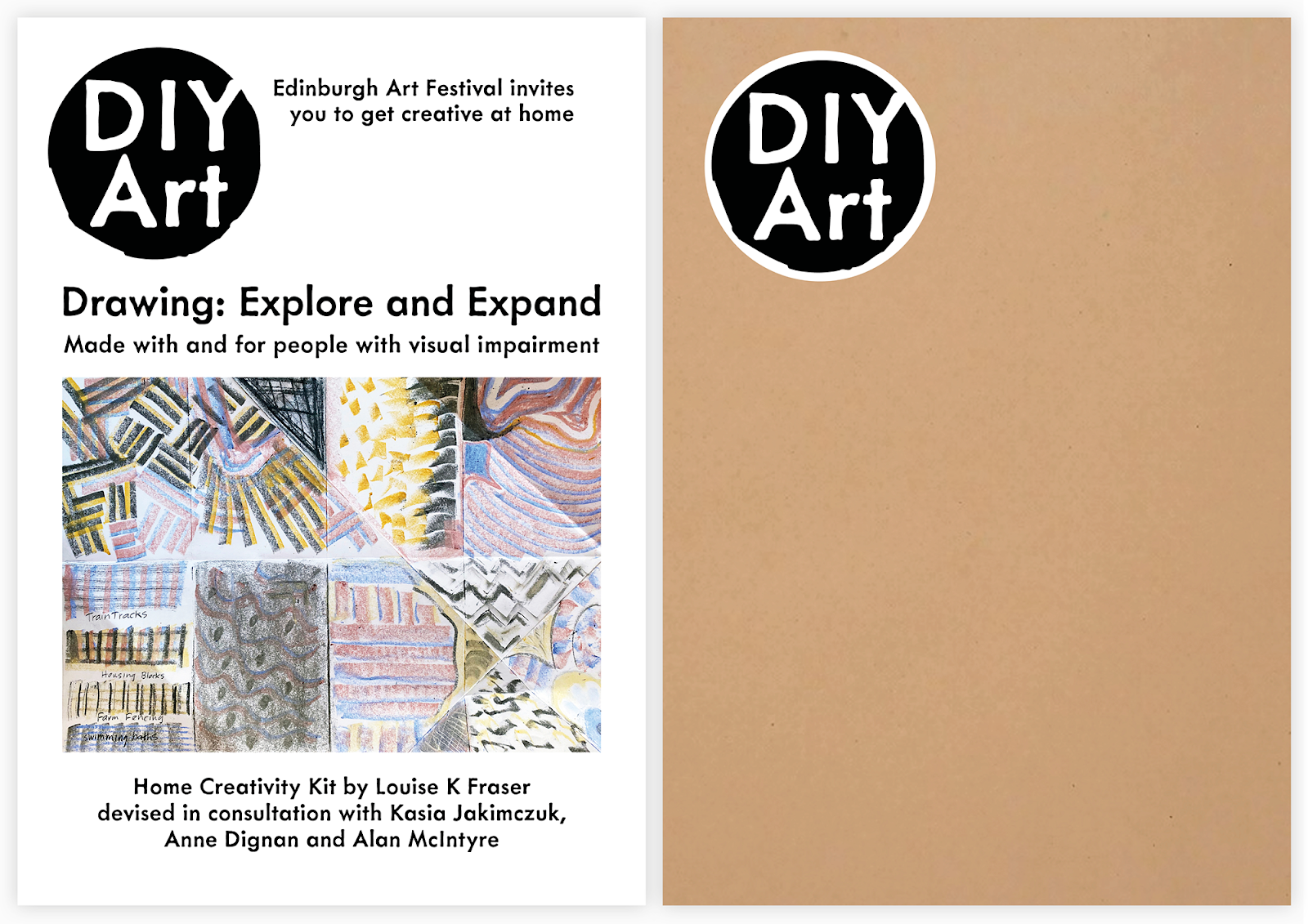
DIY Art Home Creativity Kit Drawing: Explore and Expand by Louise K Fraser
Drawing: Explore and Expand is Edinburgh Art Festival’s first home creativity kit made with, and for, people with visual impairment. The design of this pack follows the design of the previous activity packs but with some differences that make it accessible to visually impaired people; following guidelines and feedback from the artists involved, I adapted the design to suit these needs. One of the major changes was that the pack needed to be downloadable as a Word document so that users could have the option to increase the type size (or change it completely) to suit their needs – as Metallophile Sp8 (the typeface used on the other packs) is not freely available, I typeset the document in Century Gothic, which closely resembles the basic structure of Metallophile but is available on most computers. Century Gothic has a taller x-height than Metallophile as well as a clarity of letterforms and distinct differences between characters – the document is typeset at 16 points so, even without scaling, it should be comfortable for readers with visual impairment.


