Elective B Type Design 3

I've revised the glyphs, removing the tapered edges, simplifying some of the shapes and opening up the bowls:


I also tried a version using Bodoni as the framework. The results look like the Cyrillic alphabet:


Here are some 'words' made with each of the alphabets:


Words are not signs


Further development of posters for Unit 2.3 Design and Rhetoric.

Language

My research in unit 2.3 Design and rhetoric has focused on language, in particular the relationship between speech, writing and typography. I am interested in the idea of typography as a faulty transmitter, a language at one remove from writing, which, in turn, is a language at one remove from speech.

Language is constructed from a set of units called phonemes - these are the sounds from which words are constructed. The meaning of the individual phonemes disappears as they are joined together – in limitless ways - to create words. Language, then, is a system of representation: a letter represents a sound; a word (a collection of letters) represents an object or rather, a mental picture of an object. A word contains two parts: the signifier and the signified, a sign is produced when these two parts are brought together. The relationship between signifier and signified is arbitrary: in different languages, different words signify the signified: a different set of phenomes is used. In every language these phenomes are arbitrary: the word used to signify an object bears no relationship – either in its spoken or written form – to the thing itself.

“All that is necessary for any language to exist is an agreement amongst a group of people that one thing will stand for another. Furthermore, these agreements can be made quite independently of agreements in other communities”[1]

In his book Orality and Literacy, Walter J Ong states:

“Jacques Derrida has made the point that: ‘there is no linguistic sign before writing’. But neither is there a linguistic ‘sign’ after writing if the oral reference of the written text is adverted to. Though it releases unheard-of potentials of the word, a textual, visual representation of a word is not a real word, but a ‘secondary modeling system’. Thought is nested in speech, not in texts, all of which have their meanings through reference of the visible symbol to the world of sound. What the reader is seeing on this page are not real words but coded symbols whereby a properly informed human being can evoke in his or her consciousness real words, in actual or imagined sound. It is impossible for script to be more than marks on a surface unless it is used by a conscious human being as a cue to sounded words, real or imagined, directly or indirectly.”[2]

“(Saussure) saw speech as the original, natural medium of language of language, while writing is an external system of signs (For example the alphabet) whose sole purpose is to represent speech. Writing is thus a language depicting another language, a set of signs for representing signs. Typography, then, is removed one step further as a medium whose signified is not words themselves, but rather the alphabet.”[3]


[1] Crow, David (2003) Visible Signs: An Introduction to Semiotics Lausanne, AVA Publishing


[2] Ong, Walter J (1982) Orality and Literacy, London, Routledge


[3] A Natural History of Typography by J. Abbott Miller and Ellen Lupton, published in Looking Closer, Critical Writings on Graphic Design, edited by Michael Bierut, William Drenttel, Steven Heller and DK Holland, 1994


Elective B Type Design 2

Here are my tools drawings re-scaled so that the clamp (hopefully) no longer dominates. All have been scaled so that they relate to each other more successfully - though the scaling isn't necessarily true to reality.


And here are my glyphs. The glyphs are based on the typeface Akkurat.


Some glyphs are proving to be more problematic than others. The clamp has been through many stages and the chisel through 11 different versions. The main problem was that my drawings had become very symmetrical. I needed to break up the symmetry in the glyphs to create more of an interesting relationship between the glyphs. I love the spanner!

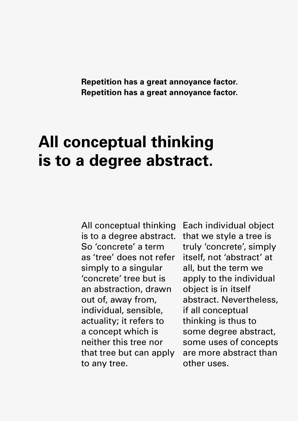
Repetition


Development of posters for Unit 2.3 Design and Rhetoric.

Text from Orality and Literacy by Walter J. Ong.

Teenage Angst

Expressive Typography / Expressive Typefaces

I have been thinking about the differences between expressive typefaces and expressive typography. For me, expressive typefaces are typefaces that have a strong character: a good, but obvious example, would be Comic Sans. Expressive typefaces shout ‘personality’ in a manner that is emphatic and prescriptive; it is difficult to subvert or alter the meaning of the typeface as it is so enmeshed in its DNA.


Above: Detail of Rotis Sans Serif designed by Otl Aicher, 1988

Expressive typefaces are often used as display faces because they draw attention to themselves and are unsuitable for extended reading in body text because of their idiosyncrasies: the individual letterforms jump out. This can also be true of typefaces that are not generally considered to be either display faces or expressive: Rotis by Otl Aicher, for example, has many peculiar features that disrupt the reading experience.


Above: Rotis Sans Serif designed by Otl Aicher, 1988

Expressive typography meanwhile, attempts to animate a text by using different font styles, weights, sizes, line length, upper and lower case and punctuation. These are the tools that the typographer can use to affect the reading of a text. In an interview from 1995 Erik van Bolland, creator of ‘Beowulf’, the ‘first typeface with a mind of its own’ talked about experimental typography:

“It takes a poor typographer to be convinced that letters are only meant to convey meaning. If you follow this line of reasoning you could also argue that a plane is the same thing as a bicycle, “because it transports people from one place to another.” Just like there are different modes of transportation to get things from one place to another, there also are different kinds of letters to communicate different types of messages.

Letters are peculiar things, and readers can take quite a bit. It is possible to create shapes that are individually unrecognisable as letters, but that are readable when put in context. This means that fascinating things happen in your head when you read. The parameters of reading, the letter shapes, context, character size, paper stock, spacing, … all influence the reading process. This is what typographers and type designers are dealing with. By changing the separate components you learn more about the whole.”[1]


Above: Beowulf font designed by Just van Rossum and Erik van Blokland, 1990

Do these ‘tools’ have a correlation to mark-making in drawing? I wondered if this might be a possible line of enquiry for my Design and Rhetoric research. Would it be possible to analyse the meanings of these marks? Is it possible to analyse typography in the same way that one can analyse the marks in a drawing by Matisse? I found it interesting that in ‘The Graphic Language of Neville Brody’, Jon Wozencroft used a language to describe Brody’s practice that an art historian might use to describe fine art practice.


Above: Poster designed by Neville Brody with FF Blur typeface, 1992


[1] Yves Peters, 20 Years of FontShop: Vintage FUSE interview

http://fontfeed.com/archives/20-years-of-fontshop-vintage-fuse-interview/


Caroline Fabès

'Times New Ramon 12 & 112' by Caroline Fabès


'Akkruat 12 & 112' by Caroline Fabès


Akkruat 12 & 112 and Times New Ramon 12 & 112 typefaces in four styles (Left, Right, Up and Down) made according to the transformation process of the area occupied by each letter in 12pt and 112pt size Akkurat and Times New Roman typefaces.

"The protocol I have set up first consists in pushing all the pixels of a same horizontal line to the left, sticking them to each other. The pixels are then flattened against a vertical axis that marks the left edge of the letter, while respecting the skeleton of the chosen basic character. The shape obtained covers a similar surface as the original drawing – but with a different outline. By repeating this process towards the right, then upwards, and finally  downwards, we get four variants of a typeface (Left, Right, Up, and Down)."

www.carolinefabes.com

MPP Draft 1.1

This is still not my final version:

Research Question

Is it possible to make typography that enhances the content of a text in a manner that is functional i.e. readable but that does not resort to superficial visual tricks to amplify meaning?

Aims and Objectives

To examine the relationship between language, text and typography.

To develop an understanding of the nuances of typography, particularly typographic hierarchy and the extent to which the reader can be controlled or manipulated by these interventions.

To further develop the polarised debate that dichotomises Modernist typography against post-Modern typography.

To create a way forward that melds text and typography to reinforce meaning.

Audience

Visually-literate readers: publishers, artists, typographers and designers.

Context

My initial idea was to work with chapter-length, continuous texts, however, my outcomes in unit 2.3 have been posters – as there is a difference between design for posters and design for books, my initial research will look at posters and shorter texts.

Left to Right by David Crow has been a good introduction to the area of study.

Orality and Literacy by Walter Ong has been a great starting point for thinking about the relationship between between language, text and typography.

On Typographic Signification by Gerard Mermoz has helped crystallise some of my ideas and has pointed the way to further reading and research.

Bridget Wilkin’s essay Type and Image has been a starting point for thinking about the potential for typography to exist in spaces outside of the modernist grid.

Action Plan

Generate a series of works that explore typographic hierarchies.

Research typographic hierarchies within early and mid Modernism, in particular, the work of Josef Müller-Brockmann, Emil Ruder and Armin Hofmann.

Survey typography by Wolfgang Weingart, Rudy van der Lans, Catherine McCoy and April Greiman - and more recent work by APFEL and Marian Bantjes.

Research other forms of typographic information eg. Road signs by Jock Kinneir and Margaret Calvert?

Reading List

Of Grammatology by Jacques Derrida

The Alphabet versus the Goddess by Leonard Shlain.

Detail in Typography by Jost Hochuli

Designing Books by Jost Hochuli and Robin Kinross

The Form of the Book Book by Sara De Bondt & Fraser Muggeridge

Typography Today by Helmut Schmid

Texts on Type: Critical Writings on Typography edited by Steven Heller & Phillip B Meggs

Elective A Visual Storytelling 2

My starting point is the absence of Dracula in the original text - he exists mainly as an idea and there are few descriptions of him; he becomes a monster created by our own minds.

There are 34 references to 'Dracula' in the entire book (and 104 references to 'blood'). I collected together all the sentences that contained the word 'Dracula' to make a kind of parastic book based on the original novel.

There are two versions that I have been working on. In the first I systematically increased the stroke weight of the word 'Dracula'. I experimented with different faces but Times was the most effective. After 34 iterations the word 'Dracula' became unreadable - a spiky monster, that could almost be a bat, appeared.


In the second version I systematically blurred the word 'Dracula' over 34 iterations until the word disappeared. The more we  read about Dracula, the more elusive he becomes: "All that is solid melts into air".


There is another version which uses a similar technique with the 104 references to blood. The narrative becomes a condensed version of the full story, I've called it 'Filthy Leech' because of its bloodsucking relationship to the original text.

I've also made an animation but it looks a bit rough. It could probably benefit from some music too:


Archive

Search

Categories

Click here to subscribe to James Brook / Design

Please visit www.jamesbrook.net for more information

The content (content being images and text) of this website is copyright © James Brook
All rights expressly reserved
Powered by Blogger.