Archie Brennan: Tapestry Goes Pop!Published by Dovecot Studios, Edinburgh, 2021
Edited by Kate Grenyer and Lisa Mason
Essay by Mary Schoeser
Photography by Kenneth Gray, Zoe Hamill, Keith Hunter, and Antonia Reeve
Designed by James Brook
ISBN 978 1 91688891 01
Soft cover | 240 x 210 mm | 48 pages | Printed by Allander, Edinburgh on Galerie Art Matt
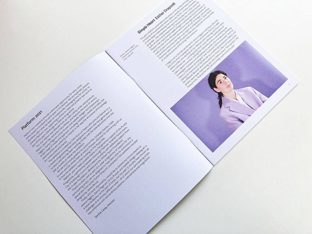
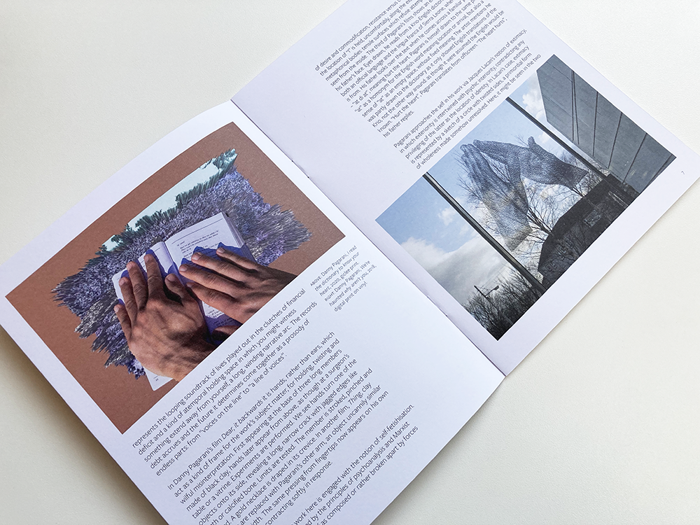
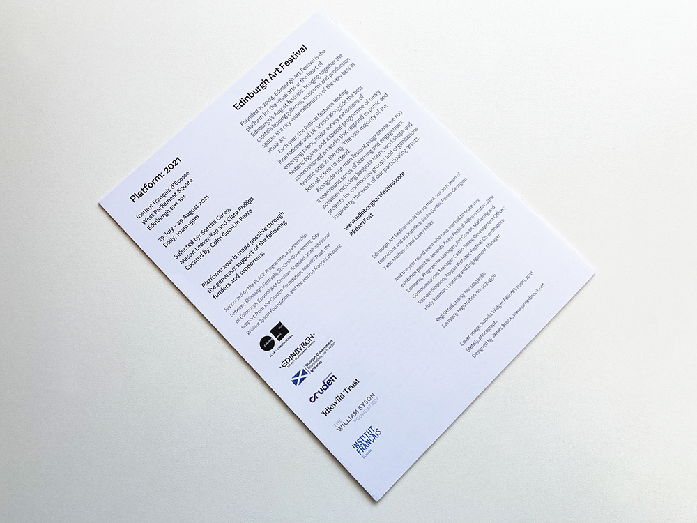
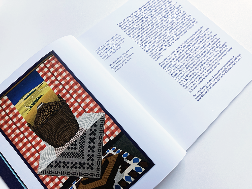
This is an exhibition catalogue that I designed for Dovecot Studio’s Archie Brennan: Tapestry Goes Pop!, an exhibition which tells the story of Archie Brennan, a much-loved Edinburgh native – a pop artist, weaver, and former Mr Scotland, who changed the course of modern weaving with his innovative approach to tapestry.
The cover of the book is based on the poster that forms the core of the identity I designed for the exhibition. The lead image of the identity – which appears in a circle so it can easily be adapted for use in lots of different formats – is a detail from Brennan’s 1973 tapestry, Muhammad Ali, one of many tapestries that he made featuring the famous boxer. A photograph of Archie Brennan (in Hawaii!) appears on the back cover, in a circle that echoes the one on the front cover.
The colours that form the identity are sampled directly from the photograph of the Muhammad Ali tapestry: dark blue as the main colour, with a lighter blue used elsewhere for emphasis, alongside oranges and yellows, to give a zingy pop art feel.
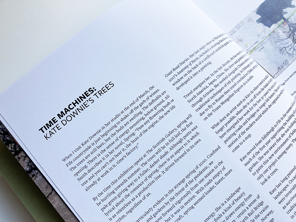
The title is set in Stencil, a typeface often associated with pop art, and the rest of the cover is set in Clarendon, a typeface that sits well with Stencil and also captures the nostalgic mood that appears in some of Brennan’s tapestries such as My Victorian Aunt from 1967.
After some printed tests, I found Clarendon, particularly in its light version, to be surprisingly readable for extended bodies of text so the main body of the book is set in this typeface – for contrast, I used Adelle Sans light for captions and secondary information.

Below is the poster that I designed for the exhibition. Click here to see the identity that I designed for the exhibition which included marketing material and exhibition graphics.
Kate Grenyer, Exhibitions Curator, Dovecot Studios: James has always been great to work with, he gets to the heart of a project very quickly and responds to briefs with intelligence, experience and imagination. When working with James on the publication for Archie Brennan: Tapestry Goes Pop! (2021), I found his experience of print stock and binding, and his knowledge of different print firms was invaluable expertise that you don’t find in many designers. He takes your work as seriously as you do and uses his experience and eye for detail to make sure the result is the best it can be within the budgets and time available.