Business Cards for Amanda Baron Stained Glass

Double-sided business cards that I designed for the very talented Amanda Baron, a stained glass artist, based in Edinburgh. They are printed on 350gsm white board with a matt varnish. I set the text on the front in Jenson, making a subtle connection between the very distinctive punctuation marks and the leading in stained glass windows. On the reverse I used an image of one of Amanda's designs which I worked in Photoshop to accentuate its abstract qualities. For this post, I've hidden Amanda's contact details, but if you are looking to commission a new stained glass design or are looking for a restorer, please contact me and I will forward your message to Amanda.


knowledge is never neutral 3


This is the third in a series of leaflets and invitations for knowledge is never neutral, a project organised by Strickland Distribution with/at Transmission Gallery, Glasgow, September 2012 - June 2013. The project overview leaflet and the first leaflet, for an event called austerity urbanism, were designed by me; but this A5 invitation, printed black and red on cream card, for an event called All Knees and Elbows of Susceptibility and Refusal: Reading History from Below, was designed by Transmission Gallery using a template and set of guidelines for placing text and images designed by myself. The project continues until June 2013 - it will be interesting to see how the design evolves over that period.

knowledge is never neutral 2

This is the second leaflet for knowledge is never neutral, a project organised by Strickland Distribution with/at Transmission Gallery, Glasgow, September 2012 - June 2013. The project overview leaflet (shown above with full-bleed red cover) and the first leaflet, for an event called austerity urbanism, were designed by me; but this leaflet, for Co-research, is the first to be designed by Transmission Gallery using my template and set of guidelines for placing text and images. It's pleasing to see how the designer has followed my guidelines and it's interesting to see how they've adapted my design to accommodate a different kind of information. I especially like the grey pattern behind the text on the cover. These two leaflets have been printed on a greyish uncoated paper, which I had planned for the first two leaflets - deadline constraints meant that they were printed on a semi-matt coated paper. The project continues until June 2013 - I look forward to seeing how the design evolves over that time.


Heaven, Hell and Other Places


Heaven, Hell and Other Places:
a Film about Emanuel Swedenborg (DVD)

Written/Presented by Philip Makatrewicz
Commissioned/Produced by Stephen McNeilly
Directed/Edited by Jacob Cartwright and Nick Jordan
Script consultant: James Wilson

DVD packaging and booklet design/artwork: James Brook


Available from the Swedenborg Society

knowledge is never neutral


I was asked to design an identity for a series of events, knowledge is never neutral, organised by The Strickland Distribution, with/at Transmission Gallery, Glasgow, September 2012 - June 2013. The brief was to create an identity that would visually unite a disparate series of events; to design a leaflet that introduced the entire project with a list of forthcoming events; and two templates, A4 and A5, that contained fixed elements along with text boxes where the gallery could drop in information relevant to each event.

The logotype uses Nimbus Sans, a sans-serif typeface designed by URW Studio (Max Miedinger) in 1987 and based on Helvetica. I liked the play between the generally accepted (though specious) argument that Helvetica is 'neutral' being undermined by the fact that the typeface is a copy and is therefore loaded with meaning. The text is in lowercase only (as suggested in the brief) and is tightly spaced with negative linespacing creating expressive and possibly decorative typography seemingly reinforcing the idea that 'knowledge (information) is never neutral'.

For the body text and titles I used Minion Pro, a digital typeface designed by Robert Slimbach and released in 2000. It works well as body text and also looks good at larger point sizes where its character becomes more evident. The two typefaces combine well and I created a hierarchy of information by using bold and italic Minion Pro within the body copy and bold and bold italic Nimbus Sans for the list of forthcoming events.

For economy, the leaflet is printed in two colours: 100% black and 100% Pantone 187 U (CMYK equivalent: C=15, M=100, y=100, K=5). Another stipulation of the brief was that the design had to work in black and white as a photocopy; I selected the red because it made a strong contrast with white.


In addition to the introductory leaflet, I designed A4 and A5 templates for individual events. These templates will have text dropped in by the gallery and will possibly be printed on the gallery's printer. Since most desktop printers cannot print to the edge of the paper - and for ink economy - I reversed the full bleed red of the logotype print so that the text printed in red on a white background. The templates also had to adapt to accommodate images so I designed four options for placement of images. The option used for the first event leaflet (designed by myself) placed a grayscale image behind the red text. I devised a set of guidelines for the gallery to use when placing text and images within the templates.


knowledge is never neutral
The Strickland Distribution, 

September 2012 - June 2013 
with/at Transmission Gallery, 28 King Street, Glasgow G1 5QP.
Designed by James Brook.


Not coming soon:


Unused cover designs for the DVD packaging of Heaven, Hell and Other Places, a documentary commissioned by the Swedenborg Society and realised by award-winning directors Jacob Cartwright and Nick Jordan. The subtitle of the film 'A film about Emanuel Swedenborg' determined that Swedenborg should have a starring role on the cover using 18th century engravings and paintings that I treated in various ways. The final design appears on the cover of the DVD box and on the booklet; the layout and choice of typeface was informed by the grid, layout and typeface of the inside pages of the booklet.


More new work:


Coming soon:

Heaven, Hell and Other Places: 
a Film about Emanuel Swedenborg (DVD)

Written/Presented by Philip Makatrewicz
Commissioned/Produced by Stephen McNeilly
Directed/Edited by Jacob Cartwright and Nick Jordan
Script consultant: James Wilson
DVD design/artwork: James Brook

Also coming soon:

austerity urbanism:
a walk through the fictional city


Saturday 15th September 2012

knowledge is never neutral
The Strickland Distribution, 
September 2012 - June 2013 
with/at Transmission Gallery, 28 King Street, Glasgow G1 5QP.
Designed by James Brook.

More information to follow.


Coming soon:


knowledge is never neutral
The Strickland Distribution, 

September 2012 - June 2013 
with/at Transmission Gallery, 28 King Street, Glasgow G1 5QP.
Designed by James Brook.


More information to follow. 

Several Clouds Colliding (Again)


More photos of Several Clouds Colliding, from the Book Works website.

Several Clouds Colliding by Brian Catling and Iain Sinclair

Artwork and design by Stephen McNeilly and James Brook
Co-published by the Swedenborg Archive and Book Works, 2012
Edition of 1,600 
ISBN 978 1 906012 41 0
72 pages
Hard cover with blind blocking
225 x 135 mm

Several Clouds Colliding


Several Clouds Colliding by Brian Catling and Iain Sinclair

Artwork and design by Stephen McNeilly and James Brook
Co-published by the Swedenborg Archive and Book Works, 2012
Edition of 1,600
ISBN 978 1 906012 41 0
72 pages
Hard cover with blind blocking
225 x 135 mm


Available from www.bookworks.org.uk


The future is flat


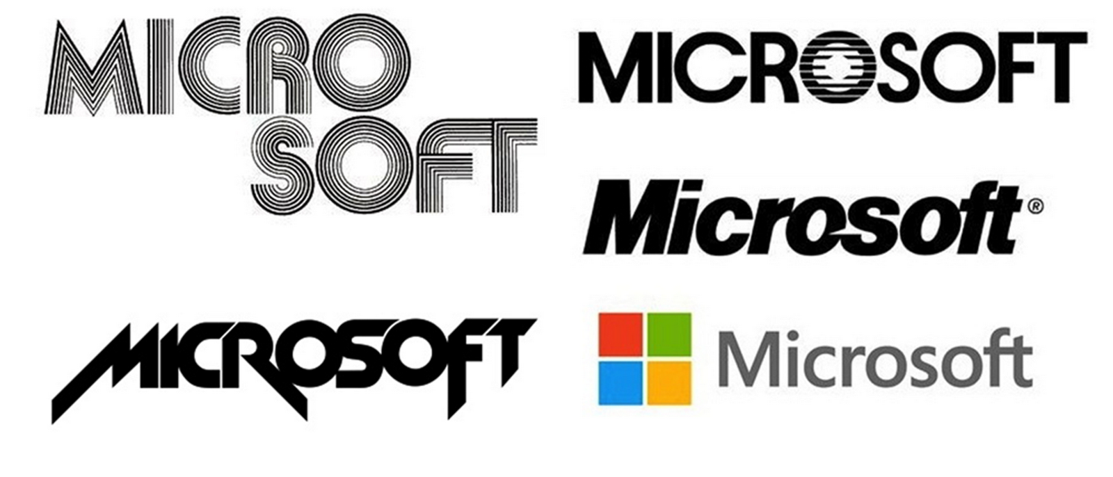
On the 23rd August Microsoft unveiled a new logo, 25 years after the last update, which will be used across all of its products and communications and is intended to "express the company’s diverse portfolio of products." The logo has two components: a logotype and a symbol. The logotype uses the Microsoft font Segoe, set in grey and loosely letter-spaced. This is a stark contrast to the previous logotype which used Helvetica, tightly set in black, with a slice taken out of the first 'o' to create an upward-pointing triangle with the left terminal of the 's'. The ligature between the last two letters exists in both logotypes, visually connecting old and new.

What I find most interesting about the new logo is the flattening of the Windows symbol which accompanies the new logotype. The Windows symbol - four squares of colours, red, green, blue and yellow separated by bars of white - has been through several redesigns, most recently as a kind of flowing magic carpet seen in perspective, complete with shading and 3D effects but in this latest version the squares are simply presented as coloured squares with no shadows or other visual trickery.


I've been thinking about some of the bizarre design choices of computer software interfaces for some time - hardly surprising when I spend so much time in front of the computer. I was dismayed when I saw the OS X Leopard dock on my first iMac: why did it have to be a shelf rendered in 3D? If the concept of the screen as a 'desktop' was relatively easy to grasp then what did the shelf represent? I started thinking of it as the lip that holds brushes and paints on an artist's easel. Similarly Garageband, one of my favourite ways to waste time, presented a similar conundrum with its wood-effect mixing desk, working sliders and knobs.

'Skeuomorph' does not appear in my 1996 Oxford Compact English Dictionary but acccording to Wikipedia, a skeuomorph is 'a derivative object that retains ornamental design cues to a structure that was necessary in the original.'

These functionally unnecessary skeuomorphic visual effects serve the purpose of making new technologies familiar to users: the digitally-rendered wooden bookcase containing leather-bound books with covers and pages makes Apple's iBook application understandable to those more accustomed to their analogue counterparts.

Microsoft, meanwhile have been quietly designing in another direction. Metro is a design language that was originally developed for the user interface of Windows phone. Instead of looking at other mobile phone or PC interfaces for inspiration the Windows Phone design team looked elsewhere: to the International Style of Josef Müller-Brockmann and others; to Massimo Vignelli's signage systems for the New York Subway System and his design for American Airlines; and to contemporary practitioners such as Experimental Jetset. The principles guiding the development of the design language championed reduction and refinement and clean and light typographically-based design with an emphasis on 'content, not chrome'. Crucially, the design team believed in an 'honesty of design': "A user interface is created of pixels, so in Metro we try to avoid using the skeuomorphic shading and glossiness used in some UI’s that try to mimic real world materials and objects." The design language developed for Metro informed the development of the new Microsoft logo as it as has informed the graphic design language being applied across all of Microsoft's products and communications including Microsoft's new operating system, Windows 8.

Online opinion is divided whether the new Microsoft logo is a good or bad thing. A user interface is different to a logo and while I applaud the design philosophy that has been applied to the design I wonder if it is distinctive enough to sell the ethos of the company. Apple's logo, based on the same silhouette of an apple with a bite taken out of it, has been through many mutations from the rainbow striped version of 1976 to the 3D rendered liquid metal version still in use today - albeit in a more toned-down version. Compared to the Microsoft logo, Apple's is more memorable and that's important: I think a logo that can be described in a few words is easily remembered and therefore more successful in terms of brand recognition.

I am seduced by the flatness of Microsoft's logo: it references the type of design that I am in thrall to and aspire to and this has prompted me to take a look at the design of the interface of Windows 8 which is highly appealing in its use of flat colours with very little use of digital 'shadows' or gradients. I've always felt that there was a discrepancy between the pared down minimalism of the design of the exterior of Apple's products and the overblown design of its user interface - think of how difficult it is to find something restrained in the iMac's library of desktops and screen savers. I don't think I'm ready to move on to a PC just yet but, with its embracing of flat design, looking back in time to the design philosophies of heroes such as Josef Müller-Brockmann, Microsoft somehow looks like the future.


http://en.wikipedia.org/wiki/Skeuomorph
http://windowsteamblog.com/windows_phone/b/wpdev/archive/2011/02/16/from-transportation-to-pixels.aspx
http://www.helveticafilm.com/newblog/2007/01/16/microsoft-arent-they-the-arial-guys/
http://timenerdworld.files.wordpress.com/2012/08/microsoftlogos.jpg
http://www.edibleapple.com/2009/04/20/the-evolution-and-history-of-the-apple-logo/


The Braille Room


The Braille Room, a publication that I designed for Giuseppe Mistretta's exhibition at the Centre for Contemporary Arts, Glasgow, 17-28 July 2012. The publication, featuring a text by the artist, took the form of a double-sided folded 'map', printed one colour, 746 x 470 mm. 

Archive

Search

Categories

Click here to subscribe to James Brook / Design

Please visit www.jamesbrook.net for more information

The content (content being images and text) of this website is copyright © James Brook
All rights expressly reserved
Powered by Blogger.