Barry McGlashan: Between The Dream And Waking
Published by The Scottish Gallery, Edinburgh, 2021
Texts by Tommy Zyw and Barry McGlashan
Photography by Stuart Johnstone
Designed by James Brook
ISBN 978 1 912900 43 5
Soft cover | 245 x 190 mm | 80 pages | Printed by J Thomson Colour Printers, Glasgow on Galerie Art Matt
Barry McGlashan is a painter based in Aberdeen, this is a catalogue that I designed for his exhibition, Between The Dream And Waking, at the Scottish Gallery, Edinburgh, from 28 October to 27 November 2021.
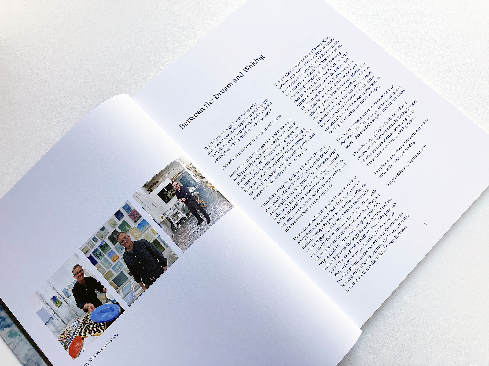
McGlashan studied painting at Grays School of Art, graduating in 1996; in 1998 he returned to Grays where he taught in the drawing and painting department until 2005 when he left teaching to pursue painting full-time. Informed by his knowledge of literature and art history, his wonderful paintings create immersive worlds for the viewer to inhabit that range from the intimate to the monumental.
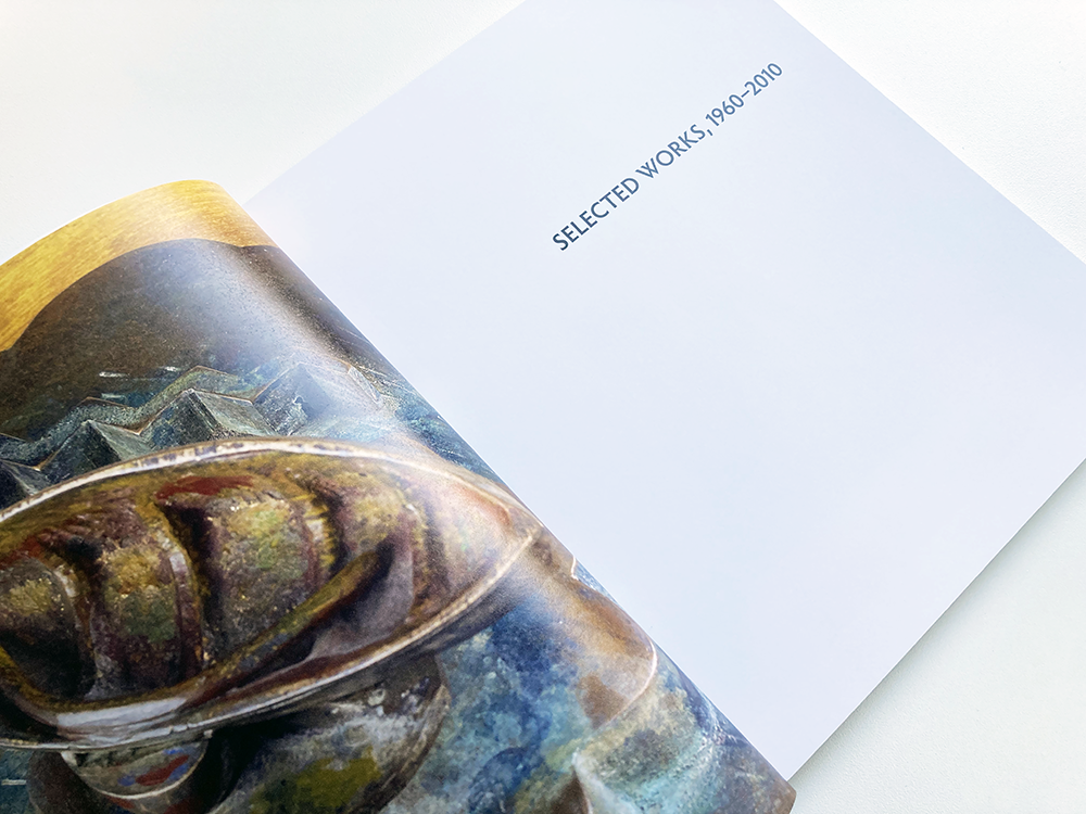
The works themselves also vary in size: in the exhibition there are paintings as small as 13 x 12 centimetres and works as large as 170 x 140 centimetres. For the catalogue, I devised a system of scaling that used the most common size of works in the exhibition, 30 x 21.5 centimetres, as a reference point for sizing the images in relation to each other; smaller images were scaled up and larger images were scaled down so that all are at a decent size on the page and no details are lost, but giving a sense of the scale of the works in relation to each other.
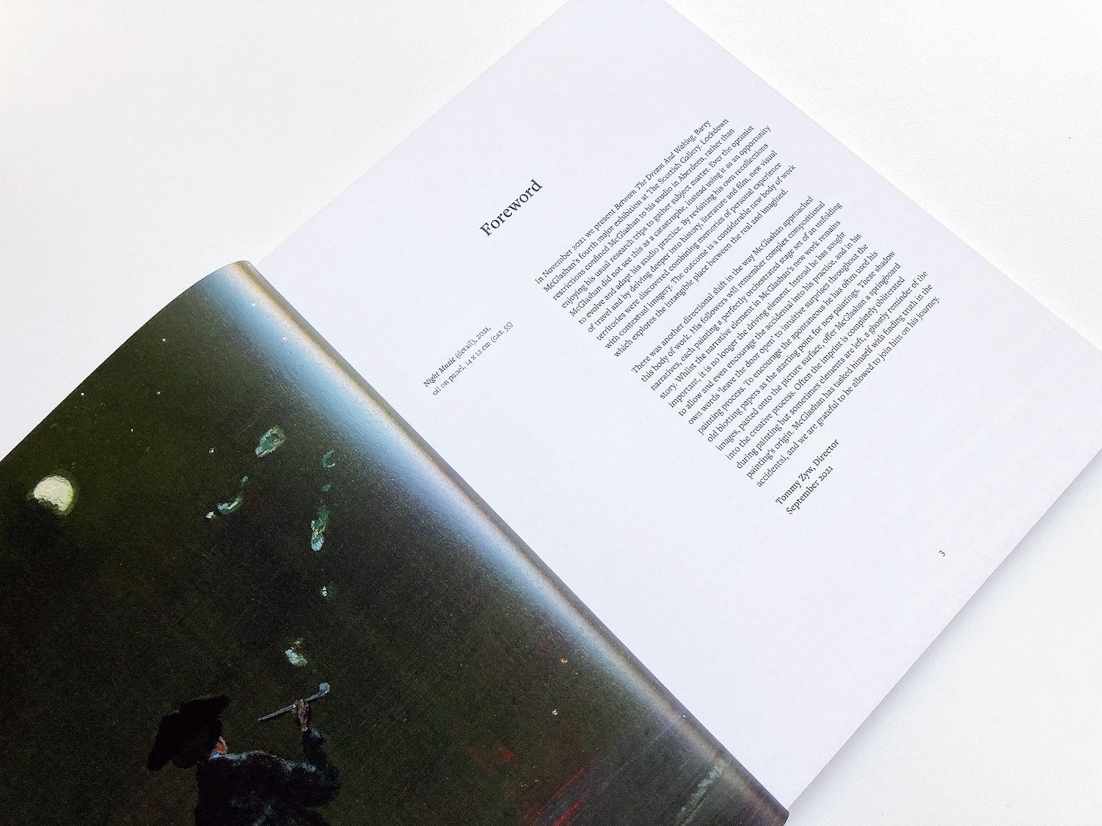
The storytelling in the artist’s work suggested a serif typeface, as traditionally used for text in story books; I used Freight Text Pro, a contemporary serif typeface, throughout the main body of the book with its sans-serif sibling, Freight Sans Pro for the secondary information at the front and back of the book. On the image pages, I used Freight Text Pro in various weights to create a hierarchy of information for the captions; the type was centred in short line lengths, with the caption centred on the page underneath the centred image creating a formal and traditional feel. Page numbers are also centred, giving a consistent baseline for the other elements to sit on. Elsewhere in the book, this centred layout is disrupted with ranged left typography and layouts based on the underlying grid, creating a tension in the design.
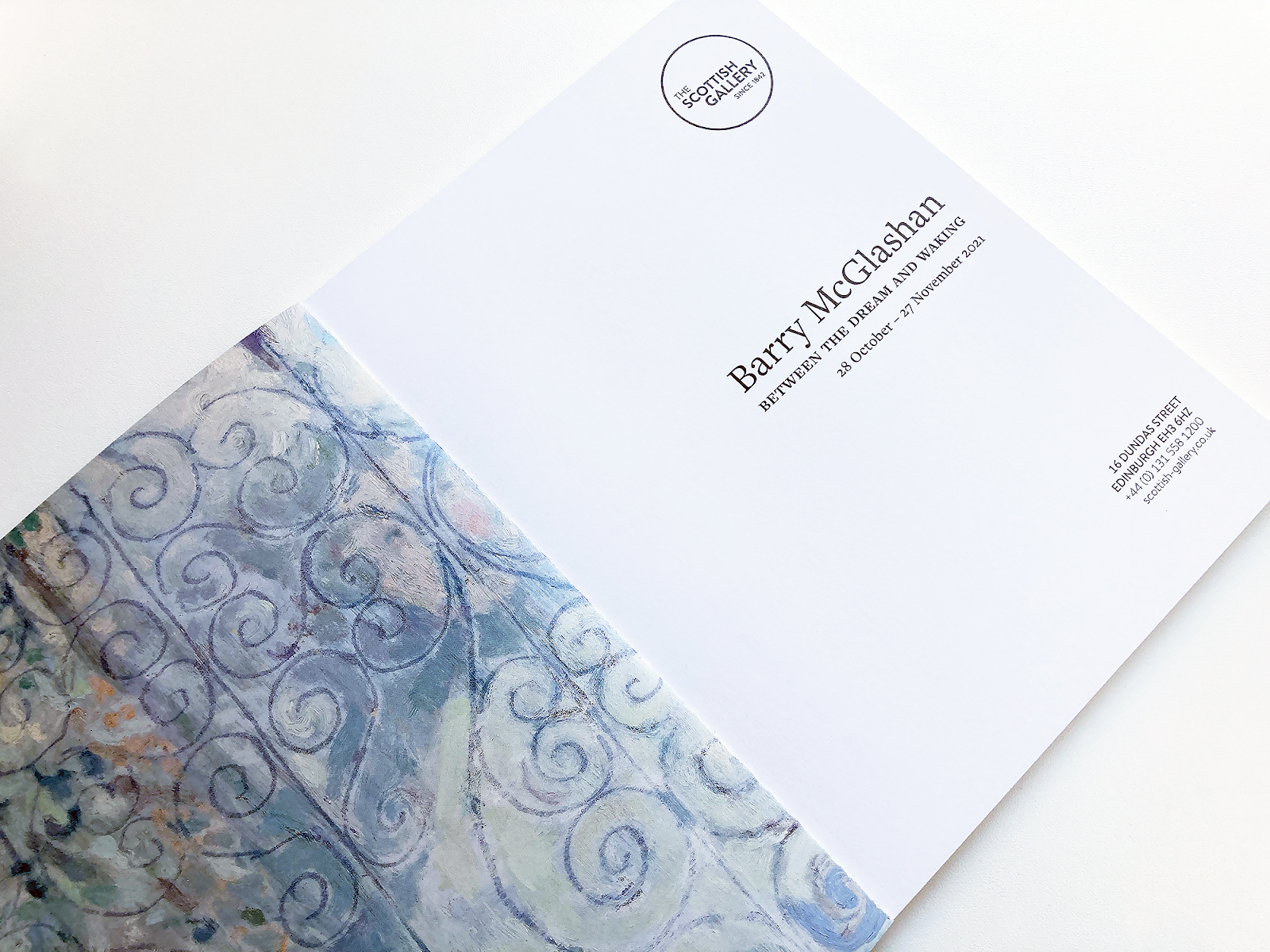
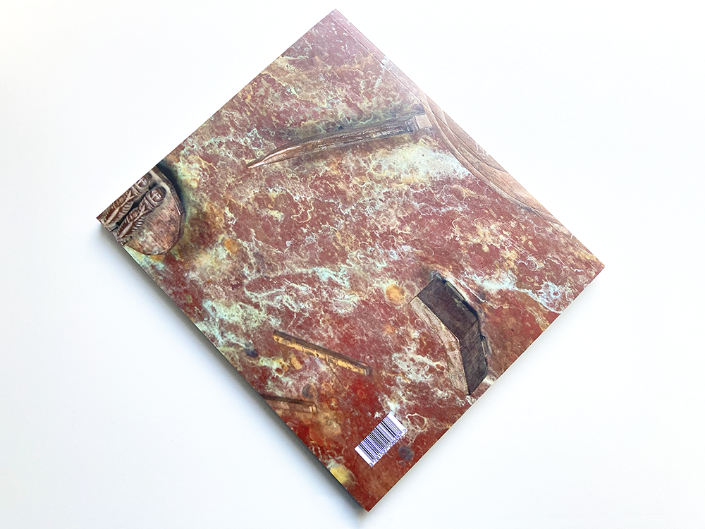
The front cover features a full bleed detail of McGlashan’s painting, The Blue Hour, a small oil painting on canvas of 30 x 26 centimetres that I felt encapsulated the title of the exhibition; the title is set in Freight Text Pro and is centred, giving a taste of the layout inside. On the back cover, I placed a full bleed detail of another small painting, Wake, this time more abstract, which sits well with the cover image, continuing the dreamlike feel and showing some of the diversity of McGlashan’s practice. On the inside covers, I used details from Veil, adding an unexpected decorative element to the book and, at this scale, revealing some of the beautiful brushwork in the painting.
Tommy Zyw, Director, The Scottish Gallery: I have had the pleasure to work on several exhibition catalogues with James Brook. James understands the individual requirements of the artist, gallery and audience. He has an in-depth knowledge of design and printing. This he combines with creative flair and a practical and hardworking approach.