Architecture & Morality, released in 1981 on the independent label Dindisc, was Orchestral Manoeuvres in The Dark’s third album and was arguably their most successful, both in terms of sales and of critical acclaim. The album presented a tension between tracks which foregrounded bleak electronic soundscapes and icy atmospherics such as Sealand and Architecture & Morality, and melodic songs such as Souvenir and Joan of Arc, which celebrated a pop sensibility.
Listening to the album immediately transports me back to the icy chill of my teenage bedroom (I grew up in Yorkshire, in a house with no central heating) and also to the metaphorical chill and feelings of isolation that, as an adolescent, I was trying out as a means of negotiating the world. There are few albums that take me back so completely to this time. And possibly because of these associations – and unlike other albums from the same time (the Human League’s Dare, for example) – I very rarely listen to Architecture & Morality.

Architecture & Morality was one of the first albums that I bought purely because of the cover. I already owned Maid of Orleans, a 12" single released by Orchestral Manoeuvres in The Dark (OMD) in 1981, and I adored its luxurious sleeve with an image of a stained glass window design printed on heavyweight silver mirror board, designed by Peter Saville (shown above). I pored over Saville’s use of uppercase Gill Sans; the use of empty space on the back cover with its centrally-placed and justified type; and the echo of the front cover typography on the silver on black record label. All these elements contributed to create a record sleeve that felt like nothing else of the time. The fact that the back sleeve carried a conflicting tracklisting to the label just added to the mystique.
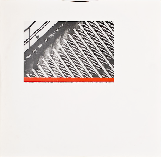
The cover of Architecture & Morality, designed by Peter Saville and Brett Wickens, is an homage to a very particular British take on 1930s Modernism, and features ranged left typography set exclusively in Gill Sans on a background of pale cream with bands of red; a die-cut square window reveals an inner sleeve photograph of light streaming through a steel staircase. The B&W photograph is perfectly positioned so that the dominant diagonal aligns with two corners of the square of the outer sleeve. The typography is in two weights and four sizes of Gill – the placing and alignment of type is perfectly considered and mathematically precise in its relationship to the other elements on the cover; all combine to create a cover that exemplifies Saville’s idea of designing a record sleeve that doesn’t look like a record: “It (the sleeve for New Order’s International) kept looking like a record cover. What do you want it to look like? A thing. Doesn’t a record cover constitute ‘a thing’? No, it’s a record cover first, and a thing second. I like the idea of it being a thing first and only secondarily a cover.”1

Saville often designs in series, with cover treatments for disparate clients sharing his interests and obsessions of that particular moment. Architecture & Morality’s closest neighbour would be Movement by New Order, also released in 1981, and featuring a similar arrangement of uppercase typography and bands of colours on a flat matt coloured backgound (shown below). Whilst Movement is pure pastiche – an appropriation of a 1932 Futurist exhibition poster designed by Fortunato Depero – Architecture & Morality, which could perhaps be seen as a distillation of the cover for Movement, is far more original – and possibly more compelling.

According to the sleeve notes, the title, Architecture & Morality, was ‘suggested by M. Ladly after a book by David Watkin (the title of the book is actually Morality and Architecture and is a critique of modernist architecture). Martha Ladly was a member of the Canadian band Martha and the Muffins, who were stable mates of OMD on Dindisc, she was also Saville’s girlfriend at the time. Saville was a director of Dindisc, a subsidiary label of Virgin; in an echo of his relationship to Factory Records, it’s clear that he was enjoying a huge amount of freedom in designing sleeves for Dindisc as well as contributing more than graphic design.
I recently moved house which inevitably, involved packing and unpacking my record collection; this gave me the impetus to re-visit some of my favourite record covers. Architecture & Morality still intrigues me: there’s something about the use of Gill, with its inherent blank stare, particularly in uppercase, which sets a tone that perfectly reflects the music within. Or maybe not. Perhaps the use of Gill, the Modernist typographic treatment and the oblique stentorian title give a gravitas to the music that is undeserved? After all, this is – despite its experimental affectations – essentially pop music, on a pop album, by a pop band.
I was curious to listen to the music afresh and bought a CD copy of the remastered album to see if I could lose the negative associations of my youth and to try to unravel the relationship between the cover art and the music within. The cover of the reissued CD loses, of course, the subtlety of Saville’s original design, with reconfigured and watered down typography and no die-cut window. Worse than that, the inner sleeve photograph is misaligned so that the diagonal that runs through the image does not point to the corners of the window. Are these pedantic details important? Well, when you’ve lived with something for 30 years, these familiar details take on a significance and resonance; and it is the attention to detail that made the original sleeves so compelling to me. Surprisingly, the music sounds incredibly fresh. Possibly because I have not played this album regularly and maybe because listening to it as remastered CD it is removed from the associations of the original LP sleeve, it sounds different. The memories of my teenage bedroom with no central heating, and the willful angst of adolescence are still there, but they are fading, to be replaced by new associations and memories.

My reappraisal of Architecture & Morality started me thinking about OMD’s next album Dazzle Ships, released in 1983 (shown above). The album was heavily delayed and, by the time the first single from the album, Genetic Engineering, was released, I had started my foundation course, lost interest in OMD, and moved on to other musics. The cover, however, intrigued me in the same way that the cover of Architecture & Morality had. The title of the album was ‘suggested by Peter Saville after a painting by Edward Wadsworth’, the painting in question being Dazzle-ships in Drydock at Liverpool, from the collection of the National Art Gallery of Canada in Ottawa, Canada (shown below). I already knew and loved Wadsworth’s work: there was a tempera painting, Pendent, in Huddersfield Art Gallery and another work, Faithful Servants (Marine), in Leeds City Art Gallery where there was also, I think, a woodcut of dazzle ships by Wadsworth. Dazzle camouflage was a paint scheme that was applied to ships during the first and second world wars consisting of geometric shapes in contrasting colours which were intended not to hide the ship, but which made the type of ship, the speed and the direction it was facing difficult to see when viewed at sea with naval rangefinders. Wadsworth himself had supervised the painting of over over two thousand warships during the first world war.

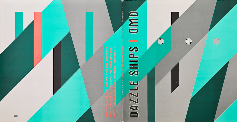
The credits for the Dazzle Ships sleeve lists five designers working under the banner of Peter Saville Associates and it is, as you might expect given the number of designers, a somewhat overblown, gatefold affair. The exterior is an approximation of dazzle camouflage rendered in greens and greys; the title of the album and ‘OMD’ are printed sideways on the left of the sleeve – the typeface is customised, possibly based on a condensed gothic typeface such as Impact and carries connotations of military or naval identification numbers as well as 1930s poster graphics. Like Architecture & Morality, the sleeve (in its original issue) features die-cuts, in this case, circular cut-outs that recall portholes and reveal details from the inner gatefold. When opened, further smaller die-cut holes show glimpses of the bright yellow of the inner sleeve (shown above and below).


What’s really intriguing about this sleeve are the credits for the album, which appear on the inside of the front gatefold: the credits are arranged in three columns and are set in two weights, regular and bold, of Helvetica. There is a similarity between Saville’s systematic use of Helvetica on this sleeve and on the record labels of New Order’s Blue Monday and Power, Corruption and Lies, both from 1983, the same year that Dazzle Ships was released. The labels for the New Order releases were based on the Diatype disc used in mechanical typesetting and, for the most part are a way of ordering information (Bold letters are used to mark the start of different types of information, for example) but, beyond ordering, this idiosyncratic use of uppercase, lowercase, bold, regular and italic appear to be an attempt by Saville to add another level of meaning to the text through typographic interventions. With the sleeve of Dazzle Ships, Saville took this intervention a step further, as illustrated below:
babies/mother
Hospital-Scissors
creature/JUDGEment
butcher-ENGINEER.
ROBOTICS a SCIENCE
tried in some factories
Functions & Adaptability
its own terminology
Auto-INDUSTRY production
Engineering technology
ROBOTICS a SCIENCE
frankenstein’s Monster

Whilst the outside of the sleeve carries connotations of first and second world war battleships, the inside carries connotations of cold war communications: a crudely-rendered map of the world is revealed, divided by timezones and punctuated by die-cut holes. Although the map is drawn in what could be perceived as a lo-res, early Mac graphic style, this is a pre-digital world, connected by radio communication, a point that immediately becomes obvious with song titles such as Telegraph, Radio Waves and Time Zones. Travel is alluded to by the presence of two ‘journeys’, one east to west, represented by the die-cut holes, and one north to south, represented by a pink dotted line. Local time and Greenwich Mean Time in six cities is shown in the bottom right hand corner: this appears to be a key to the map but does not seem to relate to any of the points on the ‘journeys’. A red herring or a decorative element to balance the design?

In early 1982, OMD’s record label, Dindisc, which had released Architecture & Morality, had been disbanded, so Dazzle Ships was released through Dindisc’s parent company, Virgin Records. In order to maintain the myth of independence, Dazzle Ships was packaged as if released on the fictional label ‘Telegraph’. Despite having a Virgin Records catalogue number, the designers cleverly established this conceit with record labels featuring a specially-designed ‘Telegraph’ logo which also appeared on the inner gatefold. Further intrigue was created with the inclusion of information that alluded to another company – possibly fictitious but probably OMD’s management company – White Noise Limited: ‘<Dazzle Ships> was produced and created by Orchestral Manoeuvres in the Dark for Telegraph and on behalf of White Noise Limited’.

Saville had previously played with these ideas of a group as part of a corporation or business on the sleeve for Architecture & Morality, which featured the strapline ‘This album was produced and created by Orchestral Manoeuvres in the Dark for White Noise Ltd. and on behalf of ARCHITETTURA INDUSTRIA.’ Architettura Industria being closely related to Grafica Industria, one of the many names that Saville designed under and who are credited with the design of New Order’s Movement album. Some New Order releases, although released on Factory Records, are packaged with a Saville-designed label that suggests that the record is released on a record label called ‘B music’. In fact, New Order’s publishing company was called B Music (sometimes ‘Bemusic’, othertimes ‘Be Music’). This exposure – using design games – of the relationship between record label, group and publisher raises interesting questions about how we consume music and is a furtherance of punk’s desire, as exemplifed in Malcolm Garret’s work for The Buzzcocks, to expose music as ‘product’ there to be consumed like any other commodity and to make money for the companies that sell it.

At this point, I should admit to an embarrassing confession: in the late eighties I had a copy of Dazzle Ships, in its original die-cut gatefold sleeve, which I bought cheaply, most probably from Record and Tape Exchange in Camden. I was seduced by the sleeve, less so by the music, which I listened to once and discarded. However, being seduced by the sleeve did not stop me cutting it up to make cassette covers for my own compilations (at the time, I was ‘running’ an imaginary record label, ‘The Sound Foundation’, with each ‘release’ obsessively numbered like those of Factory Records). I’m not entirely sure why I committed that act of vandalism, other than wanting The Sound Foundation to be imbued with some of the gravitas of Savile’s designs. None of these homemade cassette covers survive, probably because Saville’s design is so iconic that it’s hard to make a cover with it that doesn’t look like it belongs to the Dazzle Ships album. So, the outcome of this is that not only did I buy the remastered edition of the CD of Dazzle Ships but also a copy of the original vinyl, which I was fortunate enough to find – in reasonably pristine condition and with gatefold sleeve – in the local Oxfam shop.

Dazzle Ships is an absorbing and credible album; far more experimental and with fewer pop melodies than its predecessor: today it feels possibly even more out of time than it did in 1983. OMD’s music seems to be perfectly matched to Peter Saville Associates’ sleeve design: not only by the song titles which give obvious clues to the reference points for the design, but in the sounds and atmospheres that recall the retro-futurism of Kraftwerk, one of the acknowledged influences for the album, which is perfectly invoked in the cold war connotations of the sleeve design. The design for the CD is, inevitably, diluted but contains a pleasing and obsessive detail: unlike the CD label for the remastered CD of Architecture & Morality, the CD label on Dazzle Ships stays true to the vinyl release, faithfully reproducing the Telegraph logo and maintaining the conceit of an independent release.

The relationship between music and sleeve design is complex. I was initially drawn to both Architecture & Morality and Dazzle Ships through of the design of their sleeves. Both sleeves resonate deeply with me, and both have a connection to other sleeves – many designed by Peter Saville – that explore, through graphic design, themes that are often outside the remit of a record sleeve. The design of both sleeves acts as an indicator to the viewer of how the music might potentially sound; offering a way of approaching the music, decoding and understanding it. The music contained within these two sleeves affects me in different ways: sometimes deeply-felt, connecting me directly to the angst of my teenage bedroom and other times, more superficial. By the time I listened to Dazzle Ships, in my early twenties, I had lost the voracious appetite of my teenage years for investing in music, spending time with it, understanding it, and learning to love it: I bought lots of cheap secondhand records and, if the music didn’t live up to the potential of the sleeves, there was always another hoard waiting to be bought, designs loaded with possibilities.
Recent scientific research has suggested that the brain processes information differently as we get older: we struggle to recall recent events and facts while older memories remain vivid and are more easily recalled. With age comes insight – a perspective that allows us to look at the broader picture, placing memories in a wider context. The atmospheric soundscapes and melodic electronica of Architecture & Morality continue to act as a blueprint for some of the music that I to listen to, but, perhaps more revealingly, teenage art and design obsessions such as the paintings of Edward Wadsworth or Peter Saville’s cover of Architecture & Morality continue to inspire me, periodically re-entering my thoughts and informing the way I think about design (and art), often in unexpected ways. Perhaps our visual language is coded in our brain when we are young and, although it develops with age, experience and new inputs, those original stimuli that were so important to us – and that we devoured so voraciously – remain with us for life, subtly affecting and informing our design sensibilities.
1. Peter Saville interviewed by Christopher Wilson, Designed by Peter Saville, Frieze Books
Dazzle Ships images from http://www.hardformat.org