The history of letterforms is intertwined with the history of language. To understand this relationship better I read Orality and Literacy by Walter J Ong. This book outlines the relationship between speech, writing and print with specific reference to the differences between oral and literate cultures. The book is absolutely fascinating and offered me insights into how thought is manifested in non-writing cultures. Ong argues that abstract, conceptual thinking does not happen in oral cultures; simple ideas such as the names of shapes (circle, square, triangle etc) do not exist, these geometrical figures are identified with the names of objects (moon, door, mountain): “They (oral subjects) never dealt with abstract circles or squares but rather with concrete objects. Teachers’ school students on the other hand, moderately literate, identified geometrical figures by categorical geometric names: circles, squares, triangles and so on. They had been trained to give school-room answers not real-life responses.”[1]
Ong goes on to consider the massive changes that print and the shift from hearing dominance to sight dominance have precipitated. Ong talks about how “alphabetic writing broke up the word into spatial equivalents of phonemic units (in principle though the letters never quite worked out as totally phonemic indicators). But the letters used in writing do not exist before the text in which tey occur. With alphabetic letterpress print it is otherwise. Words are made out of units (types) which pre-exist as units before the words which they will constitute. Print suggests that words are far things far more than writing ever did.”[2]
In A type primer, John Kane talks about the ‘authorial voice’, an idea that occurs in many books about typography and how meaning is understood by the reader. Kane suggests that typographic hierarchy is one way in which the reader can be directed to understanding a text.
“Obviously there is no single way to express hierarchy within text; in fact, the possibilities are virtually limitless. Once clarity has been established, the typographer can – and should – establish a palette of weights and styles that best suits the material at hand and the voice of the author.”[3]
Ong has an interesting section on the residual effects of hearing culture and how that presents itself within the typographic hierarchy of the printed page in sixteenth century title pages:
“Inconsequential words may be set in huge type faces: on the title page shown here the initial ‘THE’ is by far the most prominent word of all. The result is often aesthetically pleasing as a visual design but it plays havoc with our present sense of textuality. Yet this practice, not our practice, is the original practice from which our present practice has deviated. Our attitudes are the ones that have changed, and thus that need to be explained. Why does the original, presumably more ‘natural’ procedure seem wrong to us? Because we feel the printed words before us as visual units (even though we sound them at least in the imagination when we read). Evidently, in processing text for meaning, the sixteenth century was concentrating less on the sight of the word and more on the sound than we do. All text involves sight and sound. But whereas we feel reading as a visual activity cueing in sounds for us, the early age of print still felt it as primarily a listening process, simply set in motion by sight. If you felt yourself as reader to be listening to words, what difference did it make if the visible text went its own visually aesthetic way? It will be recalled that pre-print manuscripts commonly ran words together or kept spaces between them minimal.”[4]
The Grid System
"Made popular by the International Typographic Style movement and pioneered by legends like Josef Müller-Brockmann and Wim Crouwel, the grid is the foundation of any solid design. The Grid System is an ever-growing resource where graphic designers can learn about grid systems, the golden ratio and baseline grids."
www.thegridsystem.org
www.thegridsystem.org
Josef Müller-Brockmann 2

“The grid system is an aid, not a guarantee. It permits a number of possible uses and each designer can look for a solution appropriate to his personal style. But one must learn how to use the grid; it is an art that requires practice.”
Josef Müller-Brockmann
See more
Josef Müller-Brockmann 1

"Order was always wishful thinking for me. For 60 years I have produced disorder in files, correspondence and books. In my work, however, I have always aspired to a distinct arrangement of typographic and pictorial elements, the clear identification of priorities. The formal organisation of the surface by means of the grid, a knowledge of the rules that govern legibility (lines length, word and letter spacing and so on) and the meaningful use of colour are among the tools a designer must master in order to complete his or her task in a rational and economic matter."
Josef Müller-Brockmann
Read more
Typographic Hierarchy 1


Further development of posters for Unit 2.3 Design and Rhetoric. With this set of posters I attempted to make work which was much 'calmer' than the previous set and which established typographic hierarchy with a limited set of variables.
The work was informed by a reading of Typography by Emil Ruder and A type primer by John Kane.
See also Typographic Hierarchy 2 & 3.
Cranbrook Design: The New Discourse

"Nothing pulls you into the territory between art and science quite as quickly as design. It is the borderline where contradictions and tensions exist between the quantifiable and the poetic. It is the field between desire and necessity. Designers thrive in those conditions, moving between land and water. A typical critique at Cranbrook can easily move in a matter of minutes between a discussion of the object as a validation of being to the precise mechanical proposal for actuating the object. The discussion moves from Heidegger to the "strange material of the week" or from Lyotard to printing technologies without missing a beat. The free flow of ideas, and the leaps from the technical to the mythical, stem from the attempt to maintain a studio platform that supports each student's search to find his or her own voice as a designer. The studio is a hothouse that enables students and faculty to encounter their own visions of the world and act on them-- a process that is at times chaotic, conflicting, and occasionally inspiring."
Read more
Word and Image
In The Alphabet versus the Goddess, Leonard Shlain comments on a return to image-based communication:
“To perceive things such as trees and buildings through images delivered to the eye, the brain uses wholeness, simultaneity, and synthesis. To ferret out the meaning of alphabetic writing, the brain relies instead on sequence, analysis and abstraction.”[1]
Similarly, in Left to Right by David Crow, the author looks at the cultural shift from word to image. Crow examines the evolution of image-based fonts which were developed alongside shifts in graphic design production and software. Now, typing a letter on a keyboard could bring up a symbol that was entirely different from the one we might expect. Although the fonts followed the convention of the Roman alphabet (and the interface of the computer keyboard) the result was a collection of symbols that was unreadable in the conventional sense but that, nevertheless, could be considered a language or dialect.
What I find particularly interesting about these symbol fonts is the relationship that they have to mark-making in painting or drawing. For Fuse 10 an interactive disk and poster package, founded in 1990 by Neville Brody and Jon Wozencroft, Brody created ‘Freeform' a symbol-based font, which he used to generate works that were genuinely experimental, pushing typography – and the purpose of typography - to extremes. Brody said of 'Freeform':
“The basic idea behind freeform typography is that the computer keyboard can also be used as a musical instrument or a painter’s palette. It can be used as a way to redefine the representation of digital language.”[2]
Fuse 10 generated a huge amount of negative criticism: the main one being that freeform typography was a contradiction in terms. The critics of Fuse claimed that the only purpose of letters is to transmit meaning. When letters are abstracted to the point that they stop performing this function, then they no longer can be letters nor, by extension, typography.
Jon Wozencroft defended their position:
“Conveying meaning is not the sole function of letters/symbols/pictograms. It is also communicating feelings and vision. Fuse 10 – Freeform did not aim to don the mantle of Art, nor to throw ourselves into absolute chaos. We wanted to explore and question typographic shapes and motives, to emphasize the essence of communication: to reach out, not to recede. Paradoxically, Freeform is more an artistic statement than a fixed message.”[3]
Elective A Visual Storytelling 3
I thought I'd try to reconfigure the Dracula book as a poster:


I like the idea of the text becoming one continuous text, almost like a page from a book, but I miss the sequential aspect of the book and the gradual revelation of information.
I'm not sure what I will show on Wednesday. I won't have a prototype of the book - maybe I'll show some colour copies of the posters and some spreads from the book.
The Meaning of Typefaces 2
The form of the word and the meaning of the word i.e. the signifier and the signified is arbitrary: the sound of the word and its written form has no relation to the thing itself.
“Duality freed concept and symbol from each other to the extent that change could now modify one without affecting the other”[1]
So, to some extent, the subtle changes of form that occur when a word is set in different typefaces has a marginal effect on the meaning of the word. However, as Jost Hochuli points out: “…typefaces – regardless of their optical legibility – trigger particular feelings on the part of readers simply through their appearance, and can have a positive or negative impact. This seems to be pragmatic evidence to show that, over and above their primary task of acting as a visual means of transport for language, typefaces are also able to communicate atmosphere.”[2]
Herbert Spencer notes “that findings of congeniality (in analyses of typefaces) may have little temporal stability, and such an examination supports Warde’s view, that the choice of an appropriate typeface is a subconscious act, the effect of which is ephemeral. We must also reflect that sans-serif letterforms which have been much used in this century to express the notion of ‘modernity’ were first revived in the eighteenth century because of their associations with rugged antiquity.”[3]
Typefaces themselves do not carry meaning; the words themselves signify meaning and the typeface can carry atmosphere. The same text set in different typefaces will have a different appearance and will represent that text differently. The typographic details (type size, arrangement, position on page etc) contribute to this effect. However, it seemed to me, that analyzing the effect of a typeface would always be subjective. As Jost Hochuli points out “For typographers, ananlyses of the impression created by typefaces are thus often purely theoretical: they neglect the sheer complexity of typographic practice.”[4]
‘A type primer’ by John Kane contains a really useful introduction to the history of the alphabet. Kane charts the development of the alphabet from its roots in Phoenician votive steles, dating from 4th century B.C.E. and found in Carthage, Tunisia where the text was scratched into wet clay with a pointed stick, through to Adrian Frutiger’s grid of the various weights and widths of Univers, released in 1957 for the new technology of photo typesetting.
Kane’s history is useful for positioning the evolutions in typeface design within the social, economic and technological developments of the time – and also the aesthetic trends of that moment. Kane presents technical terms for describing letterforms and guidelines for describing typefaces. He also presents a simple classification of type, based on a system devised by Alexander Lawson. These are all useful tools for describing the shape of letterforms and the differences between typefaces but Kane is as vague as Jost Hochuli when expanding on the atmosphere or, as he calls it, ‘texture’ of a typeface:
“Beyond learning about the unique characteristics of each typeface – and understanding its place in history – it’s very important to understand how different typefaces feel as text. Different typefaces suit different messages. A good typographer has to know which typeface best suits the message at hand.”[5]


Language
My research in unit 2.3 Design and rhetoric has focused on language, in particular the relationship between speech, writing and typography. I am interested in the idea of typography as a faulty transmitter, a language at one remove from writing, which, in turn, is a language at one remove from speech.
Language is constructed from a set of units called phonemes - these are the sounds from which words are constructed. The meaning of the individual phonemes disappears as they are joined together – in limitless ways - to create words. Language, then, is a system of representation: a letter represents a sound; a word (a collection of letters) represents an object or rather, a mental picture of an object. A word contains two parts: the signifier and the signified, a sign is produced when these two parts are brought together. The relationship between signifier and signified is arbitrary: in different languages, different words signify the signified: a different set of phenomes is used. In every language these phenomes are arbitrary: the word used to signify an object bears no relationship – either in its spoken or written form – to the thing itself.
“All that is necessary for any language to exist is an agreement amongst a group of people that one thing will stand for another. Furthermore, these agreements can be made quite independently of agreements in other communities”[1]
In his book Orality and Literacy, Walter J Ong states:
“Jacques Derrida has made the point that: ‘there is no linguistic sign before writing’. But neither is there a linguistic ‘sign’ after writing if the oral reference of the written text is adverted to. Though it releases unheard-of potentials of the word, a textual, visual representation of a word is not a real word, but a ‘secondary modeling system’. Thought is nested in speech, not in texts, all of which have their meanings through reference of the visible symbol to the world of sound. What the reader is seeing on this page are not real words but coded symbols whereby a properly informed human being can evoke in his or her consciousness real words, in actual or imagined sound. It is impossible for script to be more than marks on a surface unless it is used by a conscious human being as a cue to sounded words, real or imagined, directly or indirectly.”[2]
“(Saussure) saw speech as the original, natural medium of language of language, while writing is an external system of signs (For example the alphabet) whose sole purpose is to represent speech. Writing is thus a language depicting another language, a set of signs for representing signs. Typography, then, is removed one step further as a medium whose signified is not words themselves, but rather the alphabet.”[3]
[3] A Natural History of Typography by J. Abbott Miller and Ellen Lupton, published in Looking Closer, Critical Writings on Graphic Design, edited by Michael Bierut, William Drenttel, Steven Heller and DK Holland, 1994
Elective B Type Design 2
Here are my tools drawings re-scaled so that the clamp (hopefully) no longer dominates. All have been scaled so that they relate to each other more successfully - though the scaling isn't necessarily true to reality.

And here are my glyphs. The glyphs are based on the typeface Akkurat.

Some glyphs are proving to be more problematic than others. The clamp has been through many stages and the chisel through 11 different versions. The main problem was that my drawings had become very symmetrical. I needed to break up the symmetry in the glyphs to create more of an interesting relationship between the glyphs. I love the spanner!
And here are my glyphs. The glyphs are based on the typeface Akkurat.
Some glyphs are proving to be more problematic than others. The clamp has been through many stages and the chisel through 11 different versions. The main problem was that my drawings had become very symmetrical. I needed to break up the symmetry in the glyphs to create more of an interesting relationship between the glyphs. I love the spanner!
Repetition


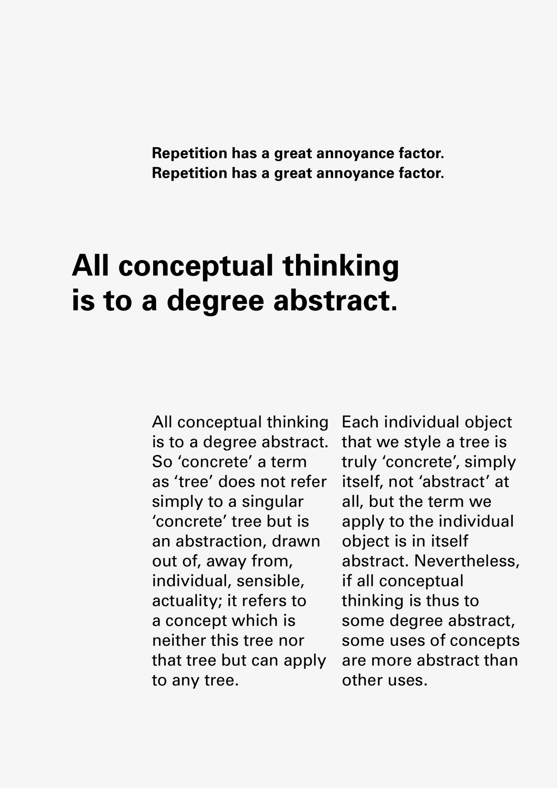


Development of posters for Unit 2.3 Design and Rhetoric.
Text from Orality and Literacy by Walter J. Ong.

Expressive Typography / Expressive Typefaces
I have been thinking about the differences between expressive typefaces and expressive typography. For me, expressive typefaces are typefaces that have a strong character: a good, but obvious example, would be Comic Sans. Expressive typefaces shout ‘personality’ in a manner that is emphatic and prescriptive; it is difficult to subvert or alter the meaning of the typeface as it is so enmeshed in its DNA.

Above: Detail of Rotis Sans Serif designed by Otl Aicher, 1988
Expressive typefaces are often used as display faces because they draw attention to themselves and are unsuitable for extended reading in body text because of their idiosyncrasies: the individual letterforms jump out. This can also be true of typefaces that are not generally considered to be either display faces or expressive: Rotis by Otl Aicher, for example, has many peculiar features that disrupt the reading experience.

Above: Rotis Sans Serif designed by Otl Aicher, 1988
Expressive typography meanwhile, attempts to animate a text by using different font styles, weights, sizes, line length, upper and lower case and punctuation. These are the tools that the typographer can use to affect the reading of a text. In an interview from 1995 Erik van Bolland, creator of ‘Beowulf’, the ‘first typeface with a mind of its own’ talked about experimental typography:
“It takes a poor typographer to be convinced that letters are only meant to convey meaning. If you follow this line of reasoning you could also argue that a plane is the same thing as a bicycle, “because it transports people from one place to another.” Just like there are different modes of transportation to get things from one place to another, there also are different kinds of letters to communicate different types of messages.
Letters are peculiar things, and readers can take quite a bit. It is possible to create shapes that are individually unrecognisable as letters, but that are readable when put in context. This means that fascinating things happen in your head when you read. The parameters of reading, the letter shapes, context, character size, paper stock, spacing, … all influence the reading process. This is what typographers and type designers are dealing with. By changing the separate components you learn more about the whole.”[1]

Above: Beowulf font designed by Just van Rossum and Erik van Blokland, 1990
Do these ‘tools’ have a correlation to mark-making in drawing? I wondered if this might be a possible line of enquiry for my Design and Rhetoric research. Would it be possible to analyse the meanings of these marks? Is it possible to analyse typography in the same way that one can analyse the marks in a drawing by Matisse? I found it interesting that in ‘The Graphic Language of Neville Brody’, Jon Wozencroft used a language to describe Brody’s practice that an art historian might use to describe fine art practice.

Above: Poster designed by Neville Brody with FF Blur typeface, 1992
[1] Yves Peters, 20 Years of FontShop: Vintage FUSE interview
http://fontfeed.com/archives/20-years-of-fontshop-vintage-fuse-interview/
Above: Detail of Rotis Sans Serif designed by Otl Aicher, 1988
Expressive typefaces are often used as display faces because they draw attention to themselves and are unsuitable for extended reading in body text because of their idiosyncrasies: the individual letterforms jump out. This can also be true of typefaces that are not generally considered to be either display faces or expressive: Rotis by Otl Aicher, for example, has many peculiar features that disrupt the reading experience.
Above: Rotis Sans Serif designed by Otl Aicher, 1988
Expressive typography meanwhile, attempts to animate a text by using different font styles, weights, sizes, line length, upper and lower case and punctuation. These are the tools that the typographer can use to affect the reading of a text. In an interview from 1995 Erik van Bolland, creator of ‘Beowulf’, the ‘first typeface with a mind of its own’ talked about experimental typography:
“It takes a poor typographer to be convinced that letters are only meant to convey meaning. If you follow this line of reasoning you could also argue that a plane is the same thing as a bicycle, “because it transports people from one place to another.” Just like there are different modes of transportation to get things from one place to another, there also are different kinds of letters to communicate different types of messages.
Letters are peculiar things, and readers can take quite a bit. It is possible to create shapes that are individually unrecognisable as letters, but that are readable when put in context. This means that fascinating things happen in your head when you read. The parameters of reading, the letter shapes, context, character size, paper stock, spacing, … all influence the reading process. This is what typographers and type designers are dealing with. By changing the separate components you learn more about the whole.”[1]
Above: Beowulf font designed by Just van Rossum and Erik van Blokland, 1990
Do these ‘tools’ have a correlation to mark-making in drawing? I wondered if this might be a possible line of enquiry for my Design and Rhetoric research. Would it be possible to analyse the meanings of these marks? Is it possible to analyse typography in the same way that one can analyse the marks in a drawing by Matisse? I found it interesting that in ‘The Graphic Language of Neville Brody’, Jon Wozencroft used a language to describe Brody’s practice that an art historian might use to describe fine art practice.
Above: Poster designed by Neville Brody with FF Blur typeface, 1992
[1] Yves Peters, 20 Years of FontShop: Vintage FUSE interview
http://fontfeed.com/archives/20-years-of-fontshop-vintage-fuse-interview/
Caroline Fabès
'Times New Ramon 12 & 112' by Caroline Fabès


'Akkruat 12 & 112' by Caroline Fabès


Akkruat 12 & 112 and Times New Ramon 12 & 112 typefaces in four styles (Left, Right, Up and Down) made according to the transformation process of the area occupied by each letter in 12pt and 112pt size Akkurat and Times New Roman typefaces.
"The protocol I have set up first consists in pushing all the pixels of a same horizontal line to the left, sticking them to each other. The pixels are then flattened against a vertical axis that marks the left edge of the letter, while respecting the skeleton of the chosen basic character. The shape obtained covers a similar surface as the original drawing – but with a different outline. By repeating this process towards the right, then upwards, and finally downwards, we get four variants of a typeface (Left, Right, Up, and Down)."
www.carolinefabes.com
'Akkruat 12 & 112' by Caroline Fabès
Akkruat 12 & 112 and Times New Ramon 12 & 112 typefaces in four styles (Left, Right, Up and Down) made according to the transformation process of the area occupied by each letter in 12pt and 112pt size Akkurat and Times New Roman typefaces.
"The protocol I have set up first consists in pushing all the pixels of a same horizontal line to the left, sticking them to each other. The pixels are then flattened against a vertical axis that marks the left edge of the letter, while respecting the skeleton of the chosen basic character. The shape obtained covers a similar surface as the original drawing – but with a different outline. By repeating this process towards the right, then upwards, and finally downwards, we get four variants of a typeface (Left, Right, Up, and Down)."
www.carolinefabes.com
MPP Draft 1.1
This is still not my final version:
Research Question
Is it possible to make typography that enhances the content of a text in a manner that is functional i.e. readable but that does not resort to superficial visual tricks to amplify meaning?
Aims and Objectives
To examine the relationship between language, text and typography.
To develop an understanding of the nuances of typography, particularly typographic hierarchy and the extent to which the reader can be controlled or manipulated by these interventions.
To further develop the polarised debate that dichotomises Modernist typography against post-Modern typography.
To create a way forward that melds text and typography to reinforce meaning.
Audience
Visually-literate readers: publishers, artists, typographers and designers.
Context
My initial idea was to work with chapter-length, continuous texts, however, my outcomes in unit 2.3 have been posters – as there is a difference between design for posters and design for books, my initial research will look at posters and shorter texts.
Left to Right by David Crow has been a good introduction to the area of study.
Orality and Literacy by Walter Ong has been a great starting point for thinking about the relationship between between language, text and typography.
On Typographic Signification by Gerard Mermoz has helped crystallise some of my ideas and has pointed the way to further reading and research.
Bridget Wilkin’s essay Type and Image has been a starting point for thinking about the potential for typography to exist in spaces outside of the modernist grid.
Action Plan
Generate a series of works that explore typographic hierarchies.
Research typographic hierarchies within early and mid Modernism, in particular, the work of Josef Müller-Brockmann, Emil Ruder and Armin Hofmann.
Survey typography by Wolfgang Weingart, Rudy van der Lans, Catherine McCoy and April Greiman - and more recent work by APFEL and Marian Bantjes.
Research other forms of typographic information eg. Road signs by Jock Kinneir and Margaret Calvert?
Reading List
Of Grammatology by Jacques Derrida
The Alphabet versus the Goddess by Leonard Shlain.
Detail in Typography by Jost Hochuli
Designing Books by Jost Hochuli and Robin Kinross
The Form of the Book Book by Sara De Bondt & Fraser Muggeridge
Typography Today by Helmut Schmid
Texts on Type: Critical Writings on Typography edited by Steven Heller & Phillip B Meggs
Elective A Visual Storytelling 2
My starting point is the absence of Dracula in the original text - he exists mainly as an idea and there are few descriptions of him; he becomes a monster created by our own minds.
There are 34 references to 'Dracula' in the entire book (and 104 references to 'blood'). I collected together all the sentences that contained the word 'Dracula' to make a kind of parastic book based on the original novel.
There are two versions that I have been working on. In the first I systematically increased the stroke weight of the word 'Dracula'. I experimented with different faces but Times was the most effective. After 34 iterations the word 'Dracula' became unreadable - a spiky monster, that could almost be a bat, appeared.


In the second version I systematically blurred the word 'Dracula' over 34 iterations until the word disappeared. The more we read about Dracula, the more elusive he becomes: "All that is solid melts into air".


There is another version which uses a similar technique with the 104 references to blood. The narrative becomes a condensed version of the full story, I've called it 'Filthy Leech' because of its bloodsucking relationship to the original text.
I've also made an animation but it looks a bit rough. It could probably benefit from some music too:
There are 34 references to 'Dracula' in the entire book (and 104 references to 'blood'). I collected together all the sentences that contained the word 'Dracula' to make a kind of parastic book based on the original novel.
There are two versions that I have been working on. In the first I systematically increased the stroke weight of the word 'Dracula'. I experimented with different faces but Times was the most effective. After 34 iterations the word 'Dracula' became unreadable - a spiky monster, that could almost be a bat, appeared.
In the second version I systematically blurred the word 'Dracula' over 34 iterations until the word disappeared. The more we read about Dracula, the more elusive he becomes: "All that is solid melts into air".

There is another version which uses a similar technique with the 104 references to blood. The narrative becomes a condensed version of the full story, I've called it 'Filthy Leech' because of its bloodsucking relationship to the original text.
I've also made an animation but it looks a bit rough. It could probably benefit from some music too:
Subscribe to:
Posts (Atom)