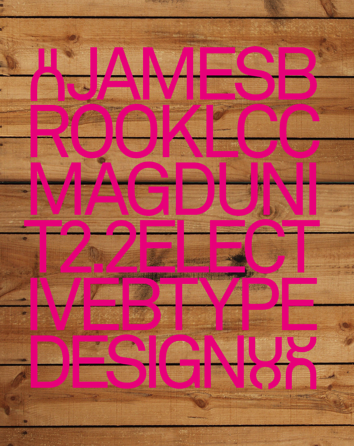
Context
My research in Unit 2.3 Design and Rhetoric focused on language, in particular the relationship between speech, writing and typography. I researched the idea of typography as a faulty transmitter, a language at one remove from writing, which, in turn, is a language at one remove from speech. Informed by the linguist Ferdinand de Saussure’s concepts of linguistics and semiotics, I am interested in how thought is mediated through writing and how ideas are disseminated through print.
My research looked at how meaning might be – if not fixed – then amplified by typography. I researched the ways in which designers use typography to direct or control the reading of a text. I was particularly interested in the construction of hierarchy using typography and how these interventions might be used to control, direct or manipulate the reader. I realised that, in terms of my outcome for the Major Project Proposal my work was lacking in focus. During the course of the study period, the focus of my research shifted: from work that attempted to amplify the authorial voice to work that also examined typographic hierarchy. I needed to find a focus for the project and a set of materials that I could use as a testing ground. I arrived at the idea of cookery books as a useful – and accesible – vehicle on which I could hang the ideas that I had been exploring.
One of the main reasons for picking recipe / cook books as an area of research is that I’m interested in the dichotomy between modernism and post-modernism, the push and pull between rationalisation and expressiveness. Cook books are an ideal vehicle because you have recipes that can be rationalised with typographic hierarchy, combined with the authorial voice or tone which can be presented in a more expressive way. My research will look at how Modernism informs the typographic hierarchy and layout of recipes and how the graphic language of cook books is created through graphic design.
My work for Design and Rhetoric had looked at how typography could intervene in a text, directing and controlling the reading of it. To inform my understanding of the relationship between language, writing and typography, I was reading texts such as Orality and Literacy by Walter J Ong. I was using these texts to make work that explored these ideas. This became problematic for two reasons: the work became too self-referential, a closed circle; I also realised that I was only scratching the surface of the texts that I was reading.
Without an in-depth understanding and comprehension of the context of the texts I was reading there was a danger that my attempts to amplify the meaning within those texts would remain superficial. I had also found that working with these texts made it difficult for my peer group to make constructive crtiticism about my work, without reading the texts themselves. I felt that recipe books offered a more accesible research subject, one which I have a previous knowledge of, and that would be fun and enlightening to pursue. In addition, I think my findings will have more relevance to other genres of book publishing than my previous research focus.
One of my main objectives of doing the MA is to better understand why I make design decisions and why I am drawn to certain styles of design. This research question will enable me to comprehend those decisions; it will expand my knowledge of design and enable me to articulate more clearly the thinking behind my design decisions.
This project will use my initial research into the relationship between language, text and typography to survey the typography of recipe/cookery books but will also be a platform for thinking about graphic design in the wider sphere of book design.
Recipe Books
The recipe / cook book exists on many different levels: as lists of recipes; as historical document; as reflections on food; as distillation of lifestyle; as propaganda; as autobiography. Recipes are presented in numerous ways that reflect the diversity of approaches to typographic hierarchy: as simple lists of ingredients; as sets of instructions; as diagrams; as sequential photographs; as continuous text; as bullet-pointed lists of instructions; as numbered lists of instructions; as conversations. How this information is presented will be the primary focus of a visual audit that will unpick the various typographic means that hierarchy is created within the convention of the recipe (recipes generally consist of a list of ingredients, sometimes a list of equipment, a set of oven temperatures and cooking times, a set of instructions and a set of timings for preparation and cooking).
A second focus of the visual audit will be the graphic language of recipe / cook books: how the authorial voice is created and amplified through typography, photography and graphic design.
Cook books exist on many different socio-political levels: in the seventeenth century recipe or receipt books contained a sometimes queasy mix of culinary and medical recipes; they can be political – wartime cook books as issued by the Ministry of Food are a kind of propaganda, vegetarian cook books can be positioned within the wider sphere of alternative anti-establishment lifestyles that emerged in the 1960s; cook books can be instructional in the forms of kitchen bibles aimed largely at women setting up home; they can exist as historical documents, reflecting the changes in eating habits for example the interest in Mediterranean food that coincided with the rise of air travel; they can also be aspirational, reflecting an idealised lifestyle as presented through food.
Traditionally, most domestic cook books have been aimed at women, as it is women who have traditionally maintained the home; cook books reflect the contemporary shift in domestic arrangements where (some) men now share the cooking.
Some cook books are aimed at professional chefs but I intend to concentrate on books that are aimed at the home cook. There are many different categories of cook books that are aimed for the home or amateur cook: kitchen bibles are basic reference books that include all types of cooking and sometimes home management (Delia Smith’s Complete Cookery Course); some are linked to restaurants (The Moro Cookbook); others to professional chefs (Gordon Ramsay); some are linked to television or newspaper columns (Jamie Oliver, Nigella Lawson and Nigel Slater); ethnic or international cook books look at cooking from other cultures (The Silver Spoon and Madhur Jaffrey); other books look at single subjects - a specific ingredient, technique, or class of dishes (The River Cottage Fish Book); some are about food history (Marguerite Patten’s Century of British Cooking).
The history of recipe / cook books is rich and extensive. A historical survey of cook books will be useful for contextualising my findings. I will need to narrow my focus: I have a large selection of books from the past fifty years (some of them illustrated here) but I think it may be wiser to limit my visual audit to books produced within the last twenty years as they will reflect the surge of interest in both cooking and books about cooking. As well as my own collection of books I will be able to draw on the books owned by my friends and from fellow students at LCC. Libraries will be another source of research material.
Finding a Focus
Towards the end of Unit 2, I began to realise that in terms of my outcome for the Major Project Proposal and, to some extent, in Design and Rhetoric, my work was lacking in focus or, rather, it was becoming too self-referential: I was making works that looked at the relationship between speech, writing and typography using, as source material or case studies, texts that looked at the relationship between speech, writing and typography. As satisfying as I find these circular, self-referential relationships, I began to realise that my outcome was becoming too much of a closed circle.
To some extent, the focus of my research had shifted: from work that attempted to amplify the authorial voice to work that examined typographic hierarchy. One of my main objectives of doing the MA was to try and understand why I made design decisions and to understand why I was drawn to certain types of design, proritising them above others.
It became clear that I needed a strong but simple focus to the project and a set of materials that I could use as a testing ground that I could hang my ideas on to and to start to explore and make sense of those ideas. Paul suggested (possibly half-jokingly) that cook books could be a possible focus. This immediately struck a chord. Living and Eating by John Pawson and Annie Bell had already been mentioned in a previous tutorial so a seed had been planted and, as it grew, I began to think that cook books could be a useful focus for my research. I am a keen cook and I collect cook books: I have about 35 books, ranging from facsimile cookbooks such as A Plain Cookery Book for the Working Classes by Charles Elmé Francatelli through 1960s vegetarian cook books to The Moro Cookbook via books by Nigel Slater and Nigella Lawson.
Above: Living and Eating by John Pawson and Annie Bell, US edition published by Clarkson Potter, 2001.
New Faces
From the introduction to Emily King’s doctoral thesis which focuses on typeface design in the United States, England and the Netherlands between 1987 and 1997.
"An anomaly amongst writing upon typography, this thesis is the work of a design historian rather than a typographic insider. For the most part, the history of type design has been the territory of those within the trade. Accounts of the development of letterform have appeared in their own right and been included within histories of printing, typography and later graphic design, but in spite of their variety, these studies almost uniformly fail to put the design of type and of printed material into any kind of broader cultural, economic or social context. Instead, they have tended to concentrate upon the evolution of form. In her book The Printing Revolution in Early modern Europe, Elizabeth Eisenstein pointed out that, although the history of printing is an integral part of the history of civilisation, studies of the subject “are isolated and artificially sealed off from the rest of historical literature” and “are seldom consulted by scholars who work in any other field”.[1]
[1] p.4, Eisenstein, Elizabeth, 1983, The Printing Revolution in Early Modern Europe, Cambridge University Press, Cambridge
Read more
The Golden Section
I have been reading about proportion in the page. I came across the above poster by Antonio Carusone on AisleOne which perfectly illustrates the Rule of Thirds, a compositional rule in visual art and design. The rule divides an image into nine equal parts by two equally-spaced horizontal lines and two equally-spaced vertical lines. Important compositional elements are placed along these lines or their intersections to create more tension, energy and interest in the composition than if these elements were simply centered. I measured my A1 Design and Rhetoric posters and found that the poster is almost divided into thirds by the square. The title line actually sits on the line dividing the bottom third of the poster.
The Golden Section, sometimes called 'divine proportion' is the relationship that occurs between two numbers when the ration of the smaller to the larger is the sum of the two. The formula expressing this relationship is a:b=b:(a+b). The aspect ratio described by a Golden Section is 1:1.618. I decided that, as an exercise, it might be interesting to re-work my Design and Rhetoric poster using the Golden Section.
Compared to the A1 version the proportions are somewhat elongated and the square no longer feels like the dominant element. I prefer the A1 version but it's interesting to look at the same information reformatted to fit The Golden Section. It's also interesting to examine some of the geometry that underpins some of my more intuitive design decisions where compositions are created based on feelings rather than logical thought.
In Designing Books: Practice and Theory, Jost Hochuli and Robin Kinross talk about some other proportions of the book:
"Certain numerical proportions work better than those that are arbitarily chosen. The following proportions of width to height have proved themselves:
The Fibonacci-series proportions: 1:2, 2:3 (the proportions of Designing Books: Practice and Theory, 170 x 255mm), 3:5, 5:8 (a rational approximation to the Golden Section); the rational proportions 3:4 (for large-size books) and 5:9; the irrational proportions 1:√2 (1:1.414), 1:√3 (1:1.732), the rectangle derived from the pentagon (1:1.538), and the Golden Section (1:1.618), which almost has the rational proportions of the Fibonacci series."
Personally, I am a fan of ISO A series of paper sizes. I find the proportion of these paper sizes satisfying to look at and to work with, the height-to-width ratio of all pages is the square root of two (1.4142:1). I'm also interested in an economy of means, using office technologies such as photocopying and spiral binding to make outputs - and A paper sizes are widely available.
The Frutiger Grid
Typefaces belong to a larger system: a system of classification that organises typeface families by size, style and weight. Adrian Frutiger is a Swiss typeface designer, most well known for the typefaces Univers and Frutiger. In order to help designers understand how to use the different tyefaces within Univers he created the Frutiger grid, a system that still resonates today. The Frutiger grid uses a system of numbers to classify a typeface. The first number in the system refers to the character weight - two is the thinnest and nine is the thickest. The second number refers to the character width and whether roman or oblique - three is the widest or most expanded and nine is the most condensed. The Frutiger grid is a system of rules for creating good typography: for example, weights that are two numbers apart always combine well together as part of a design.
Emphasis
"The classic means of giving emphasis to a word or phrase in continuous text is to set it in italic. Common experience suggests that italic is somehat slower to read than roman type and its use in large quantities is not appreciated by readers. Used sparingly, it has the advantage of attracting the reader's attention without disturbing the flow of text.
The same is true of small caps. These are capitals whose optical height is the same as the x-height of the lowercase. They cannot be substituted by a smaller size of capitals, as these will look too pale, on account of their reduction in size. The weight of true small caps is the same as that of their uppercase and lowercase, but their proportions are broader than those of the capitals. Whether or not small caps should be spaced is sometimes disputed; in the author's opinion, this will depend on the design of the type. At all events, readability is generally noticeably improved when small caps are slightly, and more or less evenly spaced. when text is set in small caps, words that begin with a capital letter need also here to begin with a full capital.
Other forms of emphasis - text set in capitals, the semi-bold or bold versions of the text type, underlining, larger size of type, a different typeface, the use of second colour or tones - produce a restless effect, and hinder linear reading. Such forms of emphasis can, however, be not only appropriate but necessary in reference works and schoolbooks, and also have a refreshing effect in experimental books."
From Detail in Typography by Jost Hochuli, published by Hyphen Press
Image from www.typotheque.com
Printing Update
I took the Design and Rhetoric posters to the printers yesterday but they were unable/unwilling to get a dense black for the square. I have found an alternative printer who, hopefully, will be able to get the black as I want it. Short run printing can be so frustrating.
On the plus side, I have two test copies (with shoddy printing) that I now have on my studio wall. This has given me an opportunity to look at the posters at full size and evaluate the typography. The margin, at 15mm works well. The title, set in 90pt, works well and I am happy with the letterspacing on it.
Unica seems to have quite tight spacing, the tracking on the body text looks a little bit loose at full size: it was originally set at 30/40pt with 30 tracking. I have made a few tests with tighter tracking that I have printed out and placed on the full size poster. I have also increased the point size slightly to achieve a more uniform grey.
More information about tracking and kerning can be found here and here.
Update: Further proof that, sometimes, the more you look at something the less you see - I've just corrected a typo on one of the posters, just in time for printing the posters but too late for my Design and Rhetoric book.
Elective B: Type Design Book Cover
This is the front and back cover for Toolbox, the book I am making for Elective B: Type Design. I liked the idea of the cover as a 'trompe l'oeil' contrast to the more flat, graphic layouts inside: the inside uses three colours: cyan, magenta and black.
Typographic Hierarchy Workshop Posters - Final Versions
These are my Typographic Hierarchy Workshop Posters, designed at A1. Scaling up the numerals to fit the scale of the A1 page, I learned that the maximum size that you can make type in InDesign is 1296 pt. Luckily, they fitted - I used an en dash to fill the gap where the hyphen that I had used in the A2 version didn't quite meet the right-hand edge.
Design and Rhetoric Posters - Final Versions
These are the final versions of my Design and Rhetoric Posters, designed at A1. After much deliberation, reflection and consideration, I have settled on a border width of 15mm. Tomorrow I am going to get them printed!
Recipe Hierarchy Exercises
I made a series of twelve interpretations of a recipe, inspired by the chapter ‘Expressing Hierarchy’ in John Kane’s A Type Primer, as a way to begin thinking about typographic hierarchy in recipes.
"In most circumstances, a designer's first goal is to make material comprehensible to the reader. In other words, you should understand the material well enough to know how someone else needs to read it to make the best sense out of it. This understanding happens on two levels: content and form."[1]
Version 1 is the text without any formatting, downloaded from www.jamieoliver.com.
Version 2 is a two-column grid with the text all one size and one weight, using line breaks to divide the different types of information within the recipe: title, commentary, ingredients, method, source.
Version 3 uses a wider left-hand margin to create a more dynamic page. Bold and medium are used to add emphasis to the hierarchy established in version 2.
Version 4 uses italic to emphasise the commentary by the author, creating a further separation within the recipe.
Version 5 uses a three-column grid to break up the information. One typeface in one weight and size is used throughout. the list of ingredients occupies one column of the grid, the method is spread across two columns. There is a single line break between the list of ingredients and a double line break between the sections of the method to create a different rhythm for the different parts of the text.
In Version 6, the ingredients are ranged right against the gutter between the first and second columns of the grid to reinforce the structure of the page.
In Version 7, the title is emphasised with a larger and heavier weight of type to create a clear starting point for reading. An italic is added to emphasise the author's commentary separating it from the method.
Version 8 introduces a seven-column grid allowing the author's commentary to be moved to the right-hand column.
Version 9 uses an eight-column grid allowing a wider line length for the author's commentary. The method has been highlighted in a heavier weight.
Version 10 returns to a more asymmetric page, ingredients are separated by an empty column of the grid, the method is emphasised with a heavier weight type and the author's commentary separated with italics.
Version 11 is a variation of Version 10 with the text in the method and commentary justified to test readability.
Version 12 moves the ingredients closer to the main column creating more dynamic white space around the text block but less white space between the different parts of the recipe.
[1] Kane, John (2002) A Type Primer, London, Laurence King
Watching Words Move
Watching Words Move is a book by Robert Brownjohn, Ivan Chermayeff and Tom Geismar, published in 1962. Using only one typeface, in one weight and in one size and with a thorough understanding of language and how to amplify its meaning through design, the authors make playful and expressive typographic puns to make type ‘speak’.
In his ‘Thoughts on Watching Words Move’ Steven Heller describes a typographic pun as:
“... the substitution of a equivalent image for a letter or letters that visually define the word or words set in type. Commonly found in logtypes and trademarks where more than one idea is conveyed in a single graphic composition, it is one of the more prized design conceits.” [1]
In A Type Primer, John Kane also suggests typographic equivalents for words, he uses examples that express the quality of certain adjectives, the quality of nouns, and verbs where the type of movement suggested by the verb is represented visually by the placement of the word within a frame. Kane suggests that repetition of words (in his example, the word ‘dance’) can be used to express different kinds of rhythm and, indeed, different kinds of dancing.
These kinds of exercises have their roots in Modernism: both Emil Ruder and Armin Hofmann have written about the importance of rhythm in typographic design. In Typographie Ruder devotes a chapter to discussing the different types of typographic rhythms and how they can be used by the typogapher.
[1] Chermayeff, Ivan and Geismar, Tom (1959) Watching Words Move, San Francisco, Chronicle Books
Low-life
Peter Saville's design for Fact 100 Low-life by New Order, released in 1985, is one of my favourite ever record covers. Though I wasn't aware of this at the time, the design quotes Josef Müller-Brockmann’s Der Film poster of 1960, it places subtle, understated typography, using the 1928 font 'Neuzeit', printed in two colours, black and silver, over stark black and white Polaroid images of the band taken by Trevor Key. The album is given a strong physical presence by Saville's use of heavyweight card for the album cover which has a wraparound (echoing Japanese 'Obi' strips) of tactile, tracing paper on which all of the typographic information, is printed. Saville's original intention had been for the paper to be discarded leaving only the four portraits of the band members, he said of the cover "Strip the whole lot away and what are you left with? Four people. Anything else is another conceit, another -ism."
For me, Low-life is the last great album cover that was designed specifically for the large canvas of the 12-inch vinyl format; the album was released on CD but its cover felt like a diminished version of the vinyl format. Though subsequent New Order releases saw the band reaching new musical highs, this cover represented a pinnacle, after which New Order's sleeves no longer appeared as objects with their own physical presence, but as record sleeves in a more prosaic sense: carriers of information that described the music inside rather than suggesting possibilities for how it might sound.
Typographic Hierarchy 9
Final versions with all text aligned to a 20 point baseline grid. I’ve added an en dash between the name and the title to differentiate between them. I'm going to think a little bit about how these might be printed - and the possibility of using a metallic silver ink.
Typographic Hierarchy 8
I've been thinking about the final tweaks on the posters for some time now. After a while it becomes difficult to look at them afresh. I reversed the black and white which made some of the relationships within the composition more clear. I hope I'm closer to a finished poster now.
Typographic Hierarchy 7
Four further experiments based on feedback from Paul: in the top version I have narrowed the margin - at A2 this will be 10mm whereas previously it was 20mm at A2. I personally think this is too narrow - the relationship between figure and ground shifts and the black square starts to dominate.
My original intention was to print the posters at A1 (they are designed at A3 with the margin at 10mm ) so at A1 that will make the margin 40mm which will definitely be too wide - I need to find a balance. I may need to do a test!
I agree that the en dash is unnecessary so I've removed it - I have kept the italic for the title of the book. Maybe that should go too?!
In the first three versions I have kept the type ranged left but I have moved it closer to the left-hand edge. I have also moved the 'title' closer to the text which I agree is much stronger and less 'floaty'. The third version revisits the larger size body text of previous versions but with ranged left type.
The fourth version is a distillation of some of my earlier versions. I think I prefer this version as the left align becomes a stronger design element that gives less emphasis on the ragged right.
Jan Tschichold
Jan Tschichold is one of the most outstanding and influential typographers of the 20th century. He was a master in his field, worked as a teacher, wrote a number of books, designed typefaces, and worked his entire life as designer and writer. The significance of his influence on the print industry and designers in Europe and the USA is uncontested and his famous typeface Sabon is still a bestseller. In honor of his 100th birthday, Linotype is dedicating this review of his life and work.
Read more
Josef Müller-Brockmann 3
"Every visual creative work is a manifestation of the character of the designer. It is the reflection of his knowledge, his ability, and his mentality."
Josef Müller-Brockmann
Eye Contact Poster
I was asked to design an A3 poster for an exhibition: the poster had to function as a poster, an invitation, and as a press release and so it contained a lot of information.
On the reverse of the poster, I tried to create a simple typographic hierarchy, using only three weights of Akzidenz Grotesk with capitals and italics for emphasis to try and make sense of the text that I was given and to guide the reader through the different levels of information.
Subscribe to:
Posts (Atom)
Archive
-
▼
2011
(147)
-
▼
January
(24)
- Context
- Recipe Books
- Finding a Focus
- New Faces
- The Golden Section
- The Frutiger Grid
- Emphasis
- Toolbox Poster
- Elective A: Visual Storytelling Book Cover
- Design and Rhetoric Book Cover
- Printing Update
- Elective B: Type Design Book Cover
- Typographic Hierarchy Workshop Posters - Final Ver...
- Design and Rhetoric Posters - Final Versions
- Recipe Hierarchy Exercises
- Watching Words Move
- Low-life
- Typographic Hierarchy 9
- Typeface Anatomy
- Typographic Hierarchy 8
- Typographic Hierarchy 7
- Jan Tschichold
- Josef Müller-Brockmann 3
- Eye Contact Poster
-
▼
January
(24)
Search
Categories
- App (1)
- Books (203)
- Business Card (1)
- Design (466)
- Exhibition Identity (139)
- Exhibitions (203)
- Identity (190)
- Leaflet (96)
- Logo (105)
- MA LCC (194)
- Magazine (6)
- Packaging (2)
- Postcard (16)
- Poster (91)
- Print (332)
- Typefaces (222)
- Typography (408)
- Writing (70)
Click here to subscribe to James Brook / Design
Please visit www.jamesbrook.net for more information
The content (content being images and text) of this website is copyright © James Brook
All rights expressly reserved
Powered by Blogger.